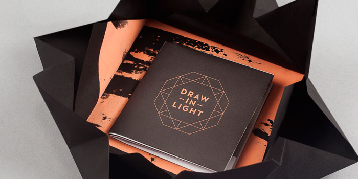
beautiful packaging:


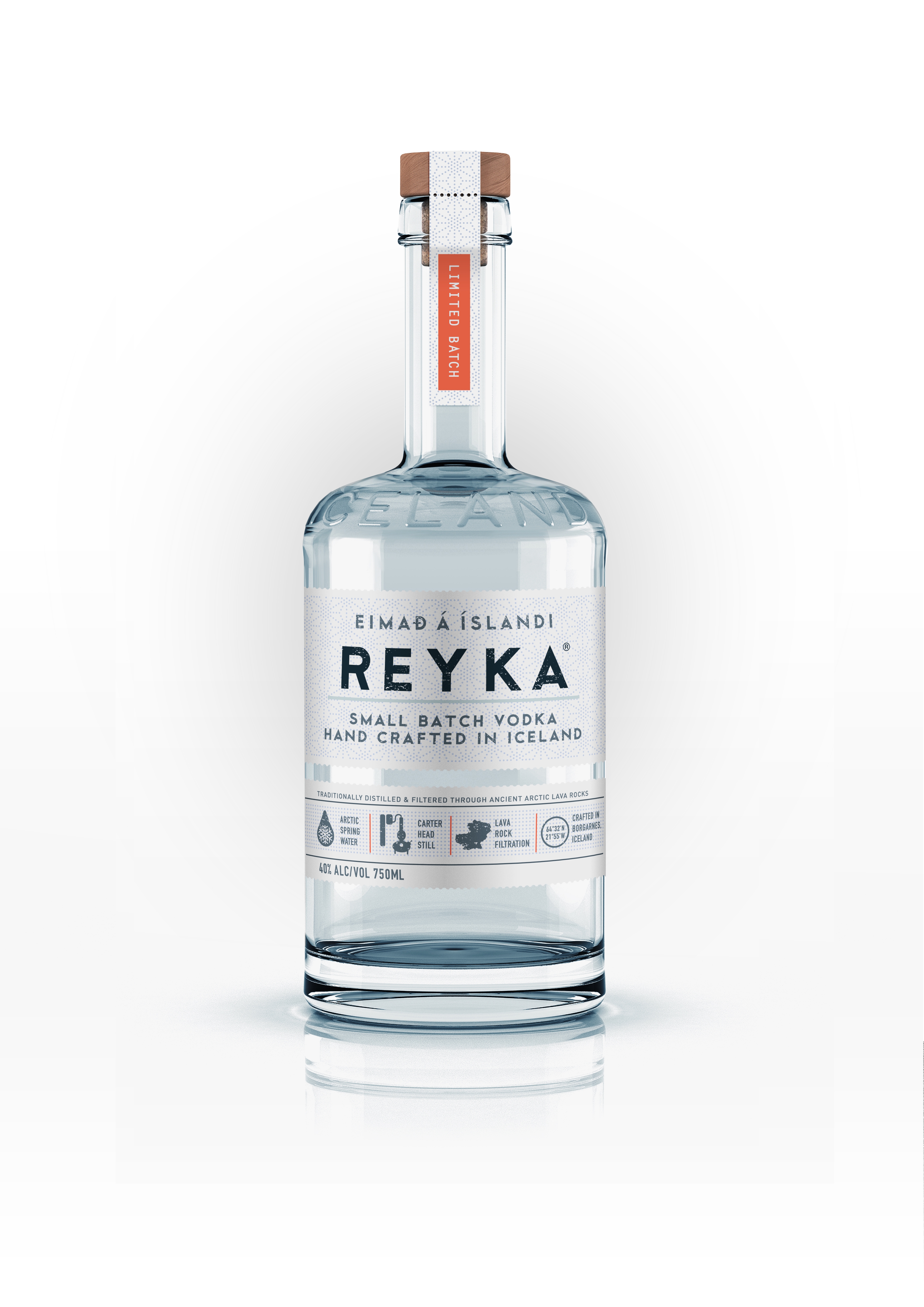

I just love REYKA Vodka's new re-design. The bottle looks so fresh and all details are beautifully flushed out.. from the icons at the bottom to the subtle geometric background pattern that embraces the scalloped label edge and perforation. The Islandic-esque blue/grey warmed by wooden cork and orange brings it all together. Their website doesn't do this bottle justice... all pixel-y and flash with a focus on cluttered degraded type. I just like the opening two frames - simple like the bottle. - sara cannon
found via Colt+Rane
Sara Cannon is a Web Design and Branding Specialist | Helping brands build seamless digital experiences.
She's also an Artist.
Do you have a project she can help you with? Contact Sara at sara@saracannon.com.