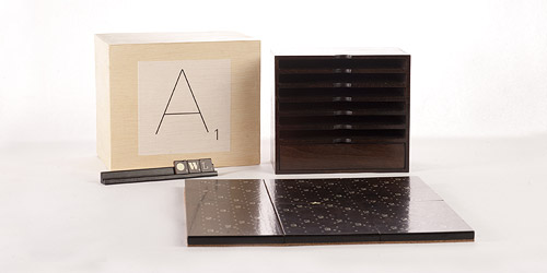
I wish all board games looked so fine as this Scrabble Typography Limited Edition.
Scrabble Typography Limited Edition | The FontFeed. h/t @miklb


I wish all board games looked so fine as this Scrabble Typography Limited Edition.
Scrabble Typography Limited Edition | The FontFeed. h/t @miklb
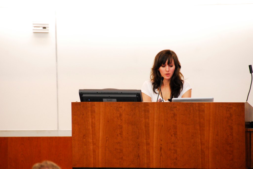
Thanks to everyone who came out to my session at WordCamp NYC! I've uploaded my slides to slideshare for you to view. Please feel free to leave comments or even just let me know what your favorite webfont is!
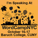 I'm so excited for WordCamp NYC this weekend! There are going to be so many talented people there it is almost overwhelming! I feel so honored to be speaking amongst this incredible lineup. If you're going, come see me speak about Typography and Your Theme. If you live in NYC or just want to come to these other incredible sessions: All you need to do is Register for WCNYC today. Make sure to find me and tell me hello! :) Here is my session description:
Believe it or not, generally WordPress sites are made up mostly of typography. This makes the relationship that these typographical elements have to each other very important. The New WordPress 3.0 default theme Twenty Ten has incredible typographical elements. In this talk I will be using a child of Twenty Ten as an example of customizing the theme’s typography. I will be going over how to plan these typographical elements out, their style and color, how to make a site/brand guideline for your Twenty Ten child theme to keep consistency, what different services to look at for your non-system fonts, typographical CSS tips and tricks, and how to account for every little detail and make sure no type element goes un-styled!
 I had the great pleasure of speaking this past weekend at WordCamp Birmingham. It was an incredible day with some incredible speakers! If you missed it, here are my slides on my session "Beyond the System Font - Advanced Web Typography." I will hopefully have a video of the talk available to you soon.
The talk covered:
– the current state of web typography/web font licensing etc
– the latest practices such as @font-face embedding
– a practical and applicable focus on how to utilize Typekit with WordPress.
– real-time typekit installation demonstration / how to change your h1
– application on mobile devices (ipad challenges)
– challenging and combating “FOUT” with js
– combating type crunch
– focus on supporting type foundries (no illegal pirating. buy licensing)
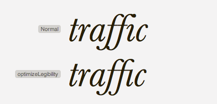
Thanks to my friend Noël, I have come across this great article on web type kerning and ligatures.
 Improved handling of kerning pairs and ligatures in modern browsers using the "text-rendering: optimizeLegibility;" declaration.
I never knew about this declaration - an interesting read and I can see some typekit experiments in my future.
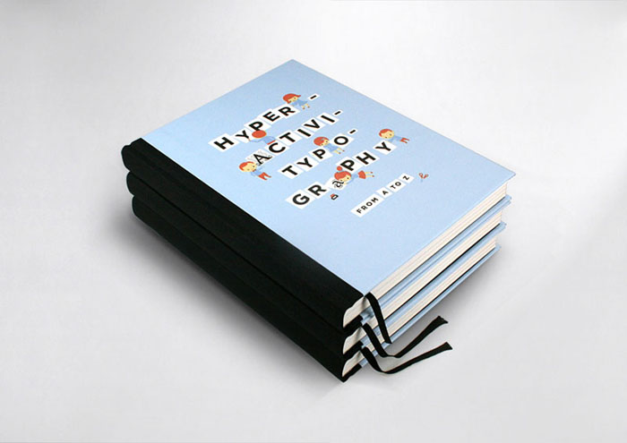
Just came across this really awesome book from Studio3 called "Hyperactivitypography from A to Z." The book is currently sold out, but I am definitely going to order one once they are back in stock. Until then, you can flip through this awesome retro-child-inspired typography book here or check out their blog to see when copies shall be back in stock. Creative and well done!


found via Play Me Design
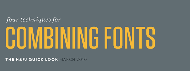
This article by H&FJ has been circling around lately. I stumbled upon it first via my friend Winslow.. and then I've been seeing it all around the inter-webs lately. Its a great little article and is insightful and encouraging to those wanting to produce good typography. I was always told in college "no more than three fonts on a page ever!" but in reality, that rule is meerly a giudeline and as you can see, there can be lots of fonts combined and it still look spectacular. enjoy the article!
- sara cannon


The Article: http://www.typography.com/email/2010_03/index_tw.htm
 ometimes I like to highlight inspiring people who have incredible work. I've been following typographer and illustrator Jessica Hische for a little while now. She has awesome work that I love to look at and was recently featured as the Letter Cult Person of the Year. Check out her website is and her blog. Here is her description of the daily drop cap, a internet type project she has created. (the S to the left is one of these drop-caps!)
The Daily Drop Cap is an ongoing project by typographer and illustrator Jessica Hische. Each day (or at least each WORK day), a new hand-crafted decorative initial cap will be posted for your enjoyment and for the beautification of blog posts everywhere.
Daily Drop Cap is a project I started in September of 2009 in which I illustrate a decorative letter every day (or at least every work day). The project will continue for approximately twelve alphabets and are available for non-commercial use as drop caps on your personal blog.
Sara Cannon is a Web Design and Branding Specialist | Helping brands build seamless digital experiences.
She's also an Artist.
Do you have a project she can help you with? Contact Sara at sara@saracannon.com.