

Interesting article about attempting to develop a coding language in arabic.
Artist's Notebook: Ramsey Nasser - ANIMAL. h/t @mitcho
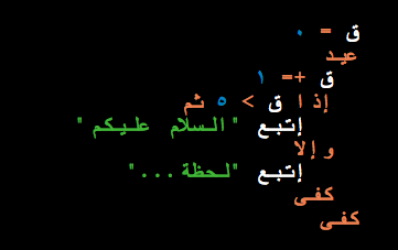
Interesting article about attempting to develop a coding language in arabic.
Artist's Notebook: Ramsey Nasser - ANIMAL. h/t @mitcho
...stop thinking about content in terms of “pages” and to start thinking about it in terms of “packages.” A content package might contain things like long and short headlines, teasers, summaries, body copy, and pull quotes. Early HTML prototyping helps us decide which of these elements we need –and helps us think of them as pieces that combine across contexts to create a cohesive experience.
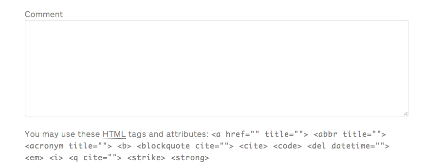
you know that annoying html help after you comment form? Do you like minimalism? remove it!
Simply go into your comments.php file and
replace
[code]comment_form();[/code]
with
[code]comment_form(array('comment_notes_after' => ''));[/code]
Done!
read up about it in the WordPress Codex

// re-blogged from Range
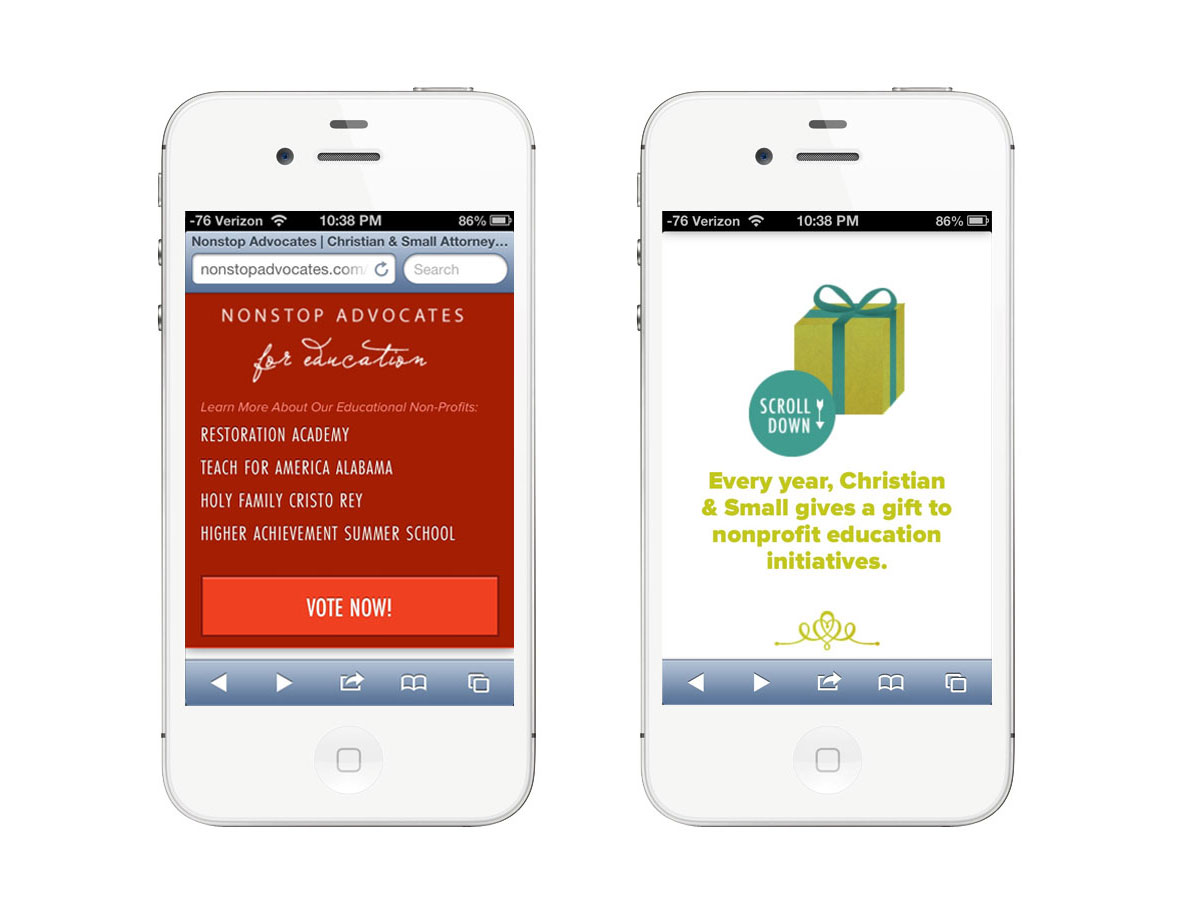
When we think about sites that have really neat parallax effects, do we ever stop to consider how they function on mobile? In making NonstopAdvocates.com we saw the use-case for parallax scrolling: to tell their philanthropic story. We also needed the website to be extremely mobile friendly as the campaign spreads around social media. How can we get the best of both worlds? Well, we decided that we would fight the uphill battle and sort this problem out once and for all.
I have always / loved / parallax / sites. I dreamed of finding a client who the story-telling aspect would be perfect for. Its almost like directing a video. You write it like a script and play it out: the graphical and storyline interactions. The code part of this comes later. Thinking about the story you have to tell is the best place to start.
As for the code: we used Richard Shephard's JS / CSS on Github as our desktop parallax base. It looks great! But what about mobile? I pulled out all the tiny tablet-y devices and to my surprise the parallax kinda worked - but it had one major flaw: it was slow and choppy and needed to simmer down and become sleek and sexy like the desktop.
Luckily for us* we were already using _s for our theme base with foundation to help with the responsive bits. Minus the parallax sludge, mobile was already in a good place with some tweaking (like un-sticking the sticky navigation, etc). Now the question is being begged:
Enter Jetpack by Automattic! They have a nifty mobile detection system built right in that we can utilize. We leveraged it to disable the parallax JavaScript and load in an extra CSS file when tablet or mobile is detected. In that stylesheet we were able to load in smaller compiled versions of multiple background images, and utilize media queries to adjust them at different sizes.
Utilizing Jetpack:
[code lang="php"]
function range_is_mobile_or_tablet() {
if ( class_exists( 'Jetpack_User_Agent_Info' ) ) {
$ua_info = new Jetpack_User_Agent_Info();
return ( jetpack_is_mobile() || $ua_info->is_tablet() );
}
return false;
}
[/code]
Disabling js and loading in the CSS:
[code lang="php"]
if ( ! range_is_mobile_or_tablet() )
wp_enqueue_script( 'parallax', get_template_directory_uri() . '/js/parallax.js', array( 'jquery' ), '20121114' );
else
wp_enqueue_style( 'tabletmobilecss', get_template_directory_uri() . "/parallaxdisabled.css", array( 'style' ), '3.1.4' );
[/code]
Now that the css is loading in , we can begin to start the tedious finagling and image resizing process until perfection is achieved. But what is the secret to the sauce? We can also use that handy function range_is_mobile_or_tablet() to target our php in our theme files if we so desired.
You're now thinking: "WHAT? REALLY? MODIFY THE THEME FILES BUT IM SO USED TO RESPONSIVE DESIGN WHERE YOU JUST SHIFT THINGS AROUND OR HIDE THINGS!"
I'm glad you had a little freak out there because I did too when I realized that I had ALL THE POWER TO MODIFY ANYTHING. But caution: power can be dangerous and evil (like if you put in so many conditionals on content that you can't keep up with modifications). Use sparingly.


*actually this was planned because we're genius
// re-blogged from range
 I was so thrilled to give a talk at WordCamp San Francisco this past weekend! My talk was on "Designing for the Modern Web" - Which in essence was a talk about designing for HiDPI. Check out my Slides & Description:
Devices that consume the web are being created at a never-before heard of rate. They’re getting smaller, lighter, faster, sharper, and sexier. Life is awesome right? But what about us web designers?
Let’s talk about how to get the best possible ratio of speed vs awesome, and what techniques to use for fast and stunning visual experiences.
I'll post the video whenever they have it up. All in all it was a fantastic weekend. I learned a ton from the other fabulous speakers, and the other attendees. Can't wait for next year.

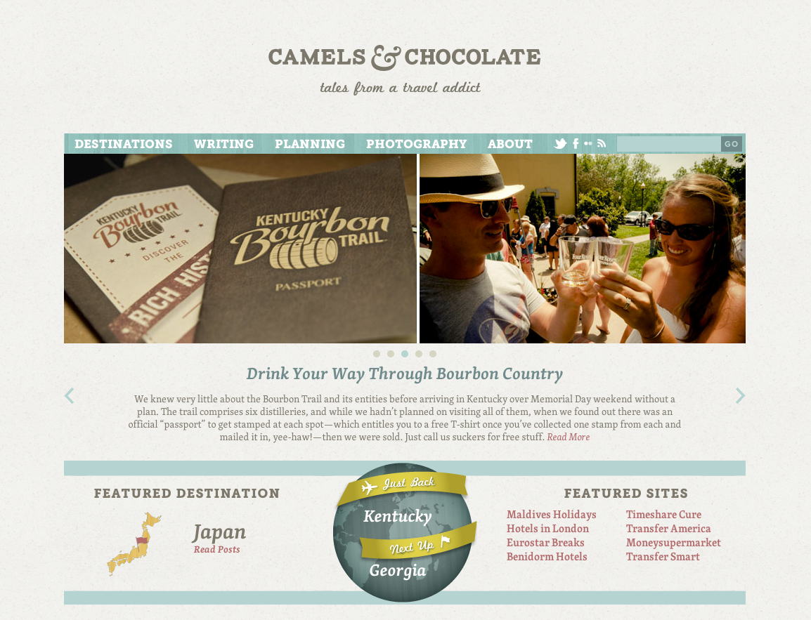
I'm so thrilled to announce that Range just launched Camels & Chocolate - Tales from a travel addict. Thanks to Kristin and Scott for their vision. The Illustrations and design came out perfect - & Aaron Campbell really finessed the destinations post type. What a fun site! Check out Kristin's Post on Camels & Chocolate re-design. I just love the comments!!


I like to make inspiration boards for my clients. Here is Kristin'sTravel Inspiration Board: http://drp.mk/Sjf
 My friends at Automattic just announced the re-vamping of their CodePoet Program. They have a fancy new website with great resources for developers, designers, and builders. WPCandy has a great article about the launch. Congrats to Pete Davies, Michael Pick, Evan Solomon, Rebecca Collins, Krista Stevens, and Dave Martin for an outstanding job on the site! I really can not wait to see where this goes. They're really tapping into the community and sharing thoughts and resources from the best in the business. Its incredible.

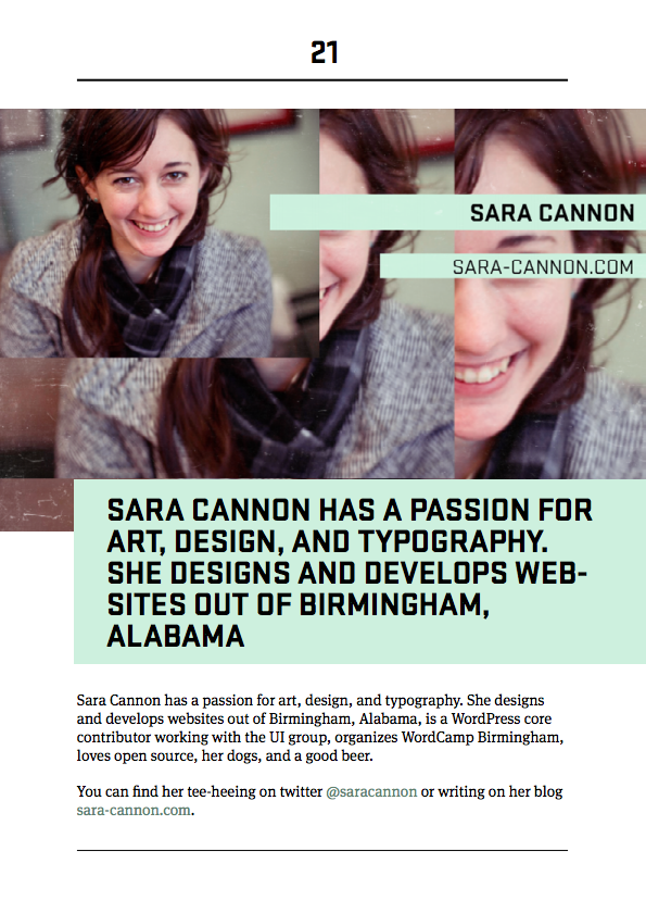
I'm in the eBook Y'all!
Along with the great resource that is the site, they are also doing an eBook series. They interviewed me for their book on WordPress and Responsive Design - you can read my thoughts on the subject in the eBook! Get it! It's Free!!! And it looks beautiful! Michael Pick did and incredible job designing it. It's just lovely. See my incredibly designed bio page below.
Congrats CodePoet! #WPYall

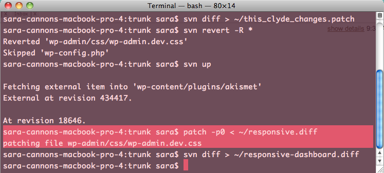
Because I do a lot of work with WordPress Core, I find myself using terminal all the time for svn management and various other things. In order to make this mundane terminal window not make me depressed, I skinned it to make it fit my style better and make me happy when I use it. Here it is:

Bumbling around in WordPress. My pretty terminal theme makes it all better!
So, If you want to use this style for your terminal download it here.
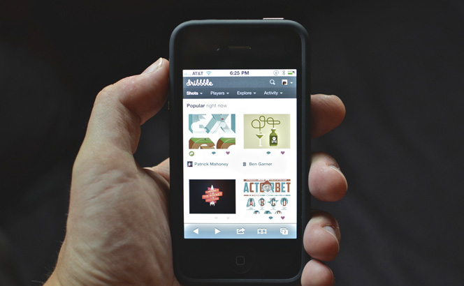
"Adapted": a great article by SimpleBits about modifying an existing site (dribbble.com) to be mobile responsive.

 WordCamp Boston has been incredible. I was thrilled to give a talk on "Theming and Mobile" with an emphasis on Responsive Web Design. The presentation is sort of a pre-cursor to my full "Responsive Web Design" talk that I'm thrilled and humbled to be giving at WordCamp San Francisco. Here is the description and slides of the talk that I gave yesterday at WC Boston:
Your site is about your content. How do we optimize for all the different devices out there but still keep our brand? Do we even optimize at all? What are different ways we can look at how our content is handled? We are going to take a look at different techniques out there including: responsive web design, media queries, dealing with video, touch, and other various plugins & CSS tricks to truly display your site and your content in the best possible manner in any given scenario.
Sara Cannon is a Web Design and Branding Specialist | Helping brands build seamless digital experiences.
She's also an Artist.
Do you have a project she can help you with? Contact Sara at sara@saracannon.com.