// re-blogged from Range
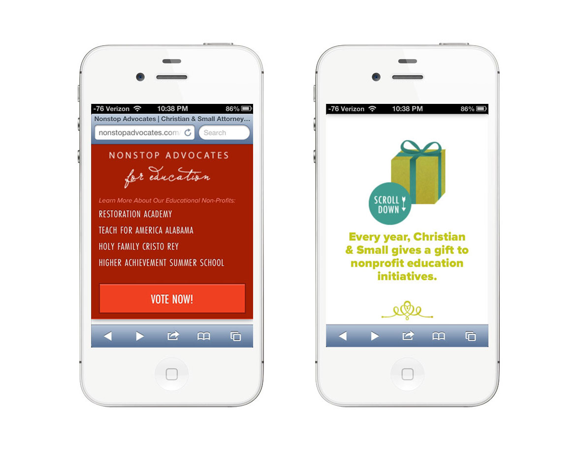
When we think about sites that have really neat parallax effects, do we ever stop to consider how they function on mobile? In making NonstopAdvocates.com we saw the use-case for parallax scrolling: to tell their philanthropic story. We also needed the website to be extremely mobile friendly as the campaign spreads around social media. How can we get the best of both worlds? Well, we decided that we would fight the uphill battle and sort this problem out once and for all.
The Parallax
I have always / loved / parallax / sites. I dreamed of finding a client who the story-telling aspect would be perfect for. Its almost like directing a video. You write it like a script and play it out: the graphical and storyline interactions. The code part of this comes later. Thinking about the story you have to tell is the best place to start.
As for the code: we used Richard Shephard's JS / CSS on Github as our desktop parallax base. It looks great! But what about mobile? I pulled out all the tiny tablet-y devices and to my surprise the parallax kinda worked - but it had one major flaw: it was slow and choppy and needed to simmer down and become sleek and sexy like the desktop.
Luckily for us* we were already using _s for our theme base with foundation to help with the responsive bits. Minus the parallax sludge, mobile was already in a good place with some tweaking (like un-sticking the sticky navigation, etc). Now the question is being begged:
How do we disable and modify the parallax to speed up the site on mobile and tablets?
Enter Jetpack by Automattic! They have a nifty mobile detection system built right in that we can utilize. We leveraged it to disable the parallax JavaScript and load in an extra CSS file when tablet or mobile is detected. In that stylesheet we were able to load in smaller compiled versions of multiple background images, and utilize media queries to adjust them at different sizes.
Utilizing Jetpack:
[code lang="php"]
function range_is_mobile_or_tablet() {
if ( class_exists( 'Jetpack_User_Agent_Info' ) ) {
$ua_info = new Jetpack_User_Agent_Info();
return ( jetpack_is_mobile() || $ua_info->is_tablet() );
}
return false;
}
[/code]
Disabling js and loading in the CSS:
[code lang="php"]
if ( ! range_is_mobile_or_tablet() )
wp_enqueue_script( 'parallax', get_template_directory_uri() . '/js/parallax.js', array( 'jquery' ), '20121114' );
else
wp_enqueue_style( 'tabletmobilecss', get_template_directory_uri() . "/parallaxdisabled.css", array( 'style' ), '3.1.4' );
[/code]
Now that the css is loading in , we can begin to start the tedious finagling and image resizing process until perfection is achieved. But what is the secret to the sauce? We can also use that handy function range_is_mobile_or_tablet() to target our php in our theme files if we so desired.
You're now thinking: "WHAT? REALLY? MODIFY THE THEME FILES BUT IM SO USED TO RESPONSIVE DESIGN WHERE YOU JUST SHIFT THINGS AROUND OR HIDE THINGS!"
I'm glad you had a little freak out there because I did too when I realized that I had ALL THE POWER TO MODIFY ANYTHING. But caution: power can be dangerous and evil (like if you put in so many conditionals on content that you can't keep up with modifications). Use sparingly.


*actually this was planned because we're genius
// re-blogged from range