July 13, 2010

Disabling Typekit for Windows

TypekitWeb Typography is coming a long way with the use of @font-face. We are finally able to break out of system fonts and have options! Unfortunately, font-rendering on IE/Windows is still sub-par. The rendering engines have a hard time interpreting fonts properly that are embedded with @font-face that have yet to be re-crafted as a web-font version.

I have been using Typekit to render my web-fonts since the service became available. It is an incredible and takes away a lot of the headache in embedding, keeping up with browser/mobile compatibility, etc. If you haven't tried Typekit out, you can get a free account to see if you like it - then upgrade if you decide you're in love. <3

I've noticed that sometimes the fonts that I've chosen can end up so "crunchy" in IE that I would rather just stack my fonts to the closest system font, and disable Typekit for Internet Explorer.

Here is a way you can Enable it for just Mac: you can query the user agent header with php in a conditional statement that wraps around your Typekit js:

[code]

<?php if (strpos($_SERVER['HTTP_USER_AGENT'], "Mac", 0) !== FALSE) { ?>
<script type="text/javascript" src="yourtypekitlink.js"></script>
<script type="text/javascript">try{Typekit.load();}catch(e){}</script>
<?php } ?>

[/code]

Don't want to exclude Linux? Disable it for Windows Only:

[code]
<?php if (strpos($_SERVER['HTTP_USER_AGENT'], "Windows", 0) === FALSE) { ?>
<script type="text/javascript" src="yourtypekitlink.js"></script>
<script type="text/javascript">try{Typekit.load();}catch(e){}</script>
<?php } ?>
[/code]


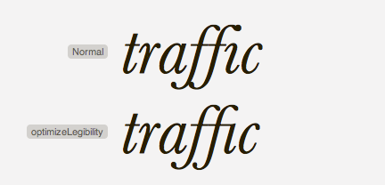
Here are examples of type crunch in a title:

LTC Bodoni type crunch IE (eww!)

LTC Bodoni Type Crunch in IE (eww!)

type on Mac with Typekit

LTC Bodoni on Mac with Typekit (perfect!)

Typekit disabled on IE

Typekit disabled on IE / reverts back to font stack


Here are some more examples with a different font:

typekit on mac: Ltc Bodoni and Proxima Nova (perfect!)

typekit on mac: Ltc Bodoni and Proxima Nova (perfect!)

Typekit enabled on Windows (crunchy! Eeek!)

Typekit enabled on Windows (crunchy! Eeek!)


typekit disabled on windows (better than the crunch.)

typekit disabled on windows (better than the crunch.)


Interested in browser-specific disabling? These methods might be interesting to look into: (but I haven't done it yet)

http://davecardwell.co.uk/javascript/jquery/plugins/jquery-browserdetect/

http://rafael.adm.br/css_browser_selector/

PS: Firefox achieves the same screen-shots as IE. Interesting.

July 1, 2010

Good Web Type Article: “Cross-browser kerning-pairs & ligatures”

Thanks to my friend Noël, I have come across this great article on web type kerning and ligatures.

Cross-browser kerning-pairs & ligaturesImproved handling of kerning pairs and ligatures in modern browsers using the "text-rendering: optimizeLegibility;" declaration.

I never knew about this declaration - an interesting read and I can see some typekit experiments in my future.

May 16, 2010

Hyperactivitypography from A to Z

Just came across this really awesome book from Studio3 called "Hyperactivitypography from A to Z." The book is currently sold out, but I am definitely going to order one once they are back in stock. Until then, you can flip through this awesome retro-child-inspired typography book here or check out their blog to see when copies shall be back in stock. Creative and well done!

Hyperactivitypography from A to Z,Hyperactivitypography from A to Z,Hyperactivitypography from A to Z,Hyperactivitypography from A to Z,Hyperactivitypography from A to Z,

found via Play Me Design

March 26, 2010

Recommended Reading: “A Few Things I’ve Learned About Typeface Design” by Gerry Leonidas

Earlier this week I posed about an HF&J article on combining typefaces. Here is another article on typography. I found it to be very informative. It lays out what an instructor of typography wants to leave with his students. The Author give you six things to leave with. I found it to be a very good read. Also, subscribe to the ilovetypography.com rss. It is wonderful.

-sara cannon

i love typography

http://ilovetypography.com/2010/03/25/a-few-things-i’ve-learned-about-typeface-design/

March 24, 2010

Combining Fonts – H&FJ

This article by H&FJ has been circling around lately. I stumbled upon it first via my friend Winslow.. and then I've been seeing it all around the inter-webs lately. Its a great little article and is insightful and encouraging to those wanting to produce good typography. I was always told in college "no more than three fonts on a page ever!" but in reality, that rule is meerly a giudeline and as you can see, there can be lots of fonts combined and it still look spectacular. enjoy the article!

- sara cannon

The Article: http://www.typography.com/email/2010_03/index_tw.htm

February 11, 2010

The Daily Drop Cap

Sometimes I like to highlight inspiring people who have incredible work. I've been following typographer and illustrator Jessica Hische for a little while now. She has awesome work that I love to look at and was recently featured as the Letter Cult Person of the Year.  Check out her website is and her blog. Here is her description of the daily drop cap, a internet type project she has created. (the S to the left is one of these drop-caps!)

The Daily Drop Cap is an ongoing project by typographer and illustrator Jessica Hische. Each day (or at least each WORK day), a new hand-crafted decorative initial cap will be posted for your enjoyment and for the beautification of blog posts everywhere.

Daily Drop Cap is a project I started in September of 2009 in which I illustrate a decorative letter every day (or at least every work day). The project will continue for approximately twelve alphabets and are available for non-commercial use as drop caps on your personal blog.

http://dailydropcap.com/

Sara Cannon is a UX/UI Designer, Former Business Owner, Creative Director, & Artist remote working in Birmingham, Alabama. 
Have a project I could help you with? Contact me at sara@saracannon.com.

Skip to content