Published on the Range blog in 2017
Whether you’re freelancing or working for someone else, you probably make decisions and organize tasks every day.
My particular role actually involves a heavy emphasis on these things and I’ve discovered I’m a better organizer and decision maker when I’m leaning on some frameworks, processes, and general awareness.
Urgent vs. Important
One of the first things I learned as a project manager is this: few tasks (fewer than we think) are genuinely urgent.
- Urgent: (of a state or situation) requiring immediate action or attention / needing immediate attention
- Important: of great significance or value; likely to have a profound effect on success, survival, or well-being / of great value, meaning, effect
Say you have two tasks on your plate right now: client A’s site is down (urgent), and client B just requested some estimates for new work (important). Which do you take care of first? Most people would say, “take care of the site that’s down!” I’d agree.
This seems straight forward and, for the most part, it is . . . once you know what urgent and important look like.
Organizing Tasks is Tricky
Beyond knowing the difference between urgent and important, the toughest part of task organization is threefold:
- Identifying what type of task is on your hands (urgent, important, or neither?)
- Making smart decisions about your to-do list (when to do what and how)
- Actually executing your tasks (following through)
With the two task example above, that’s easy. But most days of our work year aren’t that calm.
A more normal scenario: You’ve arrived for work and received a list of 20 items. You could just tackle the first item on the list and work your way down from there, but I bet you’d run out of time. A more efficient method would be prioritizing what’s urgent (and should be done ASAP), what’s important (and should be taken care of soon) and what you can delegate or tackle later. This way, you ensure you’re taking care of highest priority items first with the amount of time you have available.
So, how do you do that?
The Eisenhower Decision Matrix
There are many ways you can approach classifying tasks, but my favorite method is something called the Eisenhower Decision Matrix:
To use this matrix, you’d take each task (big or minuscule) on your 20 item to-do list and assign them to a quadrant. Once you’ve sorted all to-dos, you should have more clarity on whether you take immediate action, schedule the task for later, delegate, or ignore the item for now.
You’ll still need to make some smart decisions about how you handle those tasks, and your priorities may shift throughout the day, but this matrix can help you get on the right track.
On Smart Decision Making
Organizing your tasks (by any method) and then figuring out what to do with them is decision making. In order to make consistently smart decisions when it comes to your to-dos, it’s helpful to know about things that can skew your decisions.
Back to our to-do list example: Pull that list of 20 tasks back into your mind. On any given work day you’d dislike doing some of those tasks, but really like others. A few tasks you probably don’t mind may require you working with people you do mind. And one or two tasks likely have high stakes attached to their completion (or failure). Even if these factors shouldn’t influence how you prioritize your tasks, I bet they do.
A non-exhaustive list of factors that can skew your decisions:
- Mindset: How we perceive our abilities and limitations (popularized by Carol Dweck)
- Biases: Irrational preferences or inclinations
- Fear of Failure: I’ve never met someone who enjoys failing, but I’ve met plenty of people who are paralyzed by the idea of it. Fear-induced paralysis (or even a milder form, avoidance) can shut down our ability to rationally weigh options.
- Personal Blind Spots: Personal strengths and weaknesses create inherent “blind spots” – aspects of our personalities, actions, and behavior we’re unaware of.
- Decision Fatigue: When we’ve reached decision overload and no longer have the mental energy to adequately weigh options, that’s decision fatigue. We’re especially susceptible to biases when we’re this kind of tired.
- Default Options: It’s easy to choose the path of least resistance. Sometimes, we select or go along with default options so we can avoid a decision altogether.
- Physical Factors: Even seemingly small details like the time of day, how hungry we are, and our sensory experience can affect our decisions. (Example: I’m more likely to make a smart decision at 10am after coffee and breakfast than at 5pm when I’m hungry and ready to shut off for the day.)
Whew. Our decisions can go rogue pretty easily.
Mitigating those Factors
Personally, I need help mitigating these. Two kinds of help I find particularly beneficial are:
- decision making processes
- good people
The process that most intrigues me is called PrOACT. Researchers John Hammond and Ralph Keeney propose this approach in their book, Smart Choices. The process considers eight elements: problem, objectives, alternatives, consequences, tradeoffs, uncertainty, risk tolerance, and linked decisions. (Read Chapter 1 for more details or buy the book on Amazon). Some successful folks have highly recommended this process and I suspect that’s for good reason.
Equally important is surrounding yourself with coworkers, partners and friends who balance your thought process, are aware of your biases and blind spots, can help you navigate decision making pitfalls and practice smart decision making in their own lives. These kind of people are invaluable.
Execution Tips (Don’t Forget to Act)
Once you’ve organized your tasks and decided what to do with (or about) them, give yourself a big pat on the back and take a quick break. But don’t stop there.
How many times have you decided, unequivocally, that you’ll wake up early tomorrow morning and exercise? Or take care of that annoying fix? Or knock out that medium-sized home project?
How often to do something else instead?
Making a decision doesn’t guarantee you (or anyone else) will actually act on it.
Some tips on moving from decision to execution:
- Spend only a limited amount of time planning & prioritizing
- Involve your coworkers
- Schedule a time to act on important items
- Communicate major decisions to everyone impacted
- Set reminders via your phone, notepad, task manager, or Slack
- Use something to track your tasks and to-dos (who doesn’t love checking things off?)
- On a related note, don’t hide your to do list in your drawer
- Ask others to follow up with you
- And, especially if this is a smaller decision, just do it and move on
Putting it all Together
Navigating your to do list each day doesn’t have to be overwhelming. With some help from frameworks and smart decision making, you can grow more productive and efficient with your work days.
Resources & Further Reading
On Decision-Making:
And one good read on execution:


 . I love projects that end up being typographical based that really let the content shine. Screenshots below: or just visit


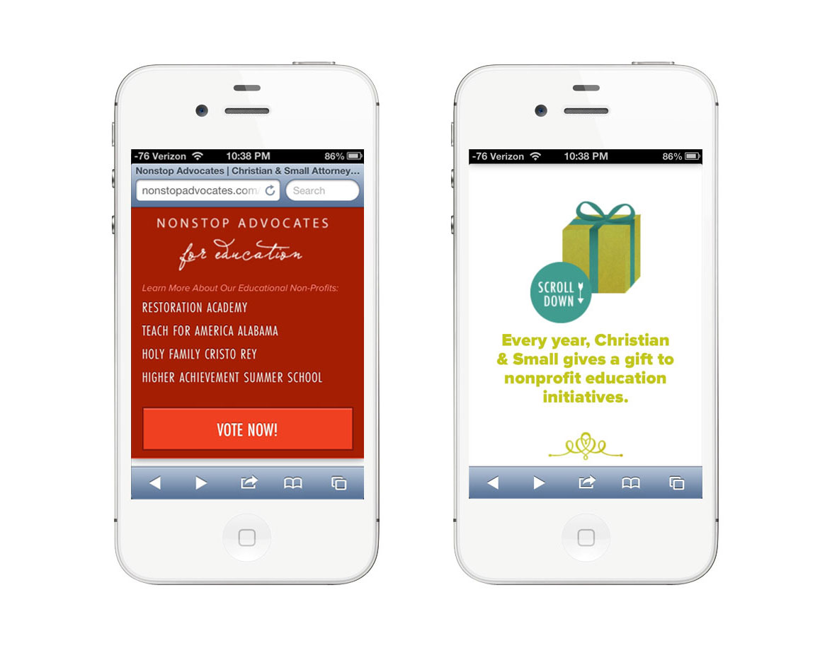
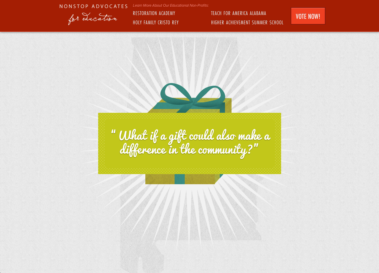
 I love working on design for incredible organizations with amazing and talented people! This past spring, I was able to collaborate with
