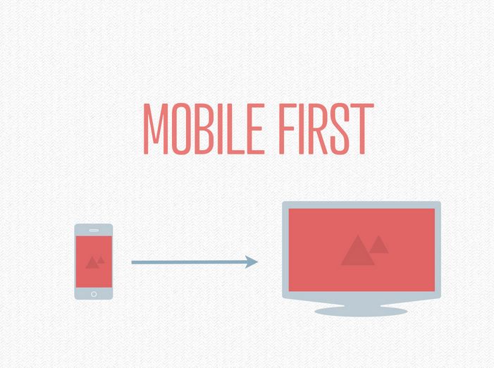
 Here are the slides on Responsive Design from my presentation at Future Insights Live in Vegas this past weekend. Thanks for everyone who came out!
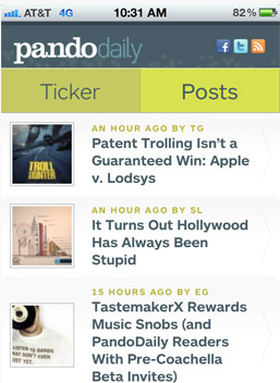
 Last week I designed and launched PandoDaily's Mobile site with Greg Kumparak's PandoDaily Lead and Aaron Campbell's development skills. It looks fabulous. We still have a ways to go with it but I'm pretty thrilled the direction its going in.
Interestingly enough, the mobile site used to be responsive (still is for the iPad and Kindle), but we needed something leaner that can put the focus directly on the PandoTicker and post headlines. Going away from responsive site for mobile was a good fit in this case.
Check out Greg's writeup on the site here.
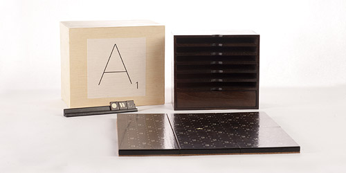
I wish all board games looked so fine as this Scrabble Typography Limited Edition.
Scrabble Typography Limited Edition | The FontFeed. h/t @miklb

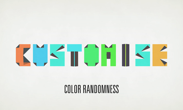
I just love this typeface that looks like origami! It reminds me of the one that I made for my site. You can download the font and the illustrator file for free if you like them on facebook. link: Animated Typeface That Folds Like Origami.
I made one of my own:

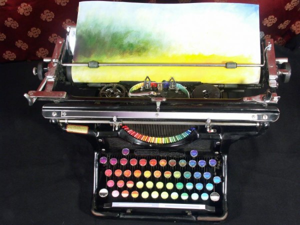
I just love this chromatic typewriter.. it makes me want to make my own!
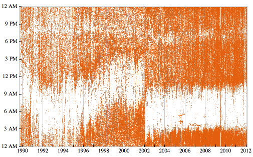
Interesting "Personal Analytics" from Steve Wolfram. Reminds me ok the one time I tracked my mouse movements.
Link: Stephen Wolfram Blog : The Personal Analytics of My Life.
Thanks Otto.
Hey y'all! My talk from WordCamp Phoenix is up on WordPress.tv! Watch it here or watch it there and leave some comments! ThankYou!
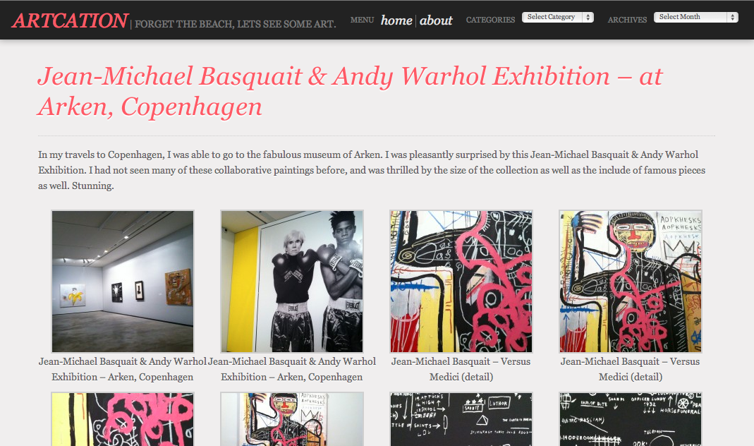
I posted over on my Artcation blog the Jean-Michael Basquait & Andy Warhol Exhibition - at Arken, Copenhagen. Go check it out!
Sara Cannon is a Web Design and Branding Specialist | Helping brands build seamless digital experiences.
She's also an Artist.
Do you have a project she can help you with? Contact Sara at sara@saracannon.com.
