May 19, 2012

Automattic Announces CodePoet / I’m in the eBook!

My friends at Automattic just announced the re-vamping of their CodePoet Program. They have a fancy new website with great resources for developers, designers, and builders. WPCandy has a great article about the launch. Congrats to Pete Davies, Michael Pick, Evan Solomon, Rebecca Collins, Krista Stevens, and Dave Martin for an outstanding job on the site! I really can not wait to see where this goes. They're really tapping into the community and sharing thoughts and resources from the best in the business. Its incredible.

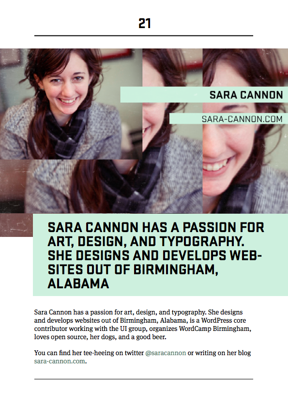
I'm in the eBook Y'all!

Along with the great resource that is the site, they are also doing an eBook series. They interviewed me for their book on WordPress and Responsive Design - you can read my thoughts on the subject in the eBook! Get it! It's Free!!! And it looks beautiful! Michael Pick did and incredible job designing it. It's just lovely. See my incredibly designed bio page below.

Congrats CodePoet! #WPYall
sara cannon codepoet Ebook

May 7, 2012

My Slides on Responsive Design from Future Insights Live 2012

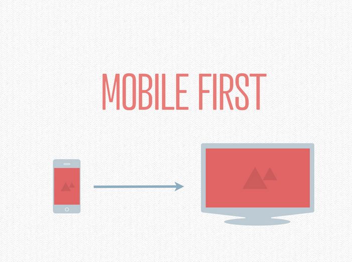
Here are the slides on Responsive Design from my presentation at Future Insights Live in Vegas this past weekend. Thanks for everyone who came out!

September 12, 2011

Responsive Design Inspiration: the Boston Globe

The BostonGlobe.com recently launched a new responsive site! its beautiful thanks to the collaboration of the filament group and the globe.

Below is an awesome video they made about the design and development process and includes some technical talk about the use of media queries as well as starting big then simplifying rather than the reverse process of progressive enhancement. Interesting video for sure!

September 2, 2011

Good Read: “Adapted” by SimpleBits.

"Adapted": a great article by SimpleBits about modifying an existing site (dribbble.com) to be mobile responsive.


September 1, 2011

Video: My Responsive Web Design talk at WordCamp San Francisco

Here's the video recording of my talk at WordCamp San Francisco that I gave on Responsive Web Design. Lots of talk about Twenty Eleven, WordPress, and Media Queries. Enjoy!

August 17, 2011

Speaking on Responsive Web Design and WordPress this Friday in Tokyo!

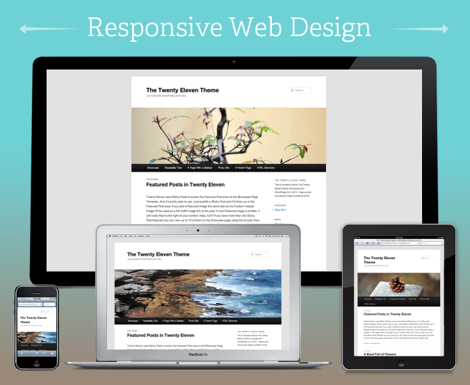
I can't be more excited about this event! This friday I will be speaking in Tokyo at the coworking space "Jelly Jelly Cafe" in Shibuya. I will be talking about Responsive Web Design and WordPress.

here is the Facebook Event:

http://www.facebook.com/event.php?eid=248644095166353

A brief description/rant:

Q. What can be more exciting than your content being viewed in the very best manner possible?
A. Your content being viewed in the very best manner possible on any device!

Enter Responsive Web Design. A topic that is very near and dear to my heart. Why? Because it is important. We actually have the ability to make our site closer to perfect on every device.  Why wouldn't we?

No matter how you're accessing your content, it should be functional, readable, and consumable. No more device hinderance! No more pinching, squinting, and scrolling when not appropriate. No more trying to drag and swipe and having it not work as expected. We are in control. We can finagle and cry and tweak and cry and get angry until our content is perfect everywhere.

July 31, 2011

Speaking at WordCamp San Francisco on Responsive Web Design

I'm speaking at WordCamp San Francisco 2011!I have have been given the great opportunity to speak this year at WordCamp San Francisco! I am absolutely thrilled and humbled to be amongst the lineup of speakers at that conference. Let me know if you're going and I'll be sure to say hi! My session will be on "Responsive Web Design" and WordPress. Here's a semi-unofficial blurb about the talk.

Your site is about your content. With mobile devices, iPads, phones, gaming consols, etc: people can access your content many different ways and formats. How can we maintain some control over the display of our content and keep our brand consistent? How can we try to provide the best user experience on any platform?

Enter Responsive Web Design. A term coined by Ethan Marcotte. Many experts aren't leaning on one static design anymore, but on structured content that adapts to its given environment.
We are going to take a look at responsive web design techniques out there including: progressive enhancement, flexible grids, media queries, flexible images & video, & other methods that you can implement to make your WordPress theme "Responsive".
This talk is particularly important to me, as I will be leading a responsive admin effort in contributing to WordPress core. Follow and Contribute: Make.WordPress.org/UI . Are you going to WordCamp San Francisco this year?

July 24, 2011

WordCamp Boston: “Theming and Mobile: Optimizing your site for various devices”

WordCamp Boston has been incredible. I was thrilled to give a talk on "Theming and Mobile" with an emphasis on Responsive Web Design. The presentation is sort of a pre-cursor to my full "Responsive Web Design" talk that I'm thrilled and humbled to be giving at WordCamp San Francisco. Here is the description and slides of the talk that I gave yesterday at WC Boston:

Your site is about your content. How do we optimize for all the different devices out there but still keep our brand? Do we even optimize at all? What are different ways we can look at how our content is handled? We are going to take a look at different techniques out there including: responsive web design, media queries, dealing with video, touch, and other various plugins & CSS tricks to truly display your site and your content in the best possible manner in any given scenario.


April 11, 2011

Scout Blog Post: “Pushing The Boundaries: Harp Law LLC”

Here is a post that I wrote over on the Scout Blog, syndicated over here just in case you didn't catch it over there.

Pushing The Boundaries: Harp Law LLC

We are so pleased to announce the launch of Harp Law, LLC. Greg Harp came to us with his vision and style and asked us to give him a site that just suits him perfectly. We are not only pleased with the tailored design, but the functionality of the site goes beyond measure.

Greg is always on his iPad and iPhone and wanted a site that would display his content well, no matter what device he was using. We decided to give him the very best and build in automatic device adaptation into the heart of the code. Utilizing the technique called "Responsive Web Design", no matter if he's on an iPad in Landscape Mode to an Android or an iPhone in Portrait Mode, Greg's content and brand is going to put its best foot forward.

Q: Did you really tweak his site on all the various devices and resolutions?
A: Yes.

Q: Doesn't that take up a lot of time?
A: Yes, it does. But in the long run, it is worth it. Greg will now never have to worry about making a custom mobile site or if things are showing up right on the iPad. We've even built in touch swiping into the slide-show. Here at Scout, we want to make the future of good web design practices, a standard reality now.

Check Out The Website: HarpLawLLC.com

Sara Cannon is a UX/UI Designer, Former Business Owner, Creative Director, & Artist remote working in Birmingham, Alabama. 
Have a project I could help you with? Contact me at sara@saracannon.com.

Skip to content