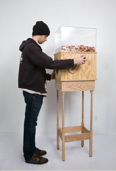
A really amazing Minimum Wage Machine. Turn the crank for an hour and you'll get paid NY's minimum wage in coins. (one penny every 4.97 seconds, for $7.25)
// re-blogged from Range
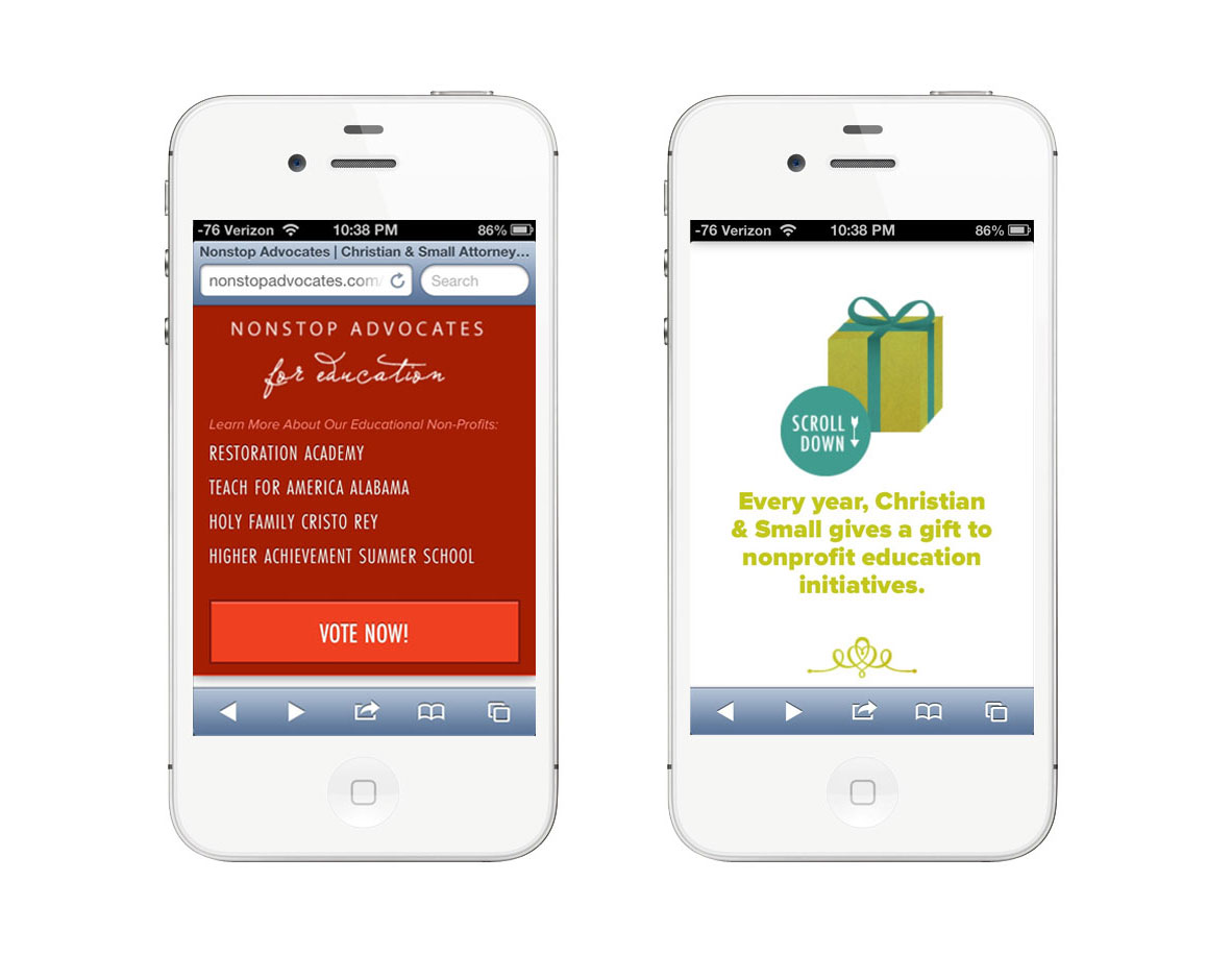
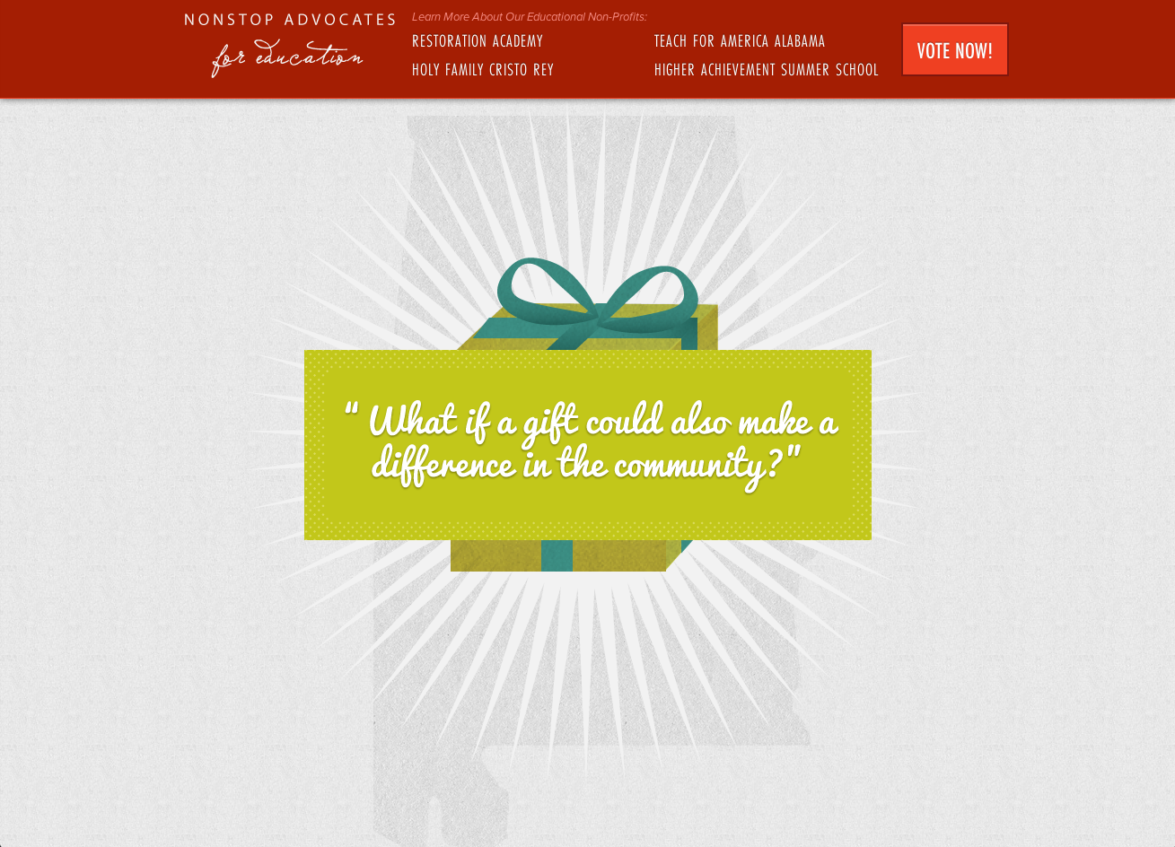
When we think about sites that have really neat parallax effects, do we ever stop to consider how they function on mobile? In making NonstopAdvocates.com we saw the use-case for parallax scrolling: to tell their philanthropic story. We also needed the website to be extremely mobile friendly as the campaign spreads around social media. How can we get the best of both worlds? Well, we decided that we would fight the uphill battle and sort this problem out once and for all.
The Parallax
I have always / loved / parallax / sites. I dreamed of finding a client who the story-telling aspect would be perfect for. Its almost like directing a video. You write it like a script and play it out: the graphical and storyline interactions. The code part of this comes later. Thinking about the story you have to tell is the best place to start.
As for the code: we used Richard Shephard's JS / CSS on Github as our desktop parallax base. It looks great! But what about mobile? I pulled out all the tiny tablet-y devices and to my surprise the parallax kinda worked - but it had one major flaw: it was slow and choppy and needed to simmer down and become sleek and sexy like the desktop.
Luckily for us* we were already using _s for our theme base with foundation to help with the responsive bits. Minus the parallax sludge, mobile was already in a good place with some tweaking (like un-sticking the sticky navigation, etc). Now the question is being begged:
How do we disable and modify the parallax to speed up the site on mobile and tablets?
Enter Jetpack by Automattic! They have a nifty mobile detection system built right in that we can utilize. We leveraged it to disable the parallax JavaScript and load in an extra CSS file when tablet or mobile is detected. In that stylesheet we were able to load in smaller compiled versions of multiple background images, and utilize media queries to adjust them at different sizes.
Utilizing Jetpack:
[code lang="php"]
function range_is_mobile_or_tablet() {
if ( class_exists( 'Jetpack_User_Agent_Info' ) ) {
$ua_info = new Jetpack_User_Agent_Info();
return ( jetpack_is_mobile() || $ua_info->is_tablet() );
}
return false;
}
[/code]
Disabling js and loading in the CSS:
[code lang="php"]
if ( ! range_is_mobile_or_tablet() )
wp_enqueue_script( 'parallax', get_template_directory_uri() . '/js/parallax.js', array( 'jquery' ), '20121114' );
else
wp_enqueue_style( 'tabletmobilecss', get_template_directory_uri() . "/parallaxdisabled.css", array( 'style' ), '3.1.4' );
[/code]
Now that the css is loading in , we can begin to start the tedious finagling and image resizing process until perfection is achieved. But what is the secret to the sauce? We can also use that handy function range_is_mobile_or_tablet() to target our php in our theme files if we so desired.
You're now thinking: "WHAT? REALLY? MODIFY THE THEME FILES BUT IM SO USED TO RESPONSIVE DESIGN WHERE YOU JUST SHIFT THINGS AROUND OR HIDE THINGS!"
I'm glad you had a little freak out there because I did too when I realized that I had ALL THE POWER TO MODIFY ANYTHING. But caution: power can be dangerous and evil (like if you put in so many conditionals on content that you can't keep up with modifications). Use sparingly.


*actually this was planned because we're genius
// re-blogged from range
// reblogged from ran.ge
We're so thrilled to announce this years launch of NonstopAdvocates.com! We designed and developed the site working with Christian & Small's Julie Ellis. Throughout the years, Christian & Small Attorneys has given back to the community in outstanding ways. This will be the third year that they decided to give donations to charities in lieu of client gifts for the holidays. But not only do they give their money, they also give countless hours of time as well as supplies. Really the involvement can't be measured.
We decided that we needed a site that not only achieves the voting, but also tells their philanthropic story. In terms of medium: we decided to use a parallax scrolling technique to tell what we couldn't say on a static page. Check it out, vote, and consider donating on your own to these great organizations!
// reblogged from ran.ge
// re-blogged from Range
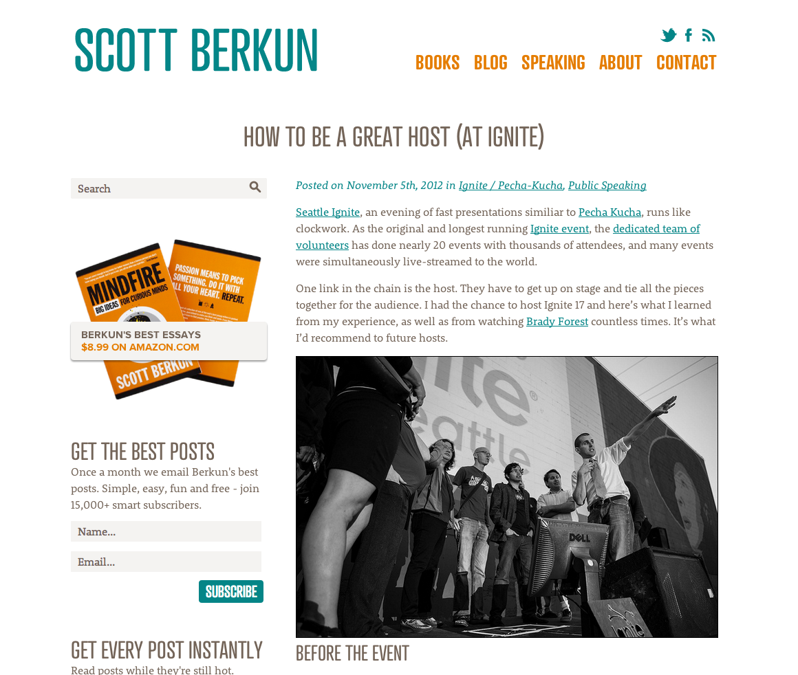
I had the great pleasure of working with Scott Berkun on his personal branding and website design. He wanted a clean modern look so we went with all white, the most awesome font Atrament Web, and colors that pop just like the cover of his famous book Mindfire. I love projects that end up being typographical based that really let the content shine. Screenshots below: or just visit ScottBerkun.com.
Development by: Shawn Johnston


// re-blogged from Range
 "Thinking Retina First: Designing for HiDPI" When: Friday, November 2nd, 11:30-1pm (networking 11:30-noon)
Where: Innovation Depot, Training Room, 1500 1st. Ave. N
RSVP: Free to attend
Devices that consume the web are being created at a never-before heard of rate. They’re getting smaller, lighter, faster, sharper, and sexier. The density of screens are even beginning to compete with print and its only up from here! How do we implement methods for these devises and are also forward-thinking?
This talk is about how to implement HiDPI graphics while tailoring the best possible ratio of “speed vs awesome”, and other techniques for fast and stunning visual experiences.
http://ipsaonline.org/ipsa-november-event-thinking-retina-first-designing-for-hidpi/
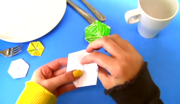
Really cool video about Hexaflexagons!
// thanks Isaac!
// Reblogged from ran.ge/blog
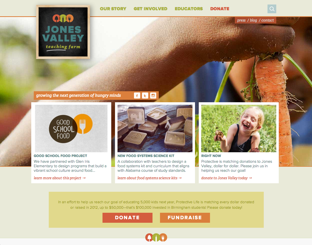
 I love working on design for incredible organizations with amazing and talented people! This past spring, I was able to collaborate with Kelly Housholder, Cary Norton, and Jordan Sowards on rebranding for Jones Valley Teaching Farm in Birmingham, AL. Under the creative direction of Kelly, we collaborated on the rebranding, logo, and color palette.. which she then worked to produce some incredible messaging copy from Jordan, which is all pulled together by the brilliant photography that Cary took! All of this while working closely with JVTF's executive director, Grant Brigham.
I can't tell you how thrilled I am to be a part of this relaunch, for such a great organization We renamed them from "Jones Valley Urban Farm" to "Jones Valley Teaching Farm" to more accurately portray what their main initiative is in our community: Education.
Continuing from the rebranding I collaborated on with Kelly, we then collaborated on the website structure and design that just launched last Friday with the development by Andrew Norcross. JVTF has so much to say and so much to give back to the community. We started with wire-framing and information architecting and then went onto design. Kelly was extremely meticulous in working in every detail out with Grant and making sure nothing was overlooked. In particular, I really enjoyed working on the blog category structure & icons. Check JonesValleyTeachingFarm.org out for yourself! (shortlink: JVTF.org)
// Reblogged from ran.ge/blog - go there to view more screenshots or vies the site at jonesvalleyteachingfarm.org
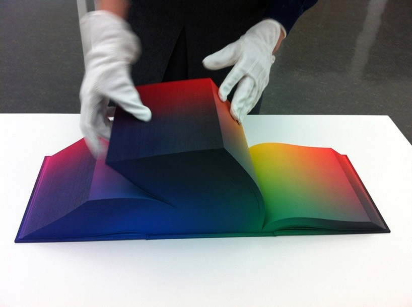
I absolutely love the concept of this printed color-spectrum book. its neat to think of color 3 dimensionally and e able to physically pull a page out of a certain plain to dissect it. WOW.
Sara Cannon is a Web Design and Branding Specialist | Helping brands build seamless digital experiences.
She's also an Artist.
Do you have a project she can help you with? Contact Sara at sara@saracannon.com.
