"Adapted": a great article by SimpleBits about modifying an existing site (dribbble.com) to be mobile responsive.

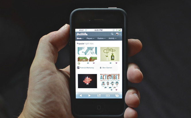
"Adapted": a great article by SimpleBits about modifying an existing site (dribbble.com) to be mobile responsive.
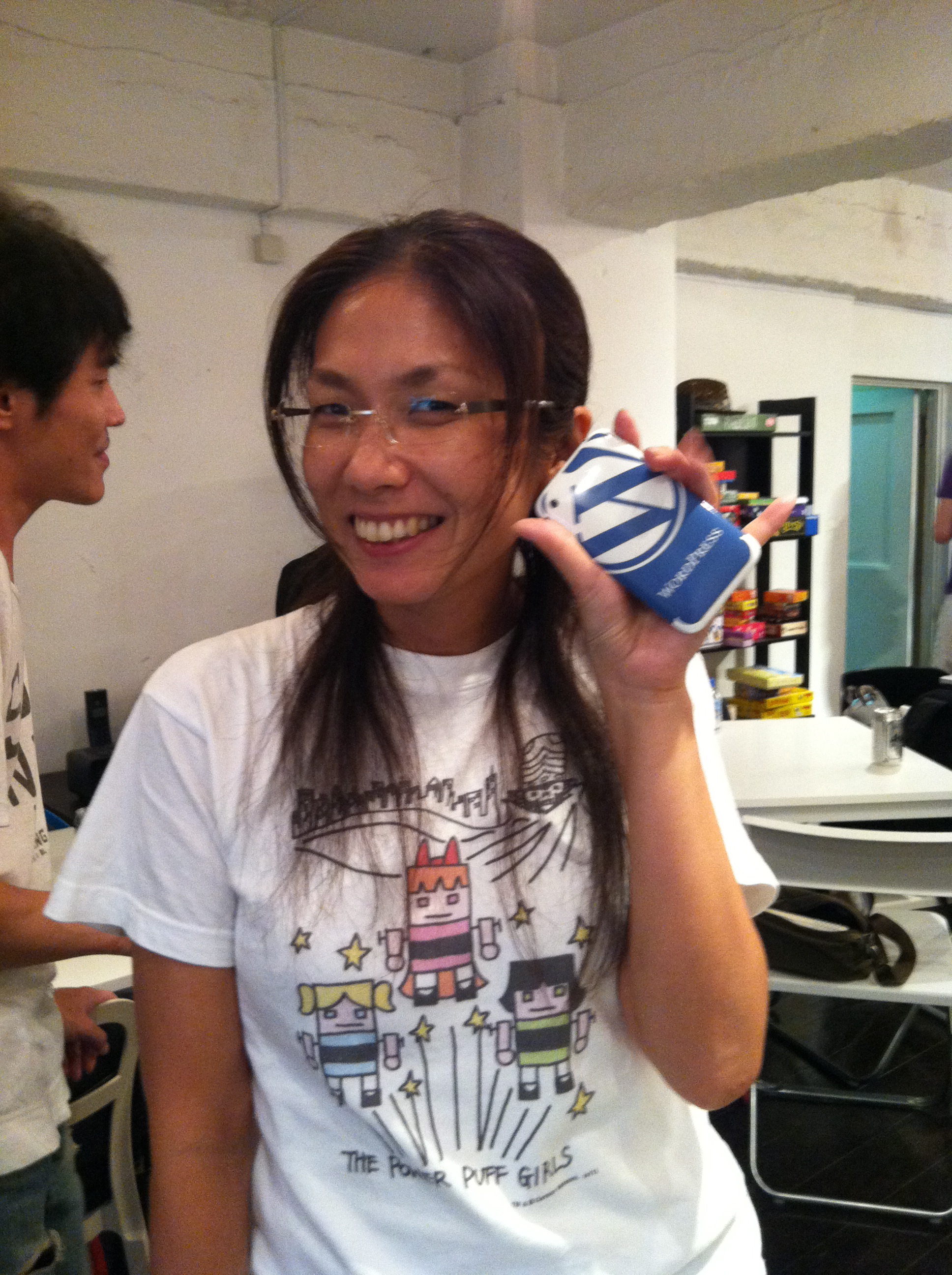
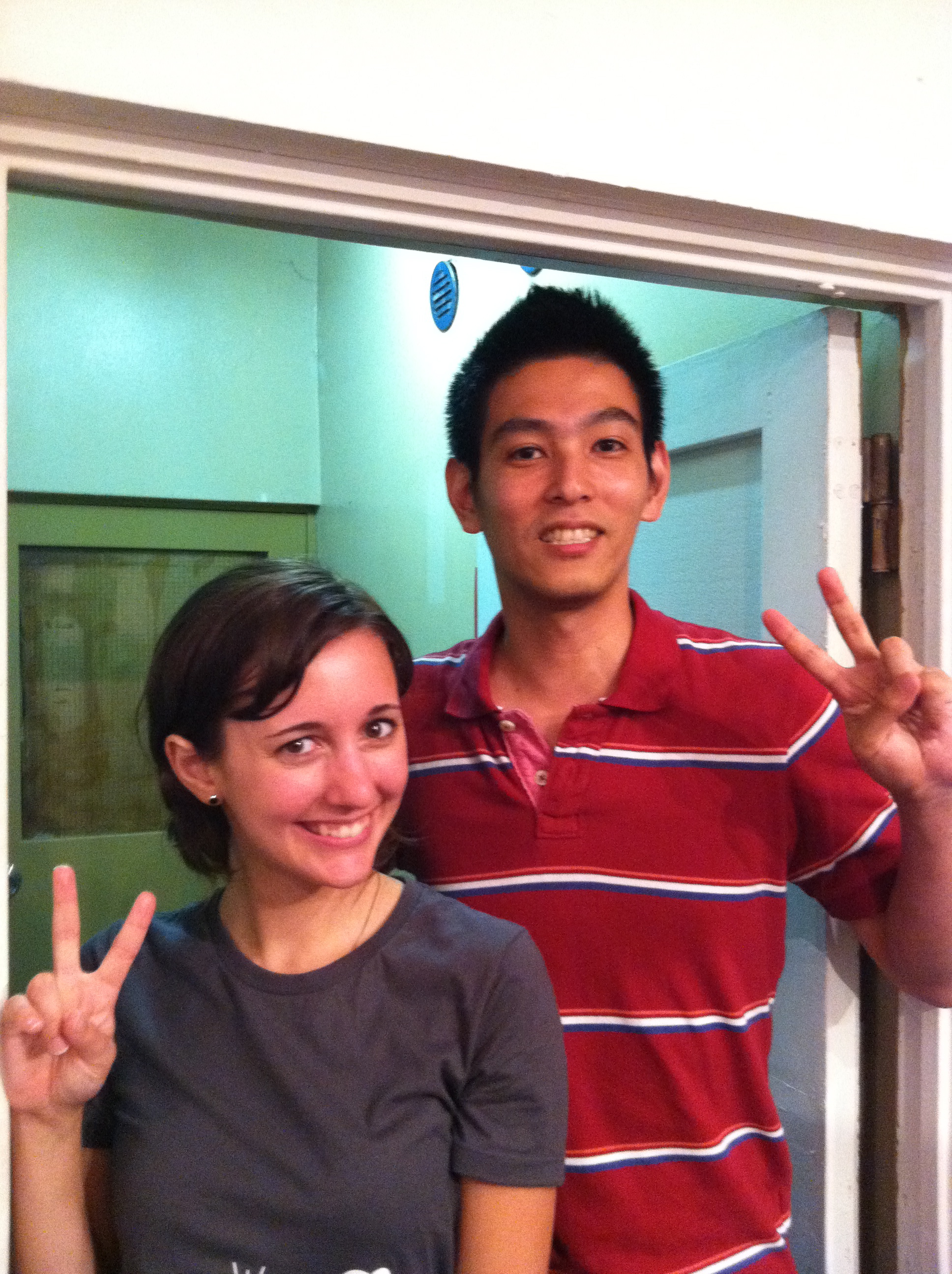
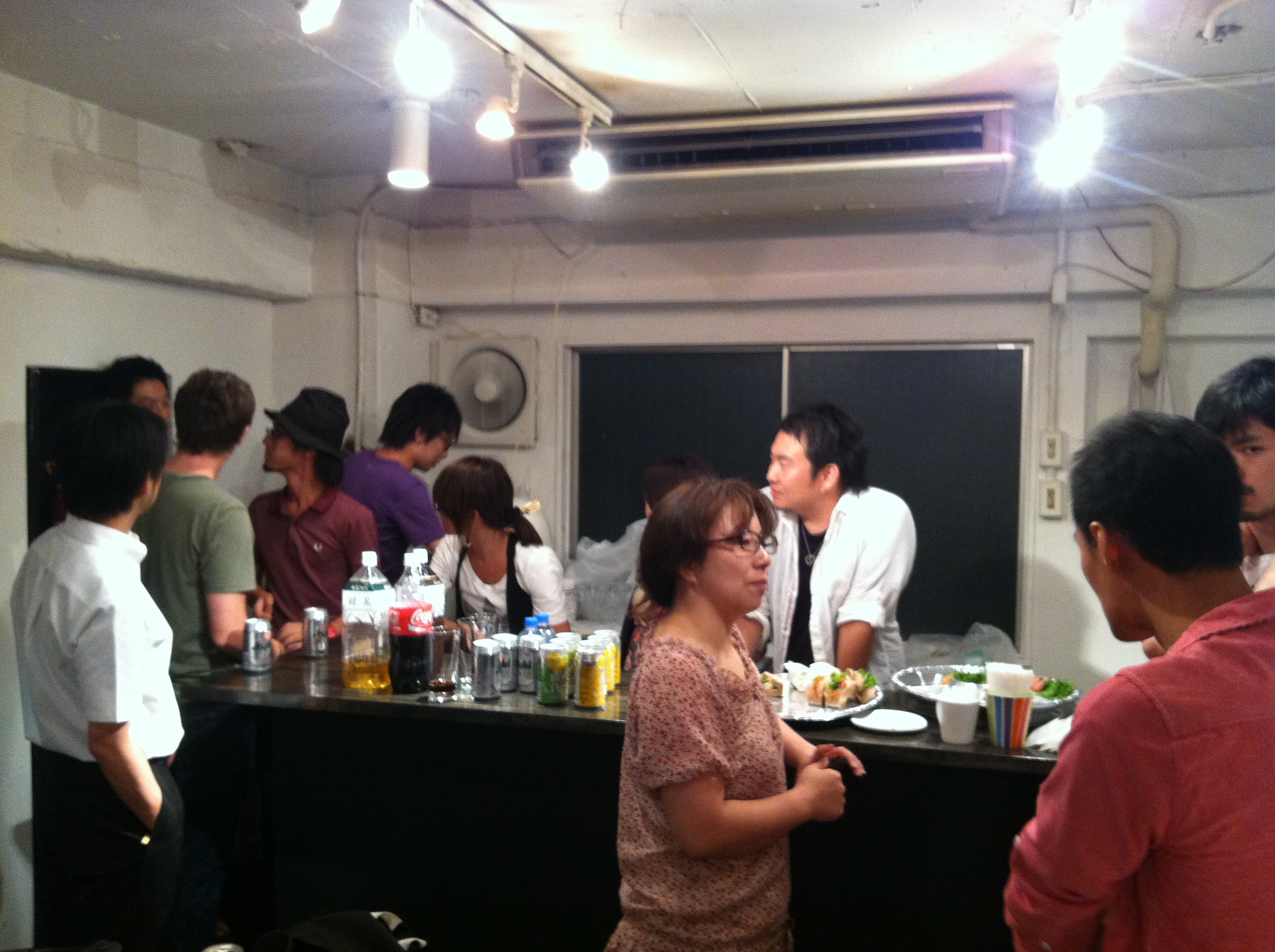
Thank you to everyone who came to my talk at Jelly Jelly Cafe in Tokyo! I had the best time. It was great meeting everyone. Special thanks to Naoko for setting up the talk, Sho for hosting the talk in Jelly Jelly Cafe, and Toru for his awesome translating skills. More thanks to everyone else who came and helped in any way. I love Japan and it meant a lot to me to meet everyone. Below is the Ustream video from the talk :)
addition 12.17.12: The video is now on youtube!
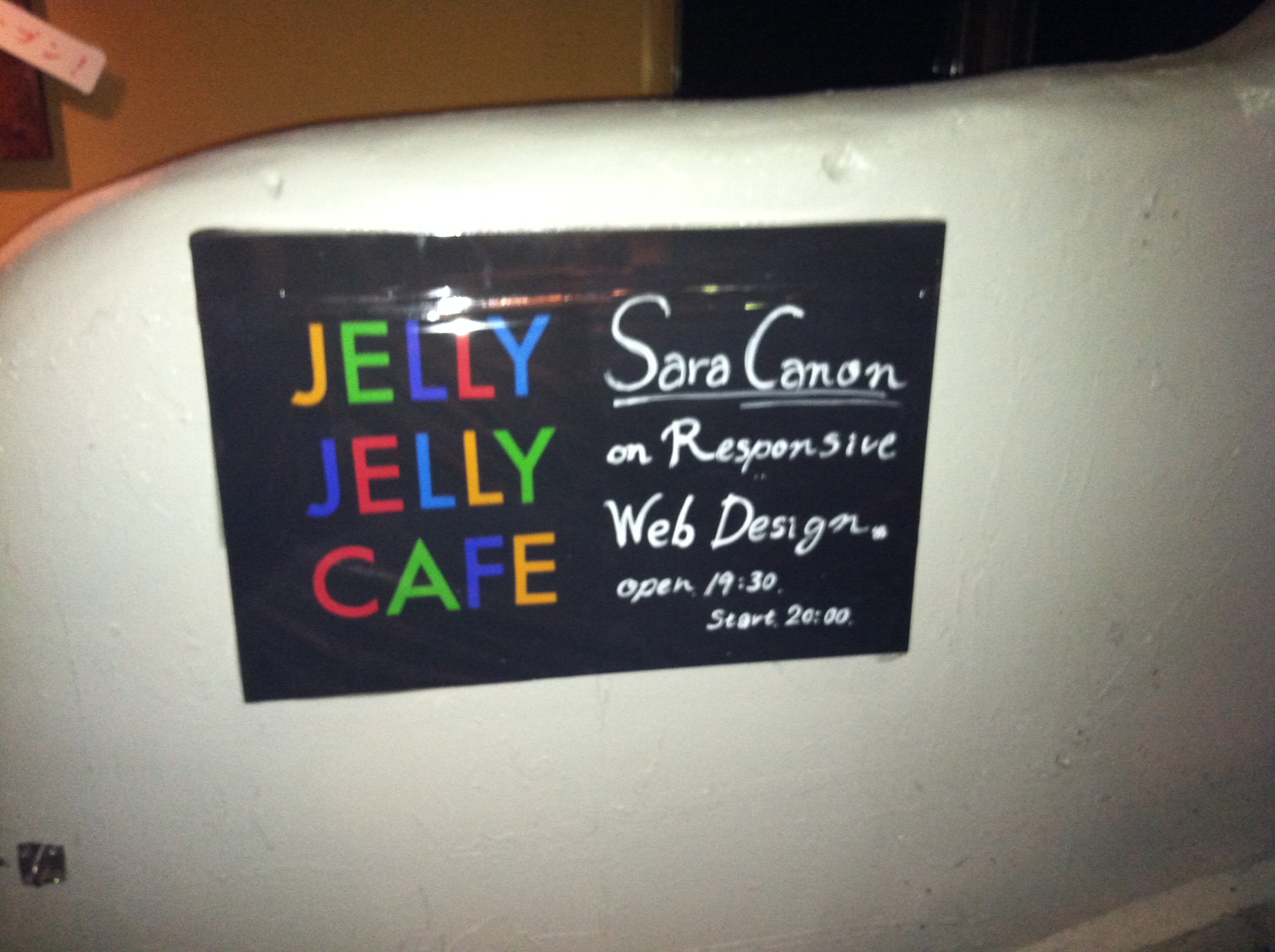
 I can't be more excited about this event! This friday I will be speaking in Tokyo at the coworking space "Jelly Jelly Cafe" in Shibuya. I will be talking about Responsive Web Design and WordPress.
here is the Facebook Event:
http://www.facebook.com/event.php?eid=248644095166353
A brief description/rant:
Q. What can be more exciting than your content being viewed in the very best manner possible?
A. Your content being viewed in the very best manner possible on any device!
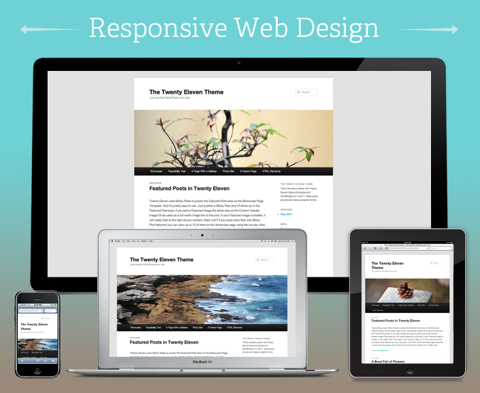
Enter Responsive Web Design. A topic that is very near and dear to my heart. Why? Because it is important. We actually have the ability to make our site closer to perfect on every device. Why wouldn't we?
No matter how you're accessing your content, it should be functional, readable, and consumable. No more device hinderance! No more pinching, squinting, and scrolling when not appropriate. No more trying to drag and swipe and having it not work as expected. We are in control. We can finagle and cry and tweak and cry and get angry until our content is perfect everywhere.

 I have have been given the great opportunity to speak this year at WordCamp San Francisco! I am absolutely thrilled and humbled to be amongst the lineup of speakers at that conference. Let me know if you're going and I'll be sure to say hi! My session will be on "Responsive Web Design" and WordPress. Here's a semi-unofficial blurb about the talk.
Your site is about your content. With mobile devices, iPads, phones, gaming consols, etc: people can access your content many different ways and formats. How can we maintain some control over the display of our content and keep our brand consistent? How can we try to provide the best user experience on any platform?
Enter Responsive Web Design. A term coined by Ethan Marcotte. Many experts aren't leaning on one static design anymore, but on structured content that adapts to its given environment.We are going to take a look at responsive web design techniques out there including: progressive enhancement, flexible grids, media queries, flexible images & video, & other methods that you can implement to make your WordPress theme "Responsive".
Here is a post that I wrote over on the Scout Blog, syndicated over here just in case you didn’t catch it over there.
We have recently launched an exciting new site for Christian & Small Attorneys and Counselors. The law firm came to Scout for not only a new website but for help with branding and positioning — both internally and externally. They are a really capable firm, full of amazing people and have a wonderful focus on the community. If you haven't seen the donation website we made for them yet, make sure you check out the post for the NonstopAdvocates.com site.
Simplicity of Design
Christian & Small has close to 50 attorneys with several different practice areas. We designed a website where communicating their expertise is the focus. We organized everything simply and made information readily available and easy to digest, all while keeping the character and integrity of the brand.
Customized WordPress Content Management System
Because Christian & Small has so many attorneys and so much content, we decided that the best fit for them would be a custom tailored WordPress backend. This set up allows designated C&S staff members, with no coding skills to easily add attorneys, edit practice areas and add photos. This ability to edit and add content internally saves money and over time, reduces the total cost of ownership of the website.
We used custom post types to organize the admin as well as create custom meta boxes for special information. This makes adding content easy.
We also added the ability to connect Attorneys to their respective practice areas dynamically, as well as their associated resources. This bridging of content really makes WordPress a true CMS.
Check out the website for yourself: CSAttorneys.com
2010 has been an incredible year. It had its ups and downs. some parts were really hard and others just joyous! I've met some incredible people this year and got plugged into a great community that surrounds the very platform that this blog (and my livelihood) is based on: WordPress. Its been quite the journey. I've stumbled into great opportunities that led me to go many places and meet many new friends.
(Post on my talk: WordPress and Your Brand)
(I just went to this one: Recap Post1, Post2)
(Post on my talk: Customizing WordPress themes / Child Themes)
(Post on my talk: Beyond the System Font: Advanced Web Typography) Other Post
(Post on my talk: Typography and Your Theme)
In conclusion: 2010 rocked my WordPress world. Thank you to everyone who has mentored me and guided me in the word of WordPress. And, absolute special thanks to those who contribute in any way to the release and improvement of this incredible software. - sara
(post syndicated from a post I wrote at scoutbrand.com)
Christian & Small decided to do something special as a holiday gift to their clients this year. Instead of sending a traditional gift such as wine or a gift basket, they decided to give a gift that's true to their mission of being "Nonstop Advocates" for the community. We designed a card to mail to their clients that contained a unique code. We created a special website, NonstopAdvocates.com, where the code can be entered to direct a gift to one of the three charities. The gift is then made in the client's name. The website features dynamically updating totals to show the real-time impact of the gifts. Clients can check back often at NonstopAdvocates.com to see the progress. This was a very rewarding project for Scout to be involved with. On a technical note: we used WordPress to power the site and PHP/MySQL to power the forms and code validation.

Clients choose what charities Christian & Small will donate to as their gift.

Clients get to read about the charities that they are choosing from and decide to give.

Clients will enter the code that they were mailed in this form.

Thank You Page

Nonstop Advocates also features what different Attorneys at Christian & Small are doing in the community. Keep checking in to read more about what they are doing as time goes on.
From Partizan director Gianluca Fallone
Here is American Software, a short film inspired by the towering giants behind the American software industry. That is, if Steve Jobs was a rebellious punk rectangle, with guitar in tow, taking on King Bill through a rock-off within some parallel counter-realist 8-bit geometric vision of our world.
For more on Gianluca, visit
http://partizanlab.com/partizanlab/commercials/?gianluca_fallone
-
Gianluca Fallone: direction, illustration, animation, grade & post
Music by Ratatat (Sunblocks from LP4)
-
via The Post Family
Well, you can use this trick for just about anything in your CSS really. It just so happens that at a certain small weight, Museo Sans really crunches on Windows XP Firefox. Weather or not we can target specifically XP I'm not sure yet.. (if anyone knows chime in!) But we can target all Firefox's on all Window's Machines. So here is how you do it...
1. Make a css file called ff.css and put this code in there:
[code]
@-moz-document url-prefix(){
#hackery {
font-family: Helvetica, sans-serif;
}
}
[/code]
Now that you've made your little hack document...
2. fill up in between the moz brackets with whatever selectors you are trying to change.
3. call your new ff style sheet in your header.php like so:
[code]
<?php if (strpos($_SERVER['HTTP_USER_AGENT'], "Windows", 0) !== FALSE) { ?>
<link rel="stylesheet" type="text/css" media="all" href="ff.css" />
<?php } ?>
[/code]
voila! Firefox targeted on only windows!
You can now fix your fonts and go from this: (crunchy liberation serif to georgia italic)

to this:

To target Window XP in particular (note that this would not cover versions before that), this should work.
[code]
<?php
if ( false !== stripos( $_SERVER['HTTP_USER_AGENT'], 'Windows NT 5.1' )
|| false !== stripos( $_SERVER['HTTP_USER_AGENT'], 'Windows XP' ) ) :
?>
<link rel="stylesheet" type="text/css" media="all" href="ff.css" />
<?php endif; ?>
[/code]
 Web Typography is coming a long way with the use of @font-face. We are finally able to break out of system fonts and have options! Unfortunately, font-rendering on IE/Windows is still sub-par. The rendering engines have a hard time interpreting fonts properly that are embedded with @font-face that have yet to be re-crafted as a web-font version.
I have been using Typekit to render my web-fonts since the service became available. It is an incredible and takes away a lot of the headache in embedding, keeping up with browser/mobile compatibility, etc. If you haven't tried Typekit out, you can get a free account to see if you like it - then upgrade if you decide you're in love. <3
I've noticed that sometimes the fonts that I've chosen can end up so "crunchy" in IE that I would rather just stack my fonts to the closest system font, and disable Typekit for Internet Explorer.
Here is a way you can Enable it for just Mac: you can query the user agent header with php in a conditional statement that wraps around your Typekit js:
[code]
<?php if (strpos($_SERVER['HTTP_USER_AGENT'], "Mac", 0) !== FALSE) { ?>
<script type="text/javascript" src="yourtypekitlink.js"></script>
<script type="text/javascript">try{Typekit.load();}catch(e){}</script>
<?php } ?>
[/code]
Don't want to exclude Linux? Disable it for Windows Only:
[code]
<?php if (strpos($_SERVER['HTTP_USER_AGENT'], "Windows", 0) === FALSE) { ?>
<script type="text/javascript" src="yourtypekitlink.js"></script>
<script type="text/javascript">try{Typekit.load();}catch(e){}</script>
<?php } ?>
[/code]
Here are examples of type crunch in a title:

LTC Bodoni Type Crunch in IE (eww!)

LTC Bodoni on Mac with Typekit (perfect!)

Typekit disabled on IE / reverts back to font stack
Here are some more examples with a different font:
")
typekit on mac: Ltc Bodoni and Proxima Nova (perfect!)
")
Typekit enabled on Windows (crunchy! Eeek!)
")
typekit disabled on windows (better than the crunch.)
Interested in browser-specific disabling? These methods might be interesting to look into: (but I haven't done it yet)
http://davecardwell.co.uk/javascript/jquery/plugins/jquery-browserdetect/
http://rafael.adm.br/css_browser_selector/
PS: Firefox achieves the same screen-shots as IE. Interesting.
Sara Cannon is a Web Design and Branding Specialist | Helping brands build seamless digital experiences.
She's also an Artist.
Do you have a project she can help you with? Contact Sara at sara@saracannon.com.


