Art Processors
Intro
Art Processors is an Australian-based company with a powerful mix of creative thinkers and mastermind strategists. At their core, they’re an experiential design consultancy. They specialize in creating rich, immersive visitor experiences for museums, such as MONA and the Australian War Memorial.
After publicized success working with multiple partners in Australia, Art Processors set their sights on additional opportunities in North America.
Building Up An Established Brand
To address this new market, as well as fuel success in Australia, the marketing team wanted to refine their message and presentation. They’re an incredible company doing imaginative things and needed an improved way to communicate their scope, expertise, and creative insights to their target market.
A Bold Vision For A New Site
To kick things off, Range sat down with Art Processor’s marketing team for an in-person Discovery session. After asking many questions about the business, strategy, vision, and brand, our team realized they needed a new site that would:
- Communicate who Art Processors is and what they do in a clear, compelling way
- Maintain a beautiful presentation of their jaw-dropping work
- Position Art Processors as a notable industry leader
To effectively do these things, we needed to hone in on three components: copy, design, and site architecture.
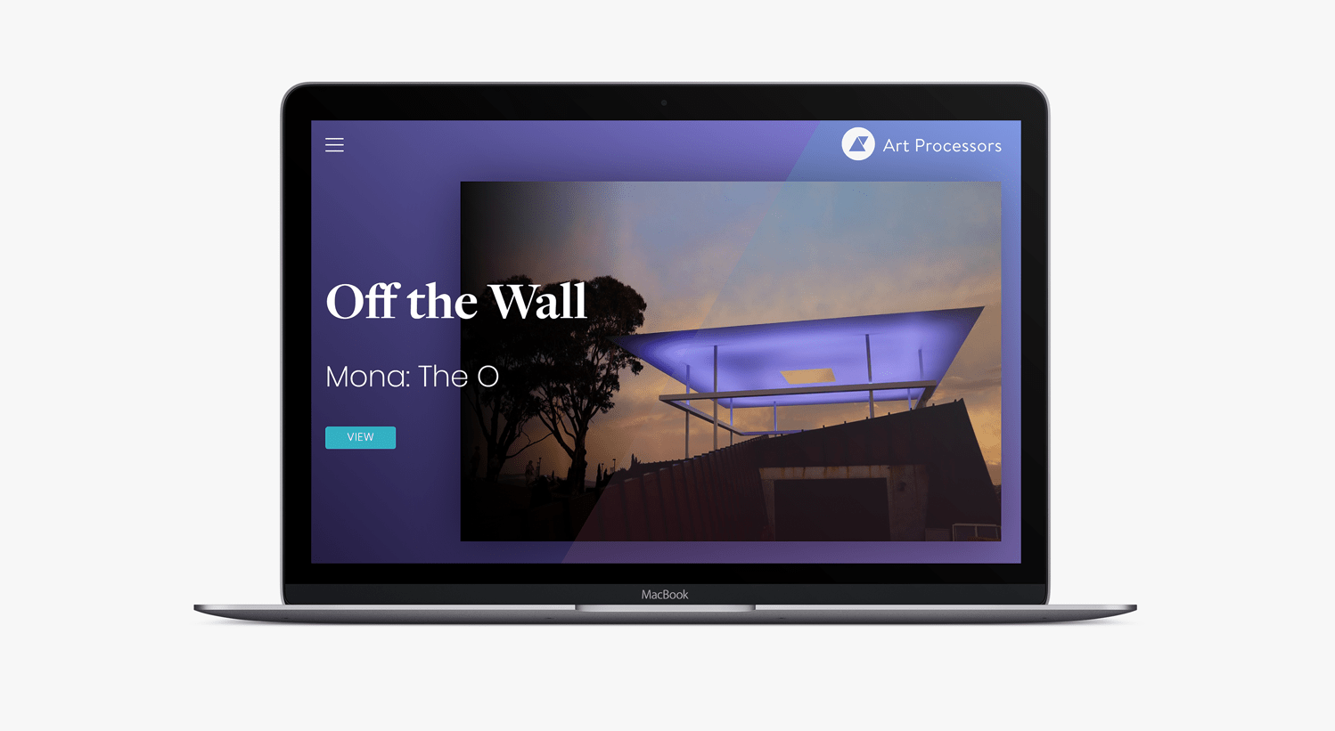
Art Processors Homepage Design Linking to A Featured Project
Refined Core Message
From our in-depth Discovery session, we knew the target audience for the site is short on time and attention. This meant the copy had to be clear, concise, and engaging. Visitors needed to be able to quickly grasp the Art Processor’s brand and work, without much digging.
To craft messaging that would stop folks in their tracks, we partnered with an incredibly talented copywriter, Jordan Sowards. Jordan dove right into the heart of Art Processor’s brand and messaging, refining their pitch and positioning in the process.
Visual Intrigue
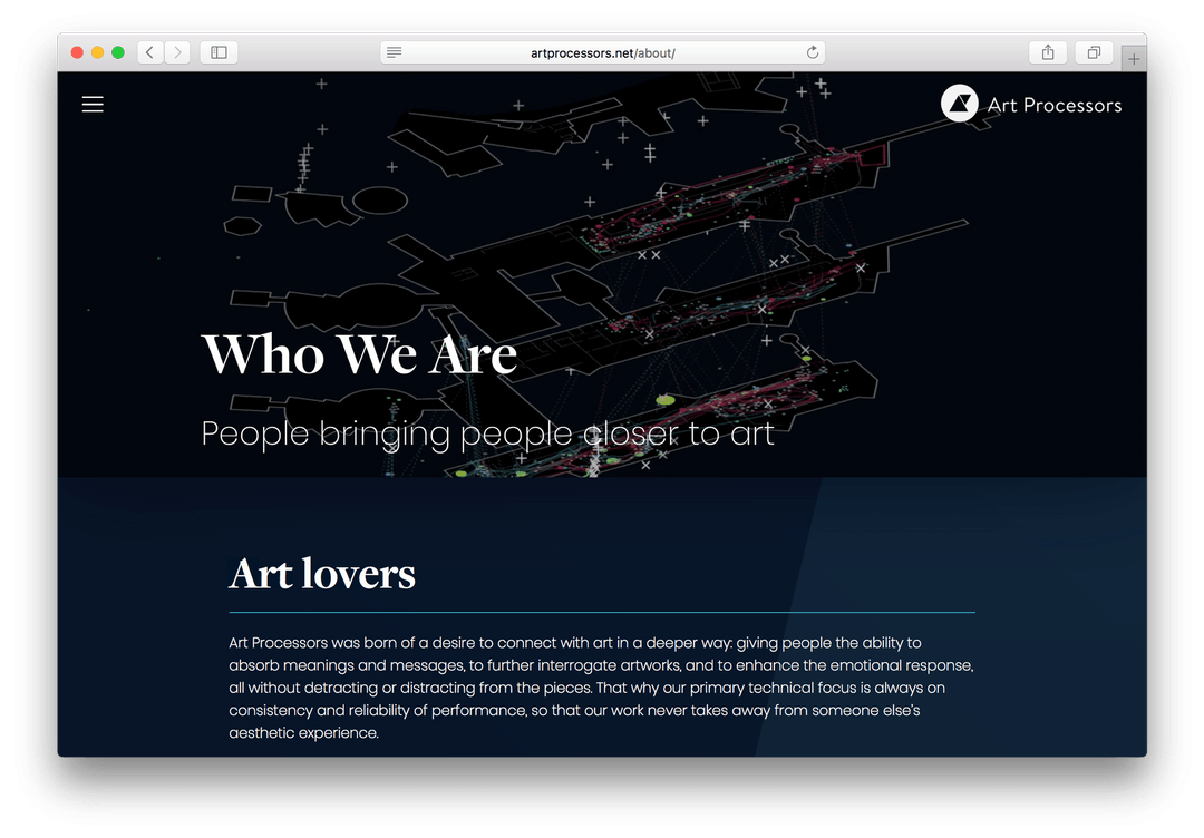
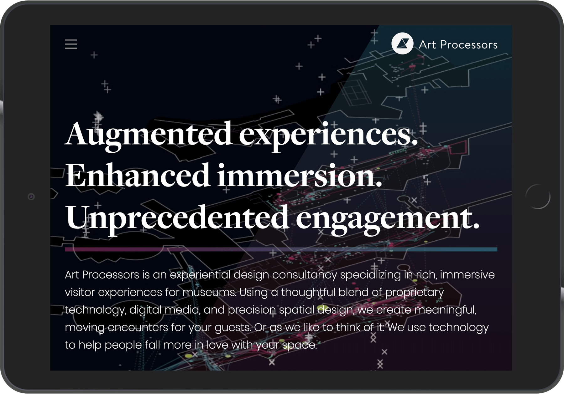
Art Processors is on the cutting edge of their industry. They’re breaking the mold, asking new questions, and crafting work that’s so revolutionary it’s hard to define. In design, we needed visuals that reflect this mastery.
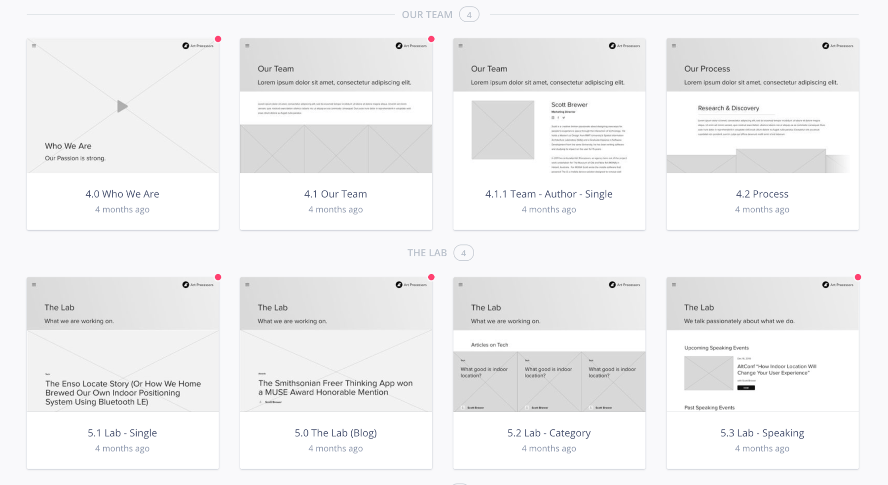
Once wireframes were nailed down, I worked with an existing color scheme to create beautiful layouts that were both strategic and show-stopping. I used subtle gradients, dark settings, and playful overlays to spark intrigue and hook viewers.
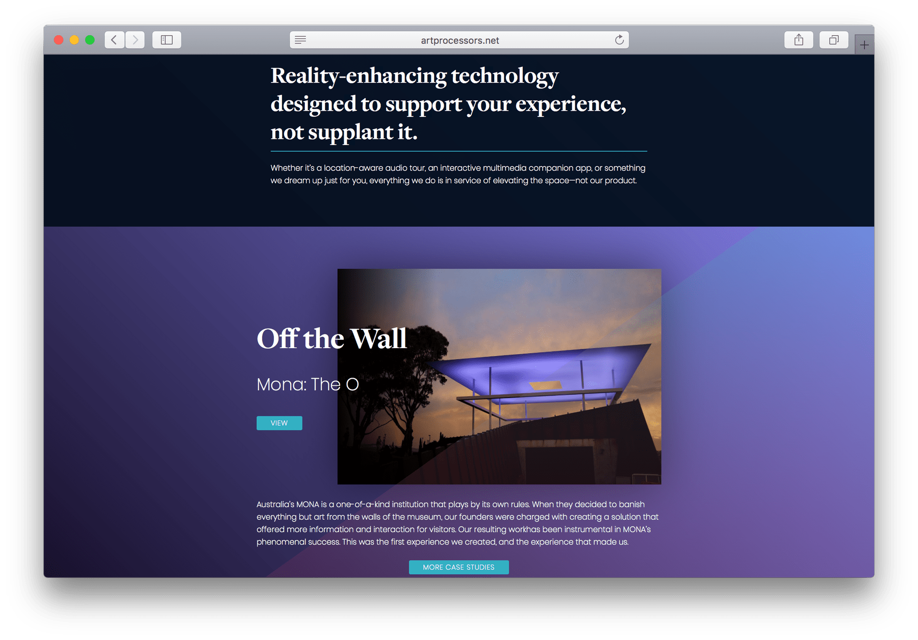
One of my favorite visual elements wound up being a gif produced by Stamen, a data visualization and map design studio. It shows off how Art Processors implemented technology to provide location-based content for one of their clients.
Sleek Site Design
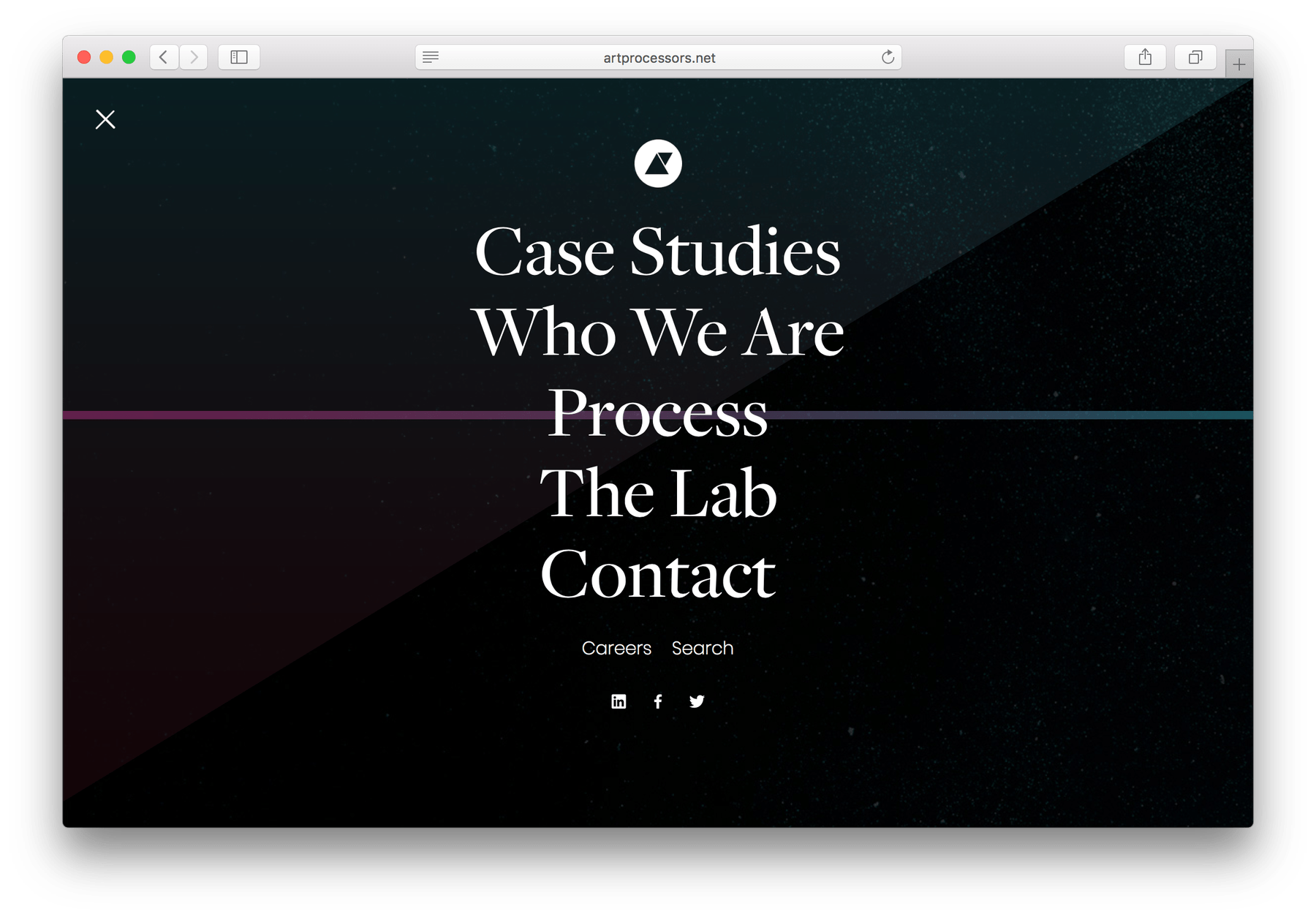
On the frontend, the site needed to be easy to navigate for the busy target audience. If visitors had to dig for information, they weren’t going to see it. We created a bold, but slim, main navigation with exactly the information partners would need to know:
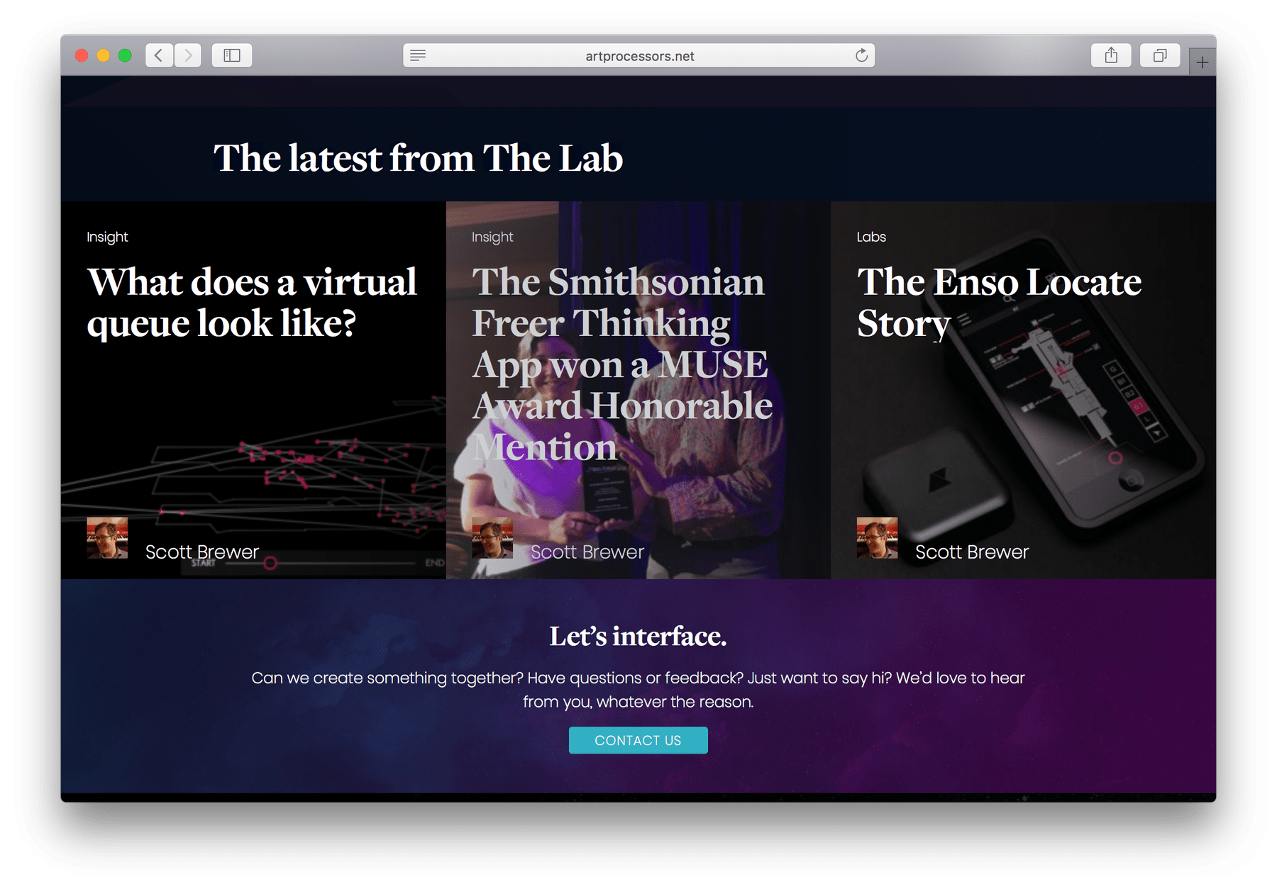
Throughout the site, we surfaced the most important information and prompts in embedded CTAs. And custom fields in the admin mean that all text on the site is editable.
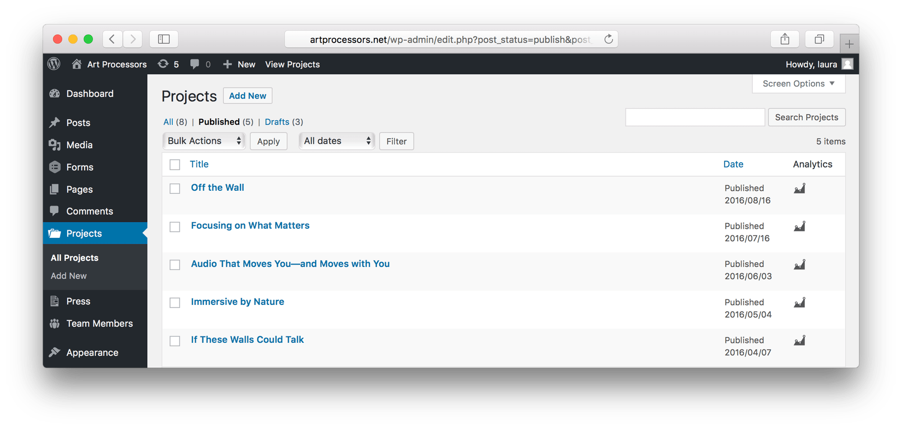
On the backend, we created custom post types like case studies, team, and press. These allow site admins to easily update, swap, and add new content as their business and target audience grows. Other parts of the site, such as the blog CTAs, automatically surface information, so admins spend very little time on maintenance and upkeep.
The result is a site that Art Processors is proud to share. It’s a tool that clarifies who this extraordinary company is and positions them exactly where they belong—at the forefront of their cutting-edge industry.
More of Sara Cannon's Work

OccupiProduct Design
RegenerosityWeb Design
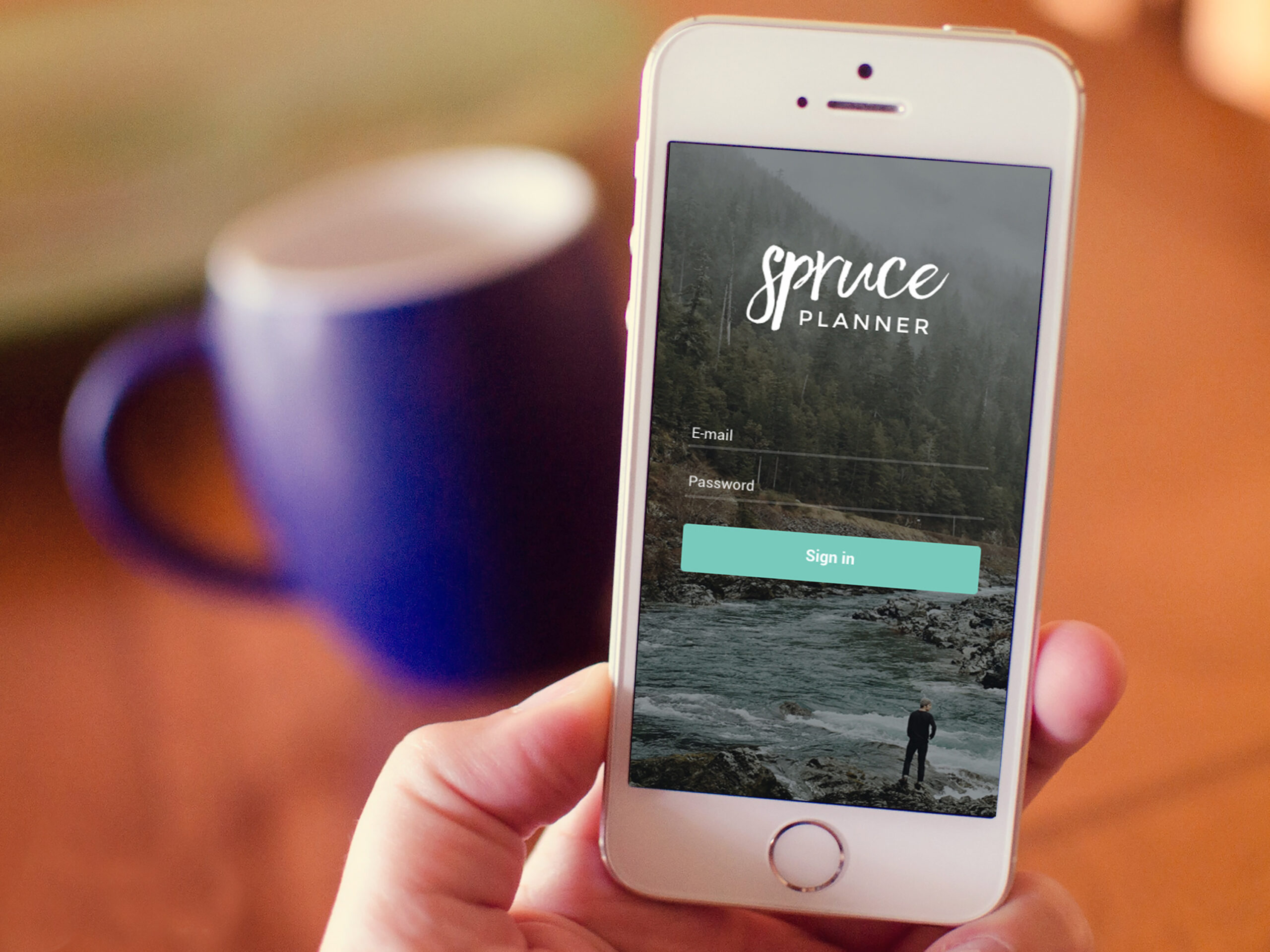
Spruce PlannerApp Design

KwickLetterApp Design

PorteriOS Design

Select BrandingBranding
BrodoAccessibility Color Audit

CUNY Academic CommonsSite Redesign and UX

ConservSAAS Product Design

Rooted In RightsWeb Design

LifeTutors - Branding and Web DesignBranding and Web Design
BorteaWeb Design
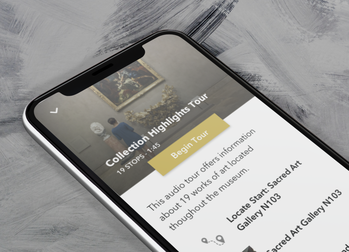
Museum Audio GuideApp Design
Art ProcessorsWeb Design

Underdog RescueBranding

WeRateDogsECommerce

SmART GuideWeb Design

DhriftBranding & Web Design
Tressie McMillan CottomWeb Design
Birmingham Museum of Art - Site DesignWeb Design

The Ulterior EpicureWeb Design

High Growth HandbookWeb Design

Rick RiordanWeb Design

ChalkbeatWeb Design

InsideClimate NewsWeb Design

California Law ReviewWeb Design
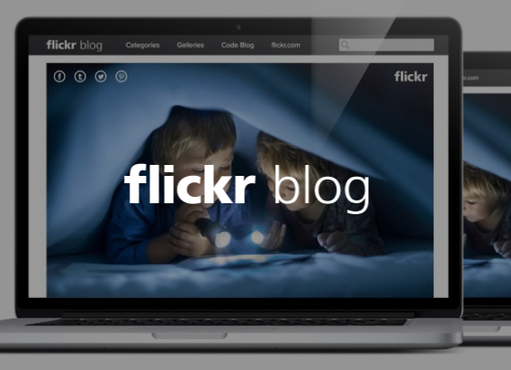
Flickr BlogWeb Design
Sara Cannon is a Web Design and Branding Specialist | Helping brands build seamless digital experiences.
She's also an Artist.
Do you have a project she can help you with? Contact Sara at sara@saracannon.com.
