App Design
Museum Audio Guide
The client sought to replace their outdated audio guide for two museums with a solution focused on enhancing user experience. The new system needed to allow visitors to easily access random stop numbers and navigate through a large facility on a guided tour. My role was to design an intuitive interface that made the audio guide more user-friendly, ensuring seamless navigation and improved accessibility for a wide range of museum-goers.
Research
We walked the facility and took the main collection tour, noting any pain points in navigation. The facility doesn't have robust way-finding signage, producing a particular challenge. We conducted in-person UX workshops, mapping the user experience from when a user arrives, the different paths they can go down based upon wants, and outcomes. We made a list of pain points on the different journey maps.
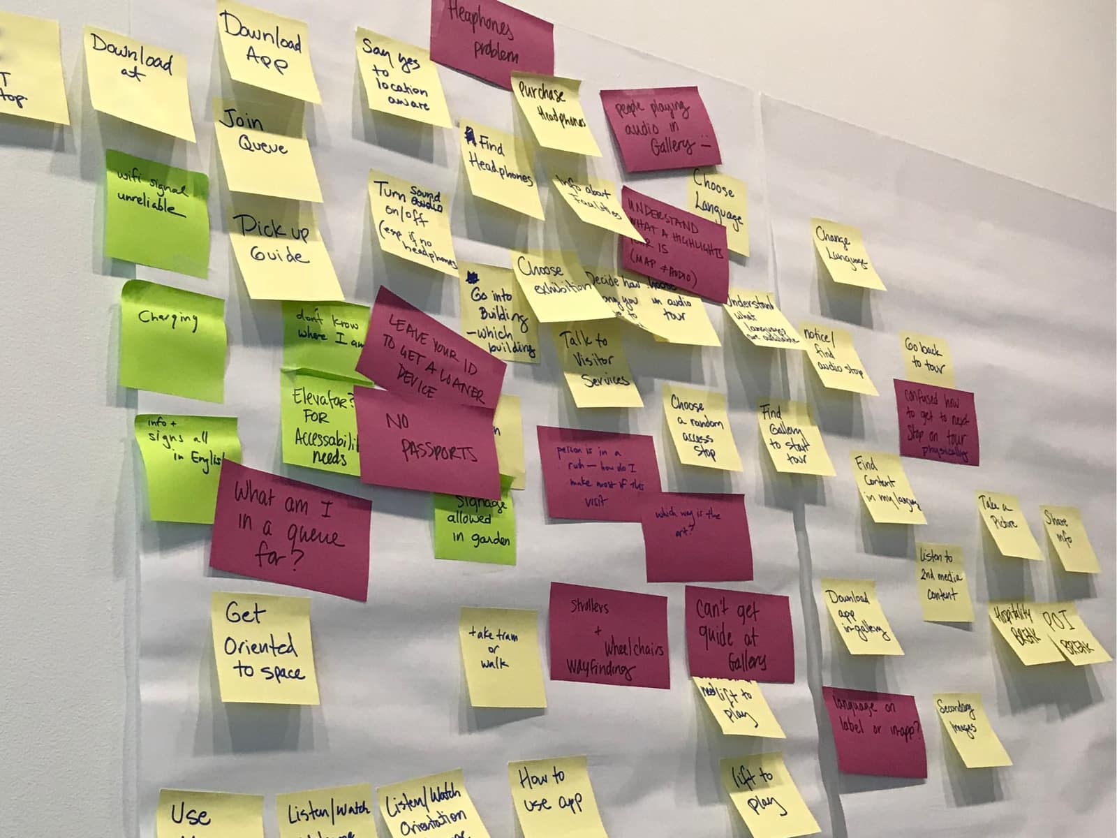
The user journey with known pain points
Where app usage enters the journey
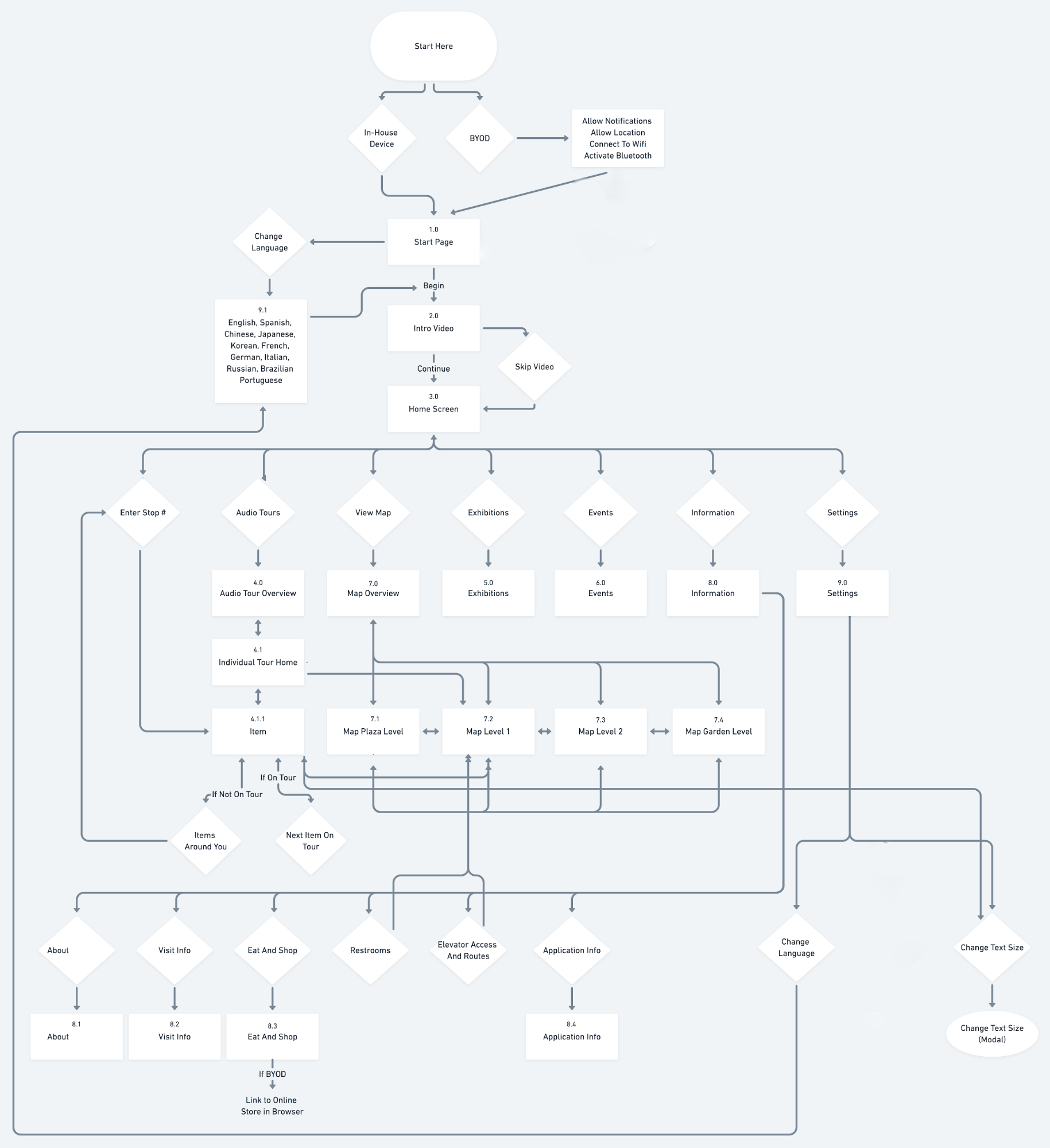
User Flow
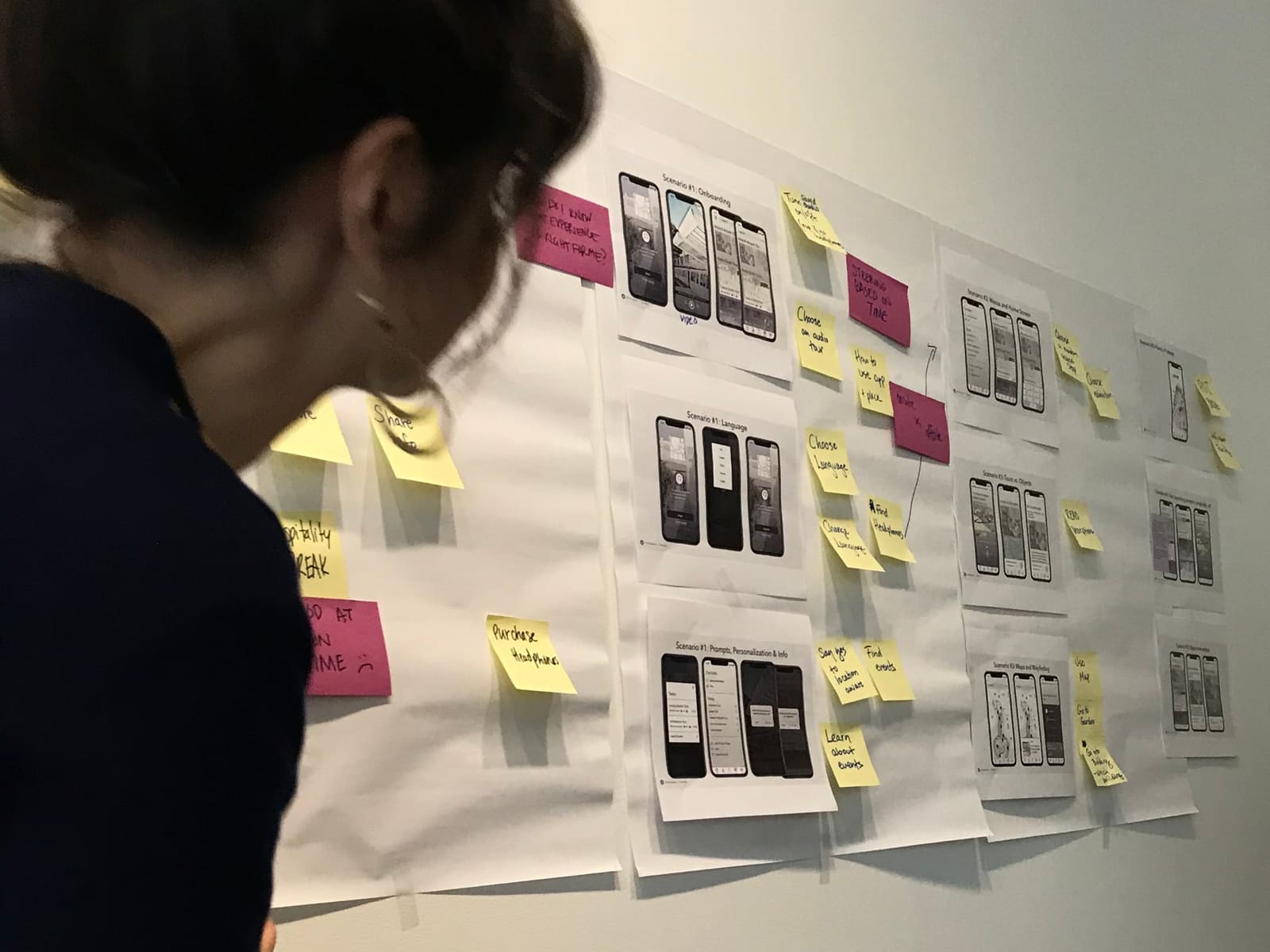
Taking in all the requirements, and our proposed navigation, I created user flows for the application.
Wireframes
Combining our user research, journey mapping, and product requirements, I put together some robust initial wireframes for the project in combination with a UX Plan document that included User Stories.
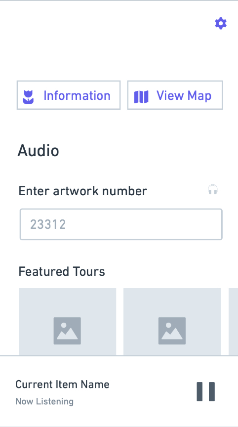
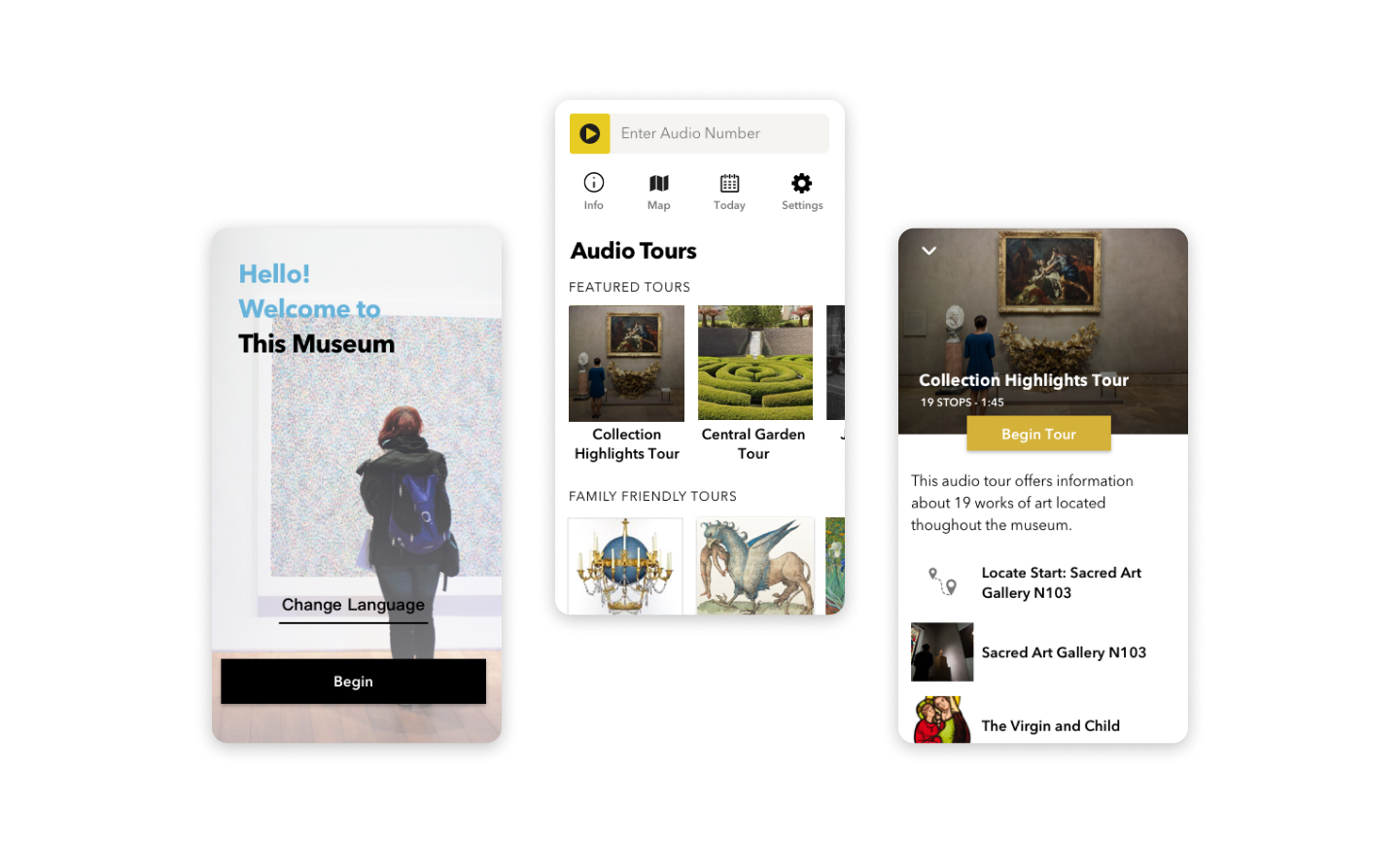
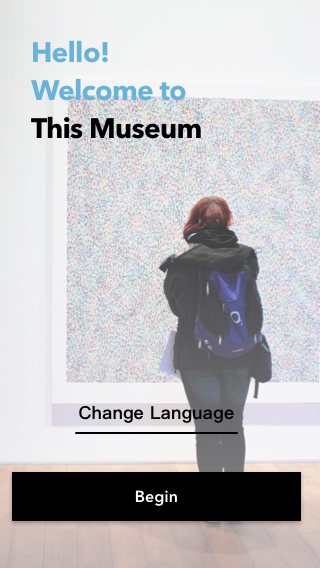
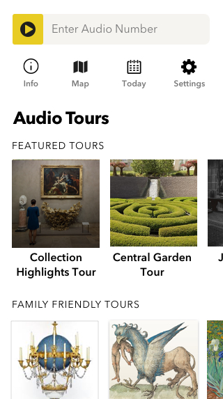
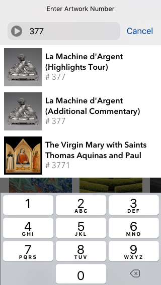
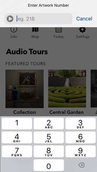
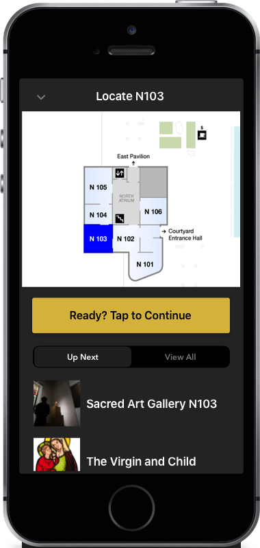
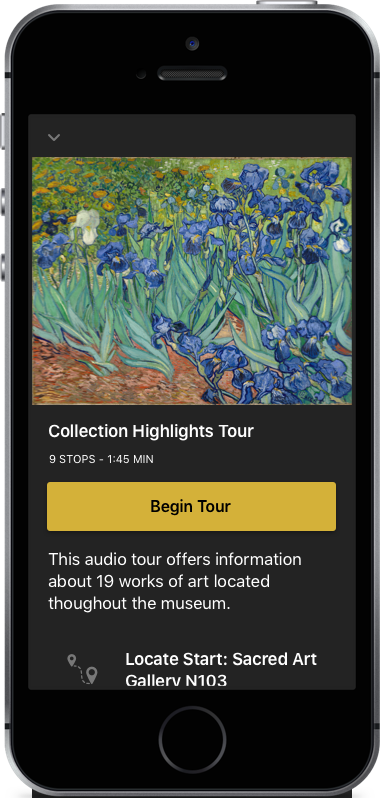
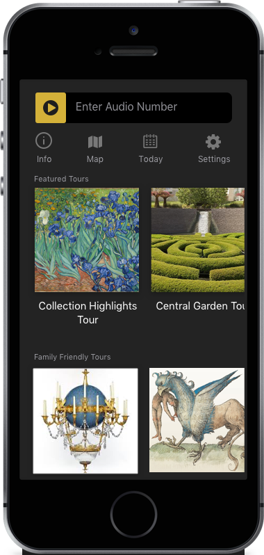
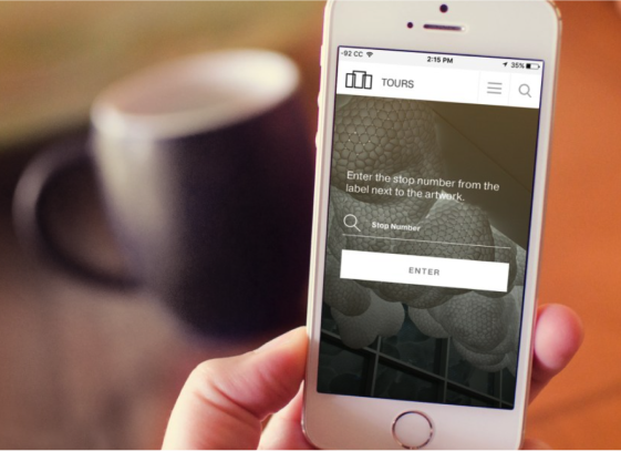
Homescreen: where you can choose a tour or enter a artwork number
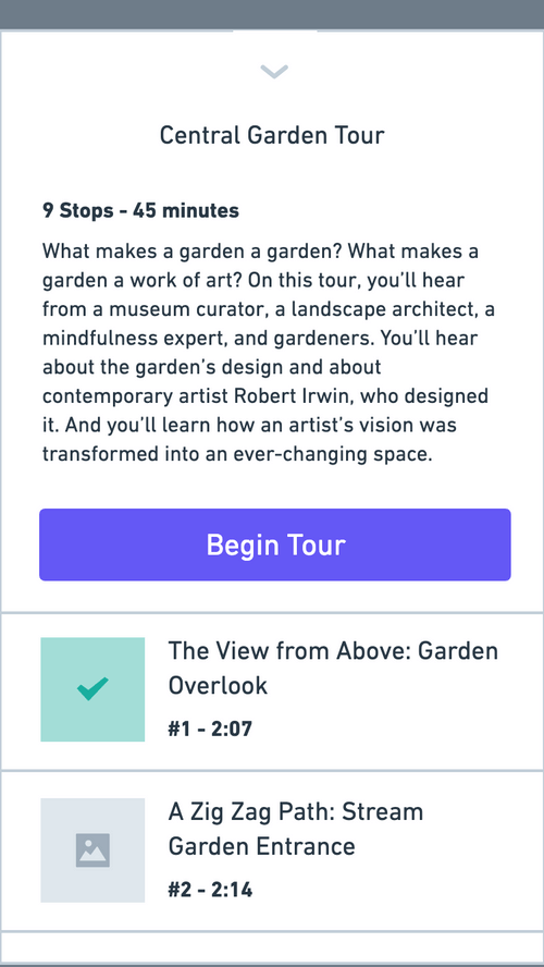
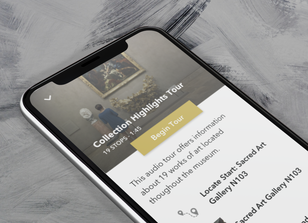
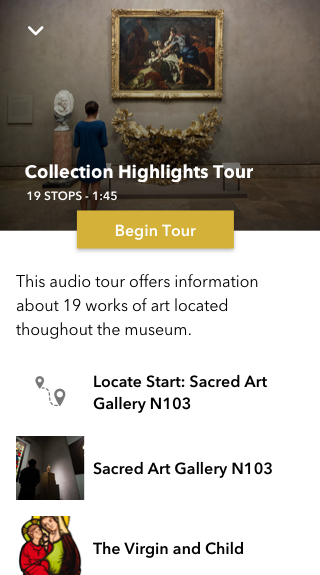
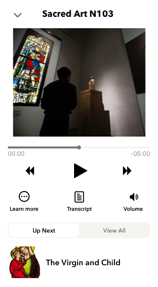
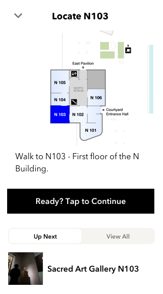
Tour Screen
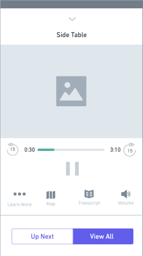
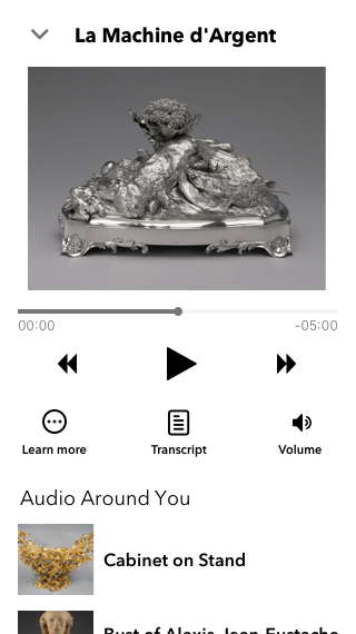
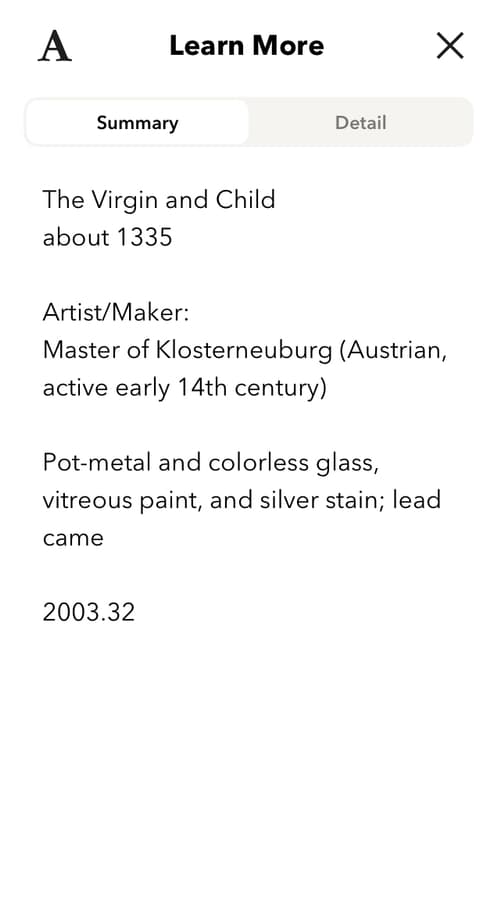
Image Screen
User Testing
After the initial wireframes and UX plan was presented to the client, in-person User Experience testing was performed with a wireframe prototype that I put together in Invision. We summarized our findings to the client and decided to make adjustments to the wireframes based upon our findings. For instance, "Eat and Shop" was initially combined together - but we found that users would prefer it to be separate. (If you're looking for a food break, you aren't necessarily looking to shop even though both are considered "Points of Interest"
Designs
Taking in all the feedback from the client and testing, I did a round of designs for the application.
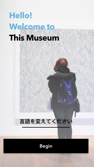
Dark Mode
To show the client a second design option, I created a fed dark mode screens.
More of Sara Cannon's Work
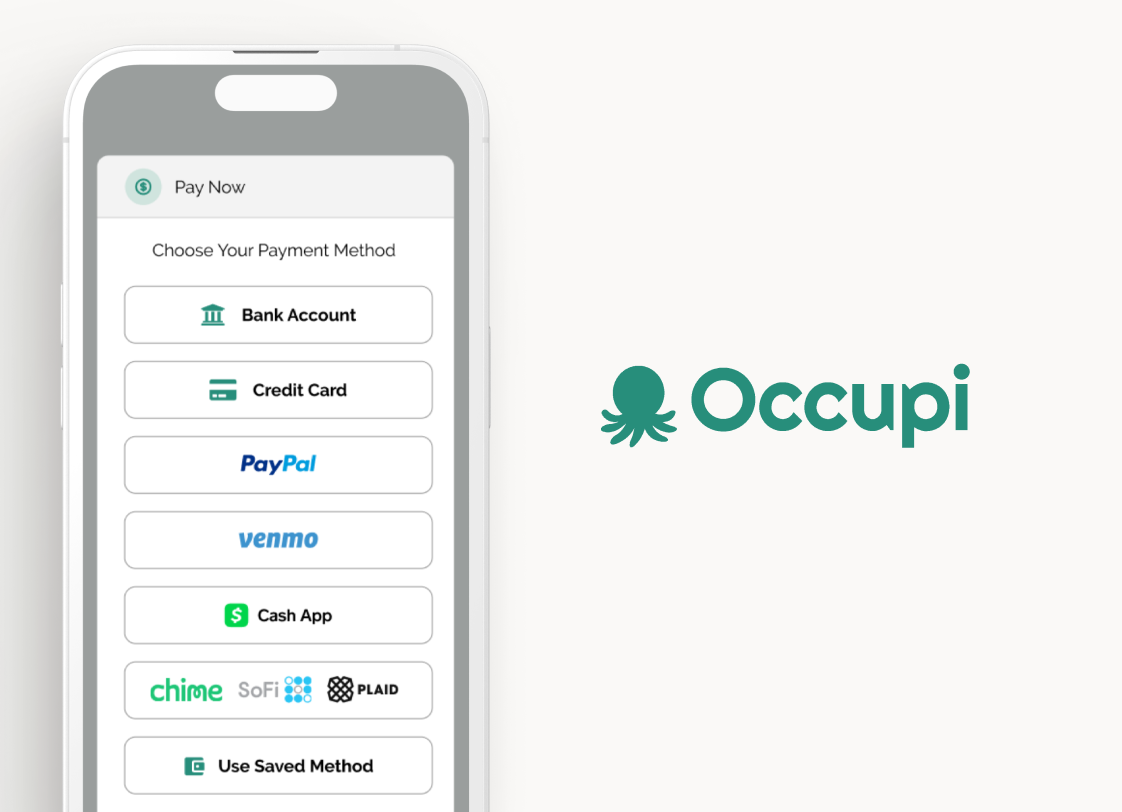
OccupiProduct Design
RegenerosityWeb Design
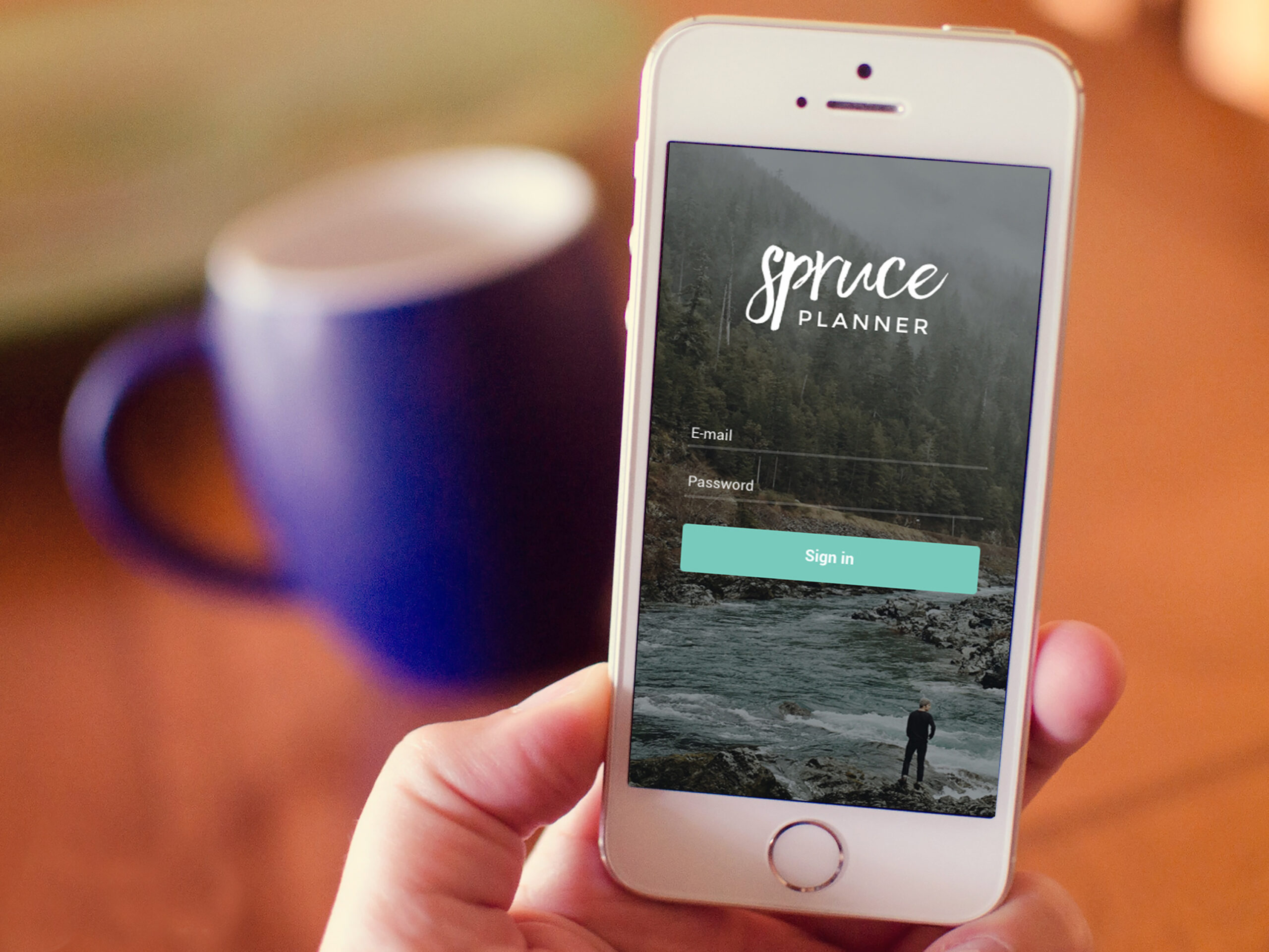
Spruce PlannerApp Design

KwickLetterApp Design
PorteriOS Design
Select BrandingBranding
BrodoAccessibility Color Audit
CUNY Academic CommonsSite Redesign and UX
ConservSAAS Product Design
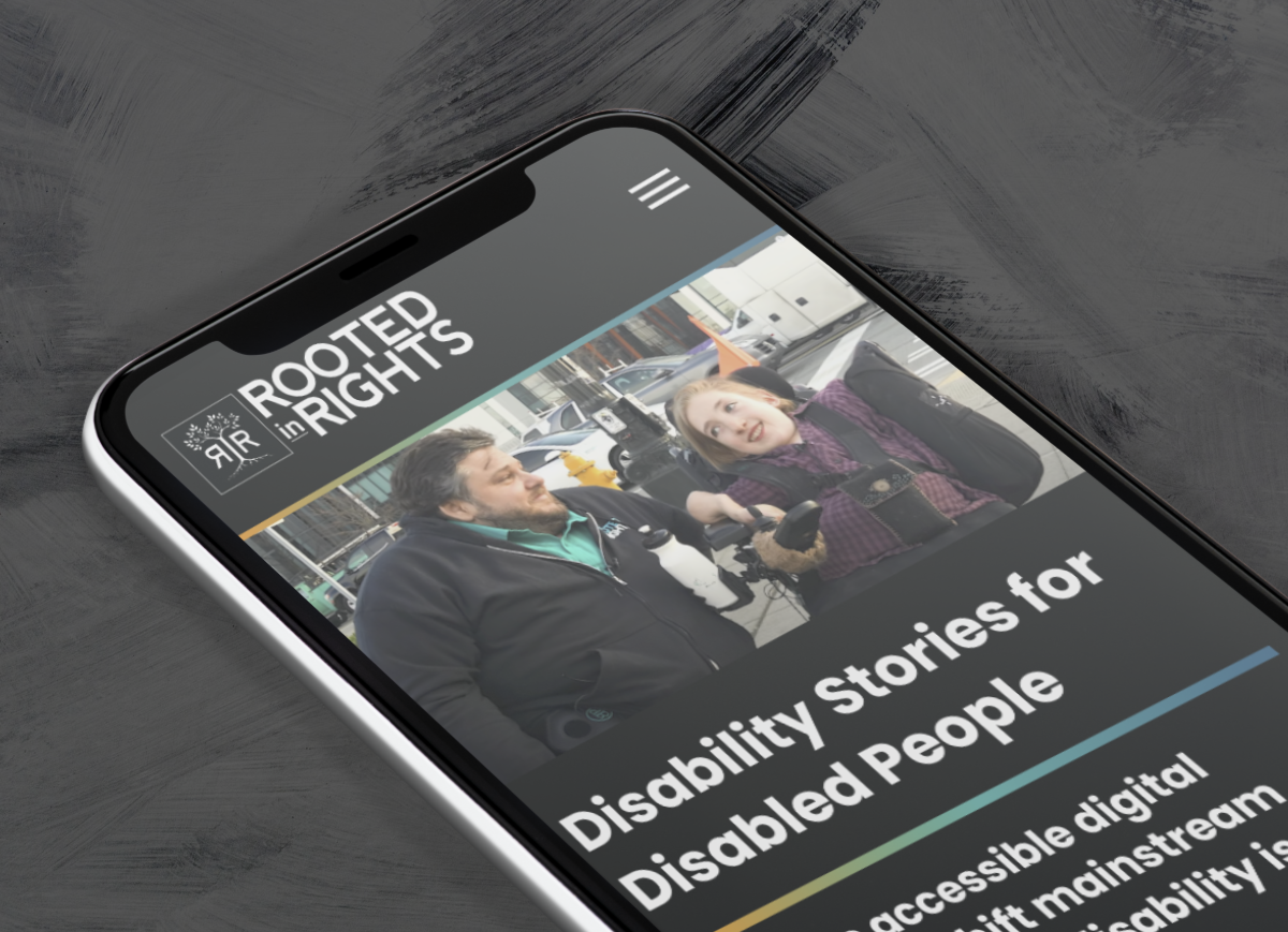
Rooted In RightsWeb Design

LifeTutors - Branding and Web DesignBranding and Web Design
BorteaWeb Design
Museum Audio GuideApp Design

Art ProcessorsWeb Design

Underdog RescueBranding

WeRateDogsECommerce
SmART GuideWeb Design
DhriftBranding & Web Design
Tressie McMillan CottomWeb Design
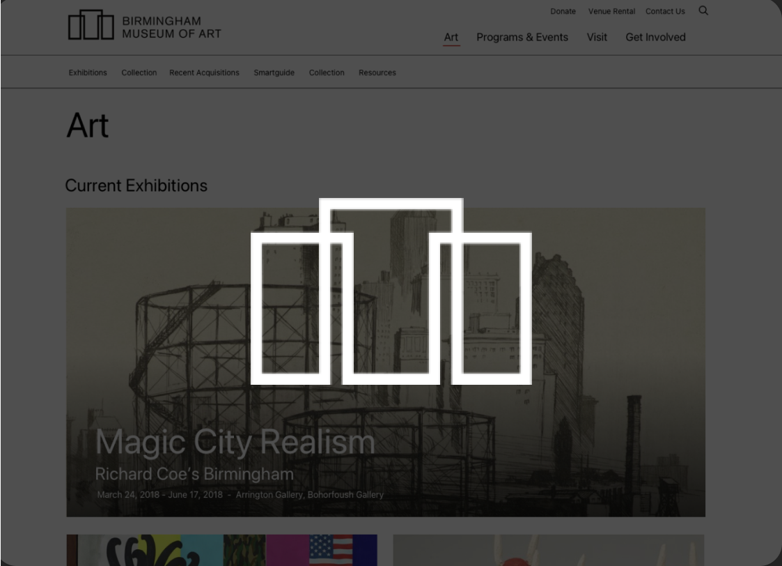
Birmingham Museum of Art - Site DesignWeb Design

The Ulterior EpicureWeb Design
High Growth HandbookWeb Design

Rick RiordanWeb Design
ChalkbeatWeb Design

InsideClimate NewsWeb Design

California Law ReviewWeb Design
Flickr BlogWeb Design
Sara Cannon is a Web Design and Branding Specialist | Helping brands build seamless digital experiences.
She's also an Artist.
Do you have a project she can help you with? Contact Sara at sara@saracannon.com.