Accessibility Color Audit
Brodo
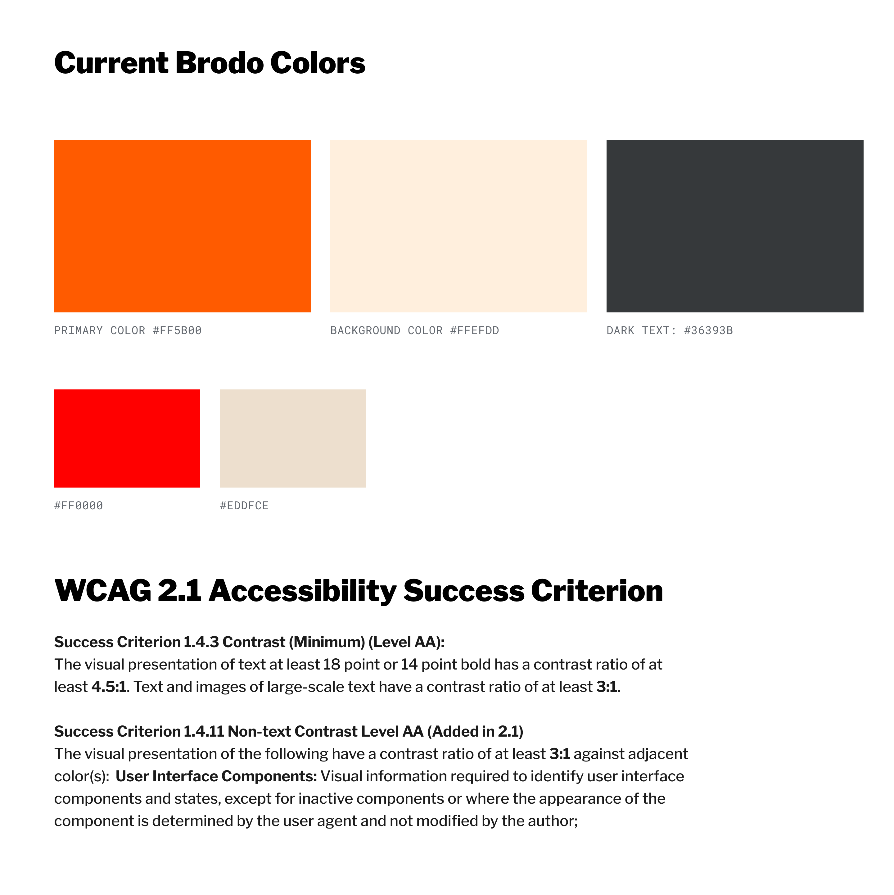
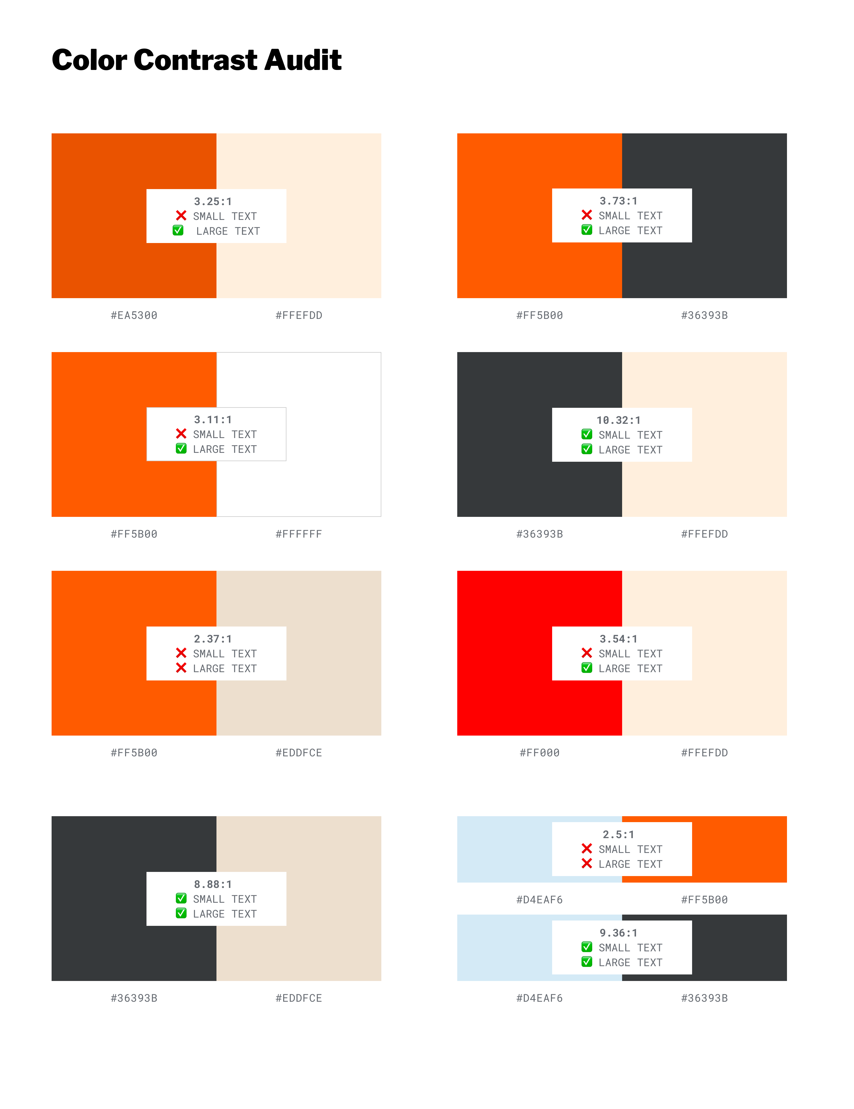
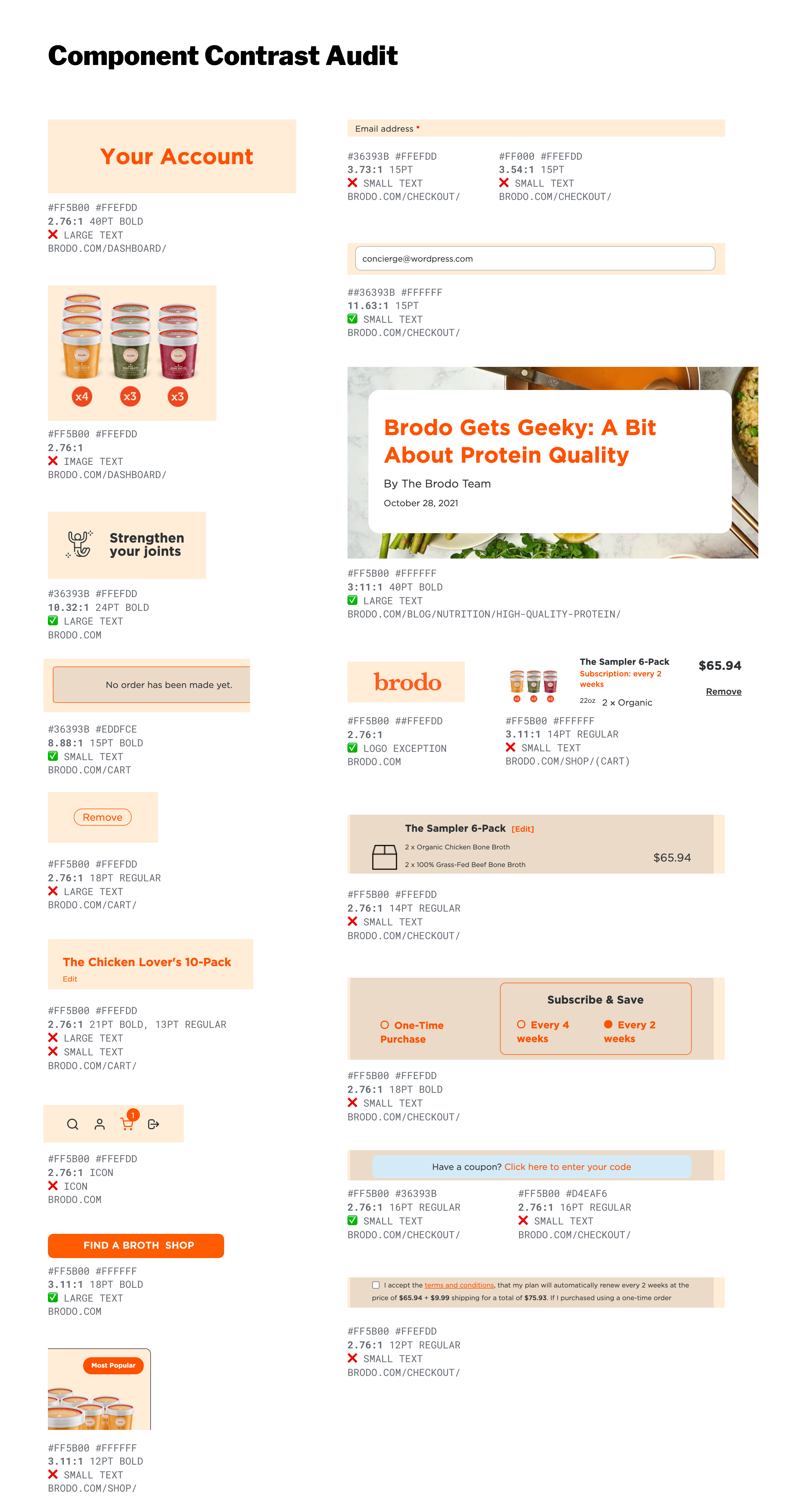
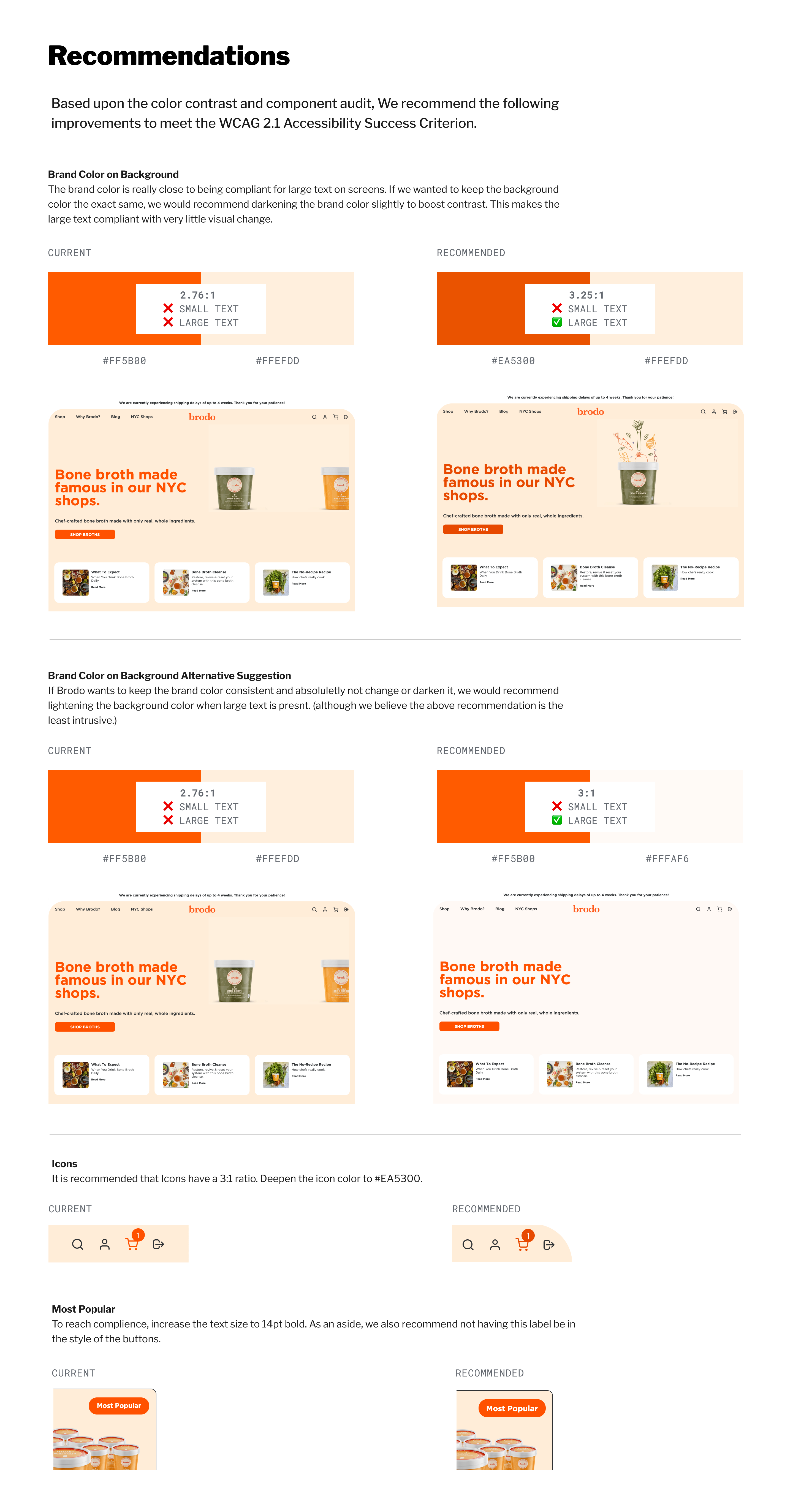
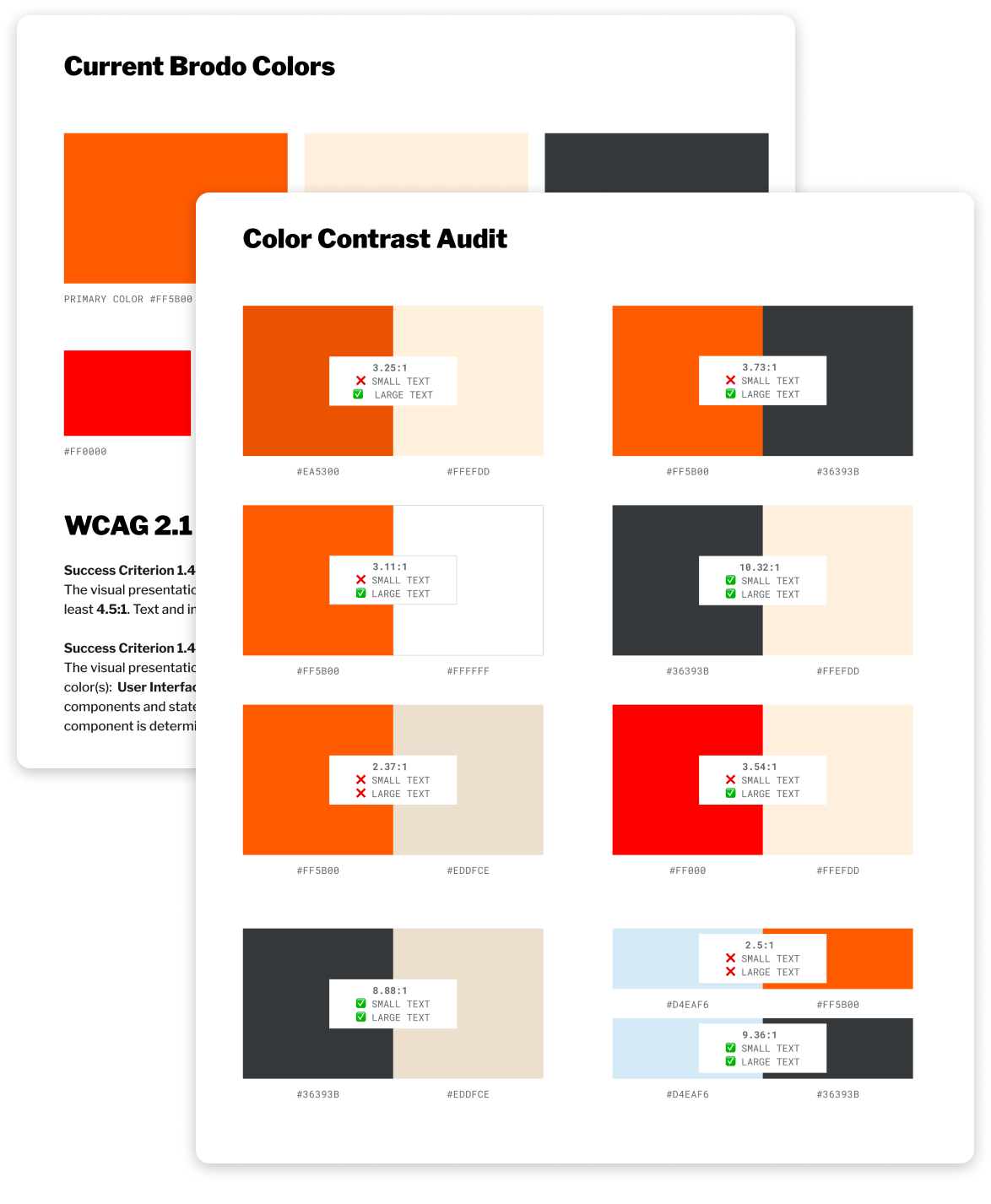
While working with Automattic's Special Projects, I conducted a comprehensive accessibility audit of Brodo’s website, focusing specifically on color and contrast. This process involved analyzing the site's color palette against WCAG 2.1 Accessibility Success Criteria to identify areas where improvements were needed.
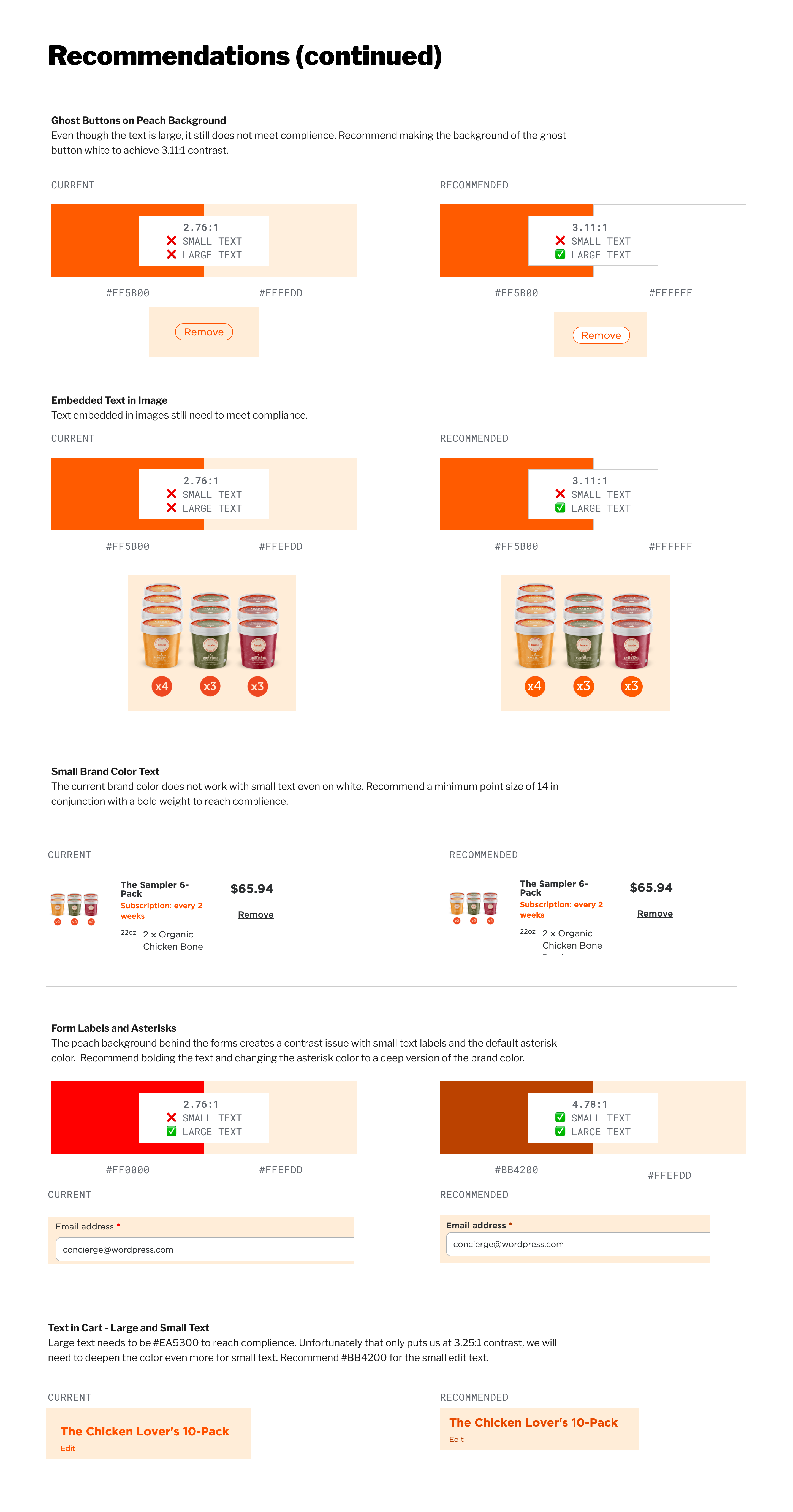
By addressing color contrast issues, I provided Brodo with actionable recommendations and options for updating their site’s design. This not only ensured compliance with accessibility standards but also enhanced the overall user experience, making the website more inclusive and welcoming for all visitors.
Skills & Tools Used:
- Web Accessibility (WCAG, ADA Compliance)
- Figma
- Project Management
More of Sara Cannon's Work
OccupiProduct Design
RegenerosityWeb Design
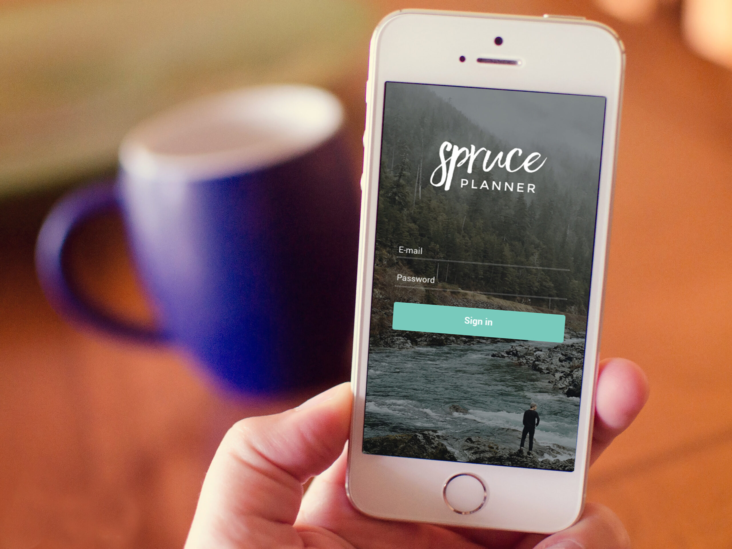
Spruce PlannerApp Design

KwickLetterApp Design

PorteriOS Design
Select BrandingBranding
BrodoAccessibility Color Audit

CUNY Academic CommonsSite Redesign and UX
ConservSAAS Product Design
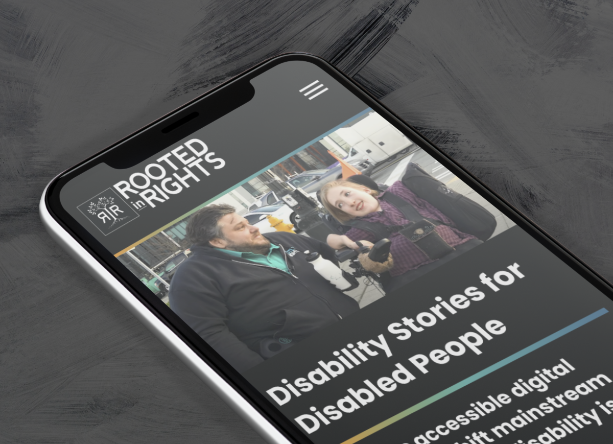
Rooted In RightsWeb Design

LifeTutors - Branding and Web DesignBranding and Web Design
BorteaWeb Design
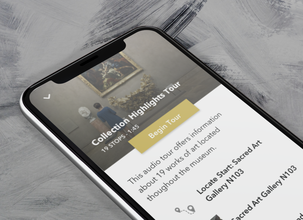
Museum Audio GuideApp Design

Art ProcessorsWeb Design

Underdog RescueBranding

WeRateDogsECommerce
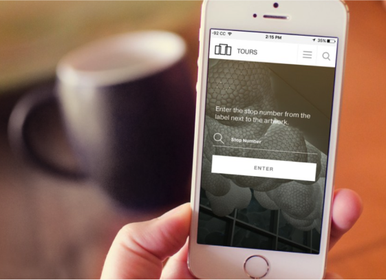
SmART GuideWeb Design

DhriftBranding & Web Design
Tressie McMillan CottomWeb Design
Birmingham Museum of Art - Site DesignWeb Design

The Ulterior EpicureWeb Design

High Growth HandbookWeb Design

Rick RiordanWeb Design

ChalkbeatWeb Design

InsideClimate NewsWeb Design

California Law ReviewWeb Design
Flickr BlogWeb Design
Sara Cannon is a Web Design and Branding Specialist | Helping brands build seamless digital experiences.
She's also an Artist.
Do you have a project she can help you with? Contact Sara at sara@saracannon.com.
