App Design
SmART Guide - Birmingham Museum of Art
Sara, with support from her old agency, Range, partnered with BMA’s team as their digital development arm to design and develop their smART Guide app.
Background
The Birmingham Museum of Art (BMA) houses a diverse collection of more than 26,000 paintings, sculptures, prints, drawings, and decorative arts dating from ancient to modern times. Their mission is to provide an unparalleled cultural and educational experience to a diverse community by collecting, presenting, interpreting, and preserving works of art of the highest quality.
SmART Guide
Coinciding with BMA’s contemporary collection exhibition opening (Third Space) we designed and developed a Smart Guide that users can leverage to learn more about artworks on display.
The Vision
When it came time to replace their previous guide, BMA let us know they needed to create a helpful, but not necessarily linear, way for visitors to tour collections of artwork.
Their vision for the guide, based on internal goals and discussions, included the following:
- A mobile-first way to browse the museum’s collections, while in the museum
- Ability for admins to manage the tour from one (existing) WordPress install
- Integration with BMA’s online collection and associated meta data (leverage existing data)
- Ability to seamlessly present rich media and audio to visitors
- User-friendly links to external, related content
- Flexibility for users to bounce between pieces of art at random
- Flexibility for site admins to frequently update content
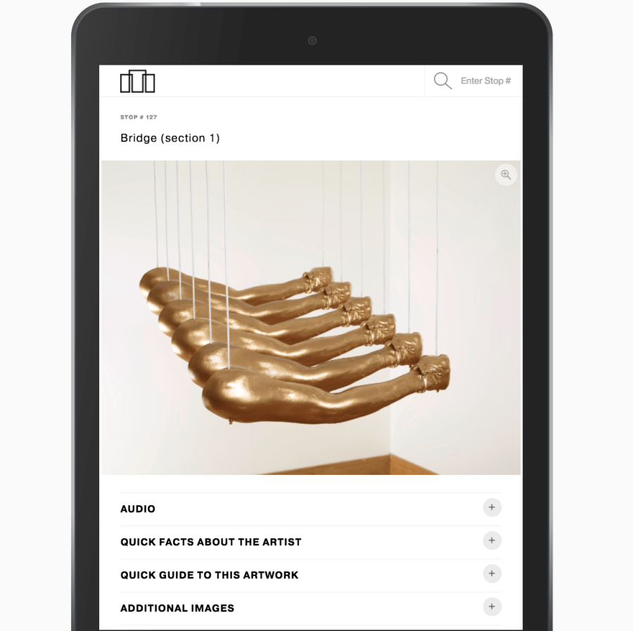
As we discussed these elements in detail with BMA, we realized that they envisioned an “app-like” experience for their visitors, and this really excited us. Our gameplan became
- meeting every element of their vision in-browser
- via an app-like interface.
To kick things off, we buckled down on some mobile mockups (based on the recently revamped site and existing brand standards) and identified a design for the interface.
We shared these designs with BMA via Invision (where they could easily view and comment on design files) and then incorporated their excellent advice into a round of revisions.
After a few iterations, we nailed down a firm design direction and turned toward development.
The Framework: React + WordPress REST API
In choosing between several framework options, we knew our setup needed to:
- Pull data from the existing WordPress install
- Manage large audio files
- Handle and display many images
- Provide an app-like interface
The first and last bullet points in particular led us to choose React and the WordPress REST API for the job. Why these two? The WordPress REST API let us give BMA the same admin and content-management experience they’re familiar with, while React allowed us to spin up the super sleek user interface BMA envisioned.
On a more technical level, all stops for the guide are stored in WordPress as custom post types. The guide itself is a React app that fetches these stops through the WordPress REST API.
Note: React is a JavaScript library that’s really handy for building user interfaces. The WordPress REST API (application program interface) allows developers to more-or-less separate the WordPress backend from the WordPress frontend. The API in particular is what allows us to use both WordPress and React in this project.
Attention to Details
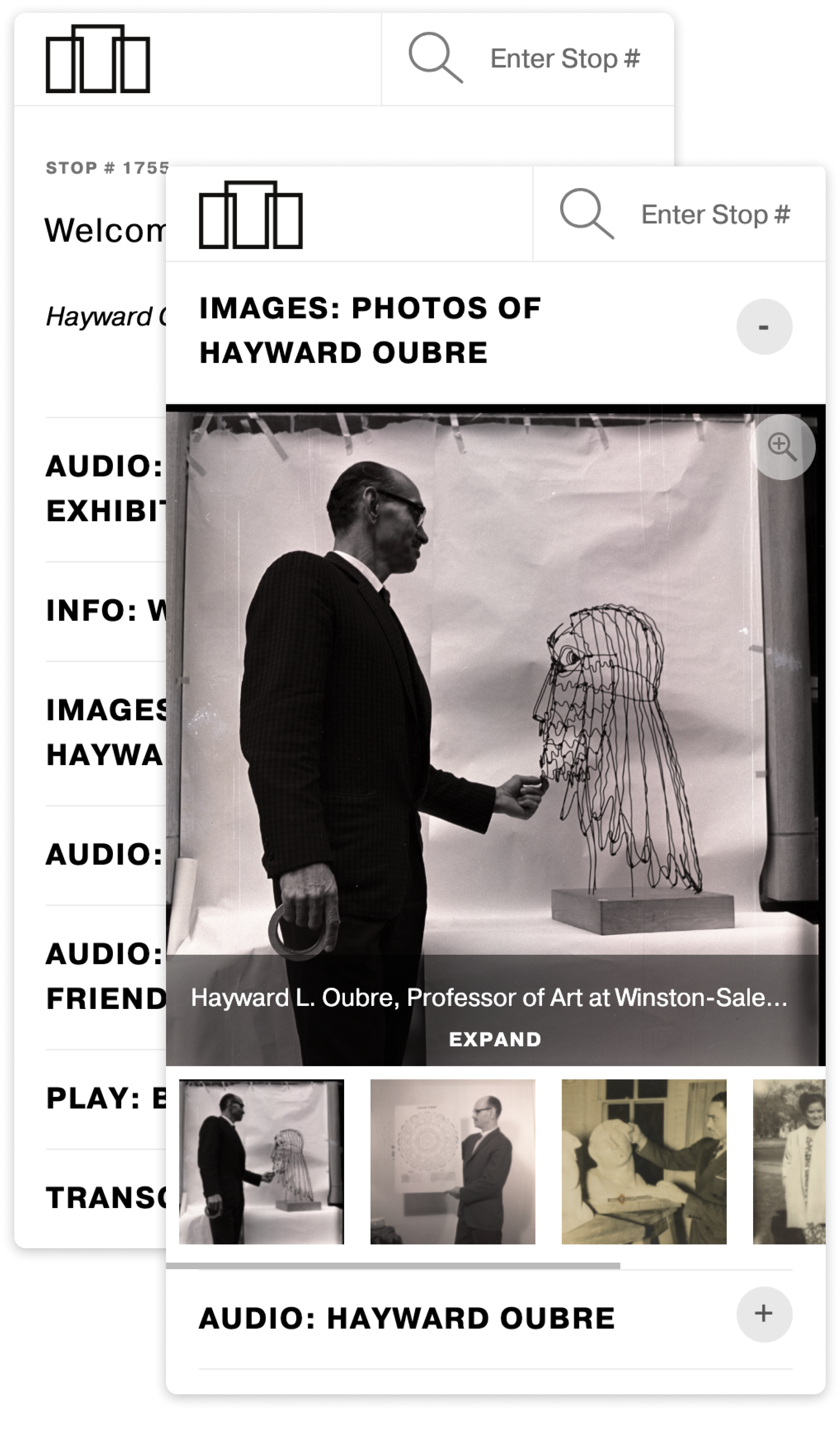
While the overall setup is pretty cool and a testament to how flexible WordPress is, we also paid a good bit of attention to the finer details that helped define both the user and admin experience of the guide.
Upfront Loading
When a visitor navigates to the guide, the longest pause they should ever experience is their first second or so (don’t worry, there’s a nice background and a custom loading state). This is because we load all stops upfront so there’s very little delay when users open other stops along their tour.
Custom Loading State
Upfront loading definitely called for a unique loading state. We knew we wanted to use something other than a standard spinner, but that “something” also needed to be on-brand and match existing styles and colors. After talking through a few animation ideas, we decided to animate a svg of their logo, via CSS, for the loading state.
Content Syncing
To make use of the data already available on the BMA website, the guide automatically imports a default set of fields for each piece of art. For example, if a BMA admin selects “Work A” to add to the guide then images of Work A plus the artist’s name, title, medium, date and credit line associated with Work A are all automatically added to the guide as well. This minimizes the amount of effort it takes admins to create a new stop.
Pinch Zoom
For visitors who value details, we added zoom functionality and an icon denoting zoom functionality to all images. Tapping the icon pulls up the image up in a modal, where users can then pinch the image for zoom capabilities.
Analytics
To help the museum understand how users explore the guide, our development team added Google Analytics event tracking to most specific interactions. This means that user interactions with the guide, like viewing a stop, opening a modal and listening to an audio piece, are all recorded as an event (as a specific action the user took). We also paid particular attention to the museum’s iPad users. In that specific use case, we reset sessions so that each individual user is counted in the museum, even if all visitors use the same iPad that day.
The Result
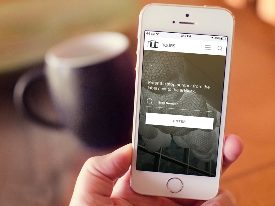
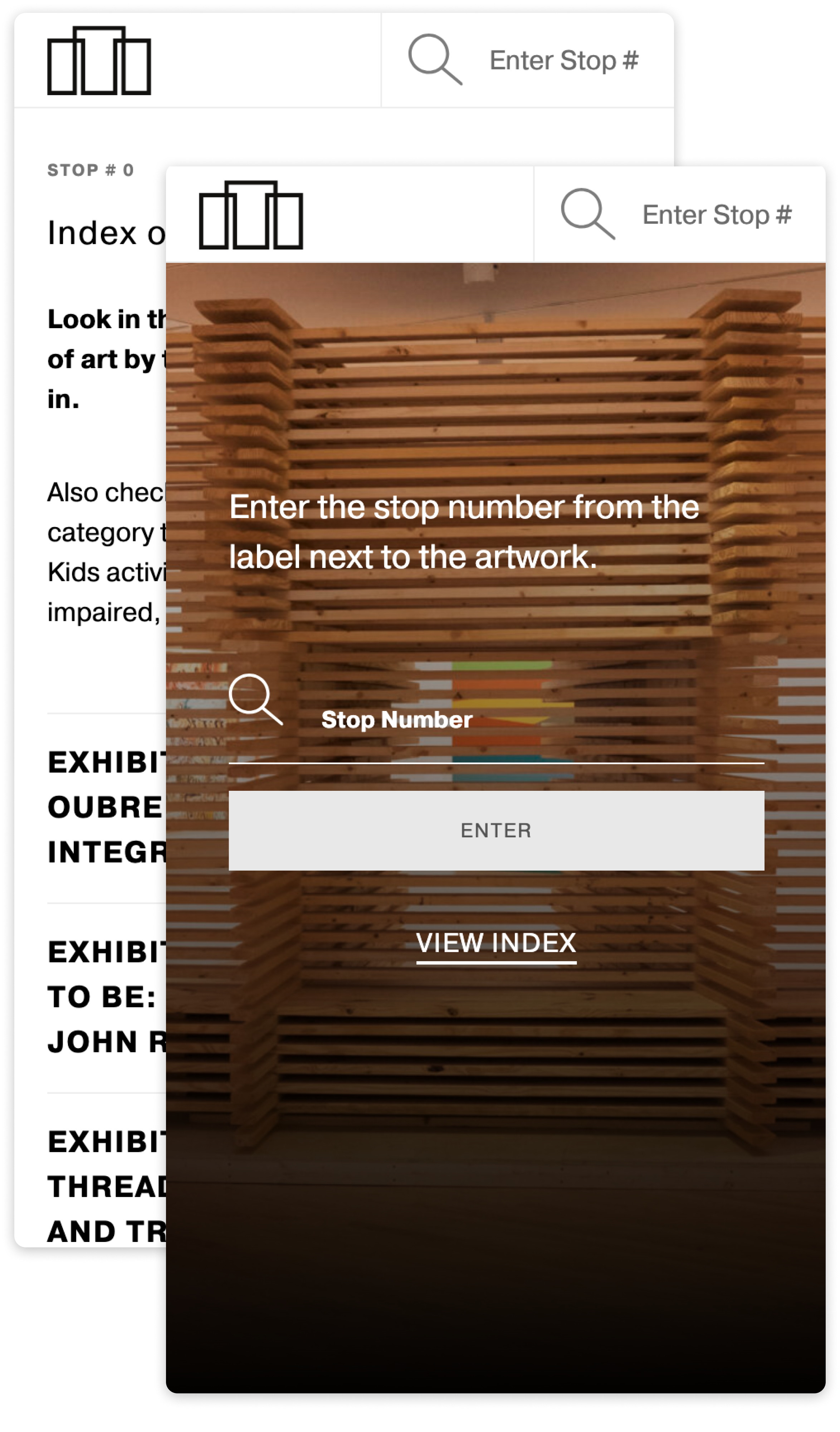
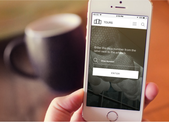
Users can access the React app, called the Smartguide, at artsbma.org/guide. When a user first arrives at the guide, they’re greeted with some friendly copy and a prompt to enter a stop number. Stop numbers are located next to pieces throughout the museum.
This approach, as opposed to listing all available stops or a suggested first stop, is based on the assumption that visitors will navigate the gallery in a nonlinear fashion. Since they’ll be bouncing from piece to piece (as opposed to moving sequentially from piece A to piece B and so on) their primary need to is to explore the stop that currently interests them.
For this reason, we also built accessible transitions into each stop page. Via the right hand corner of every page, visitors can enter a new stop number at any time. Tapping this area automatically opens a numeric keyboard on iOS.
More of Sara Cannon's Work
OccupiProduct Design
RegenerosityWeb Design
Spruce PlannerApp Design

KwickLetterApp Design

PorteriOS Design
Select BrandingBranding

BrodoAccessibility Color Audit

CUNY Academic CommonsSite Redesign and UX

ConservSAAS Product Design
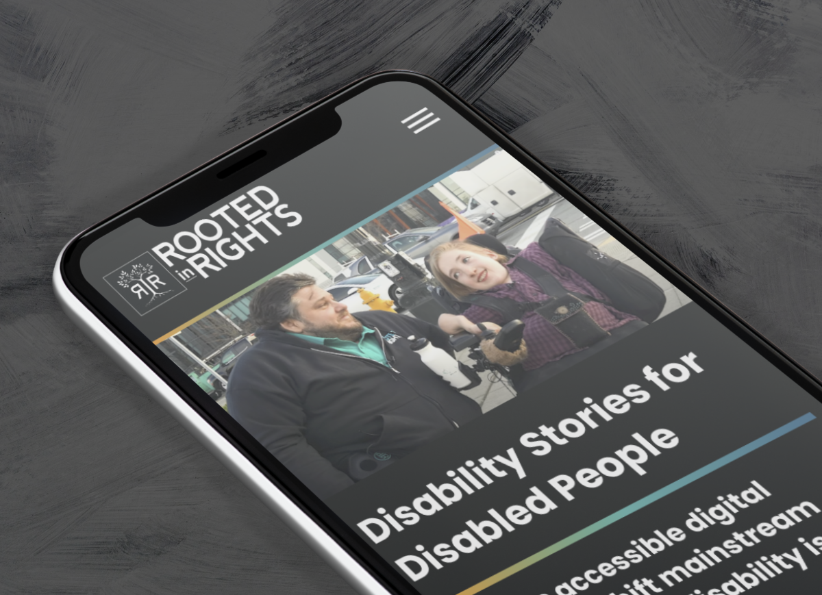
Rooted In RightsWeb Design

LifeTutors - Branding and Web DesignBranding and Web Design
BorteaWeb Design
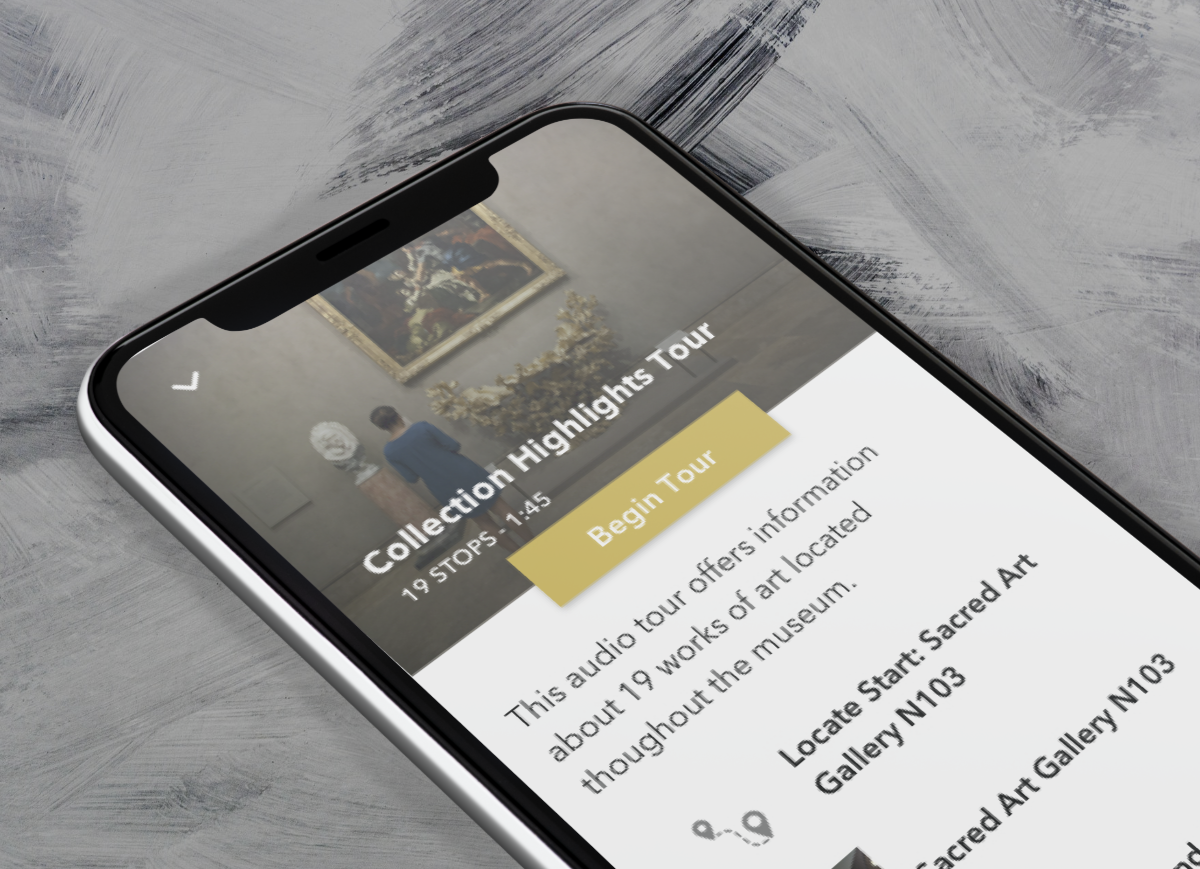
Museum Audio GuideApp Design
Art ProcessorsWeb Design

Underdog RescueBranding

WeRateDogsECommerce
SmART GuideWeb Design

DhriftBranding & Web Design
Tressie McMillan CottomWeb Design
Birmingham Museum of Art - Site DesignWeb Design

The Ulterior EpicureWeb Design

High Growth HandbookWeb Design

Rick RiordanWeb Design
ChalkbeatWeb Design

InsideClimate NewsWeb Design

California Law ReviewWeb Design

Flickr BlogWeb Design
Sara Cannon is a Web Design and Branding Specialist | Helping brands build seamless digital experiences.
She's also an Artist.
Do you have a project she can help you with? Contact Sara at sara@saracannon.com.