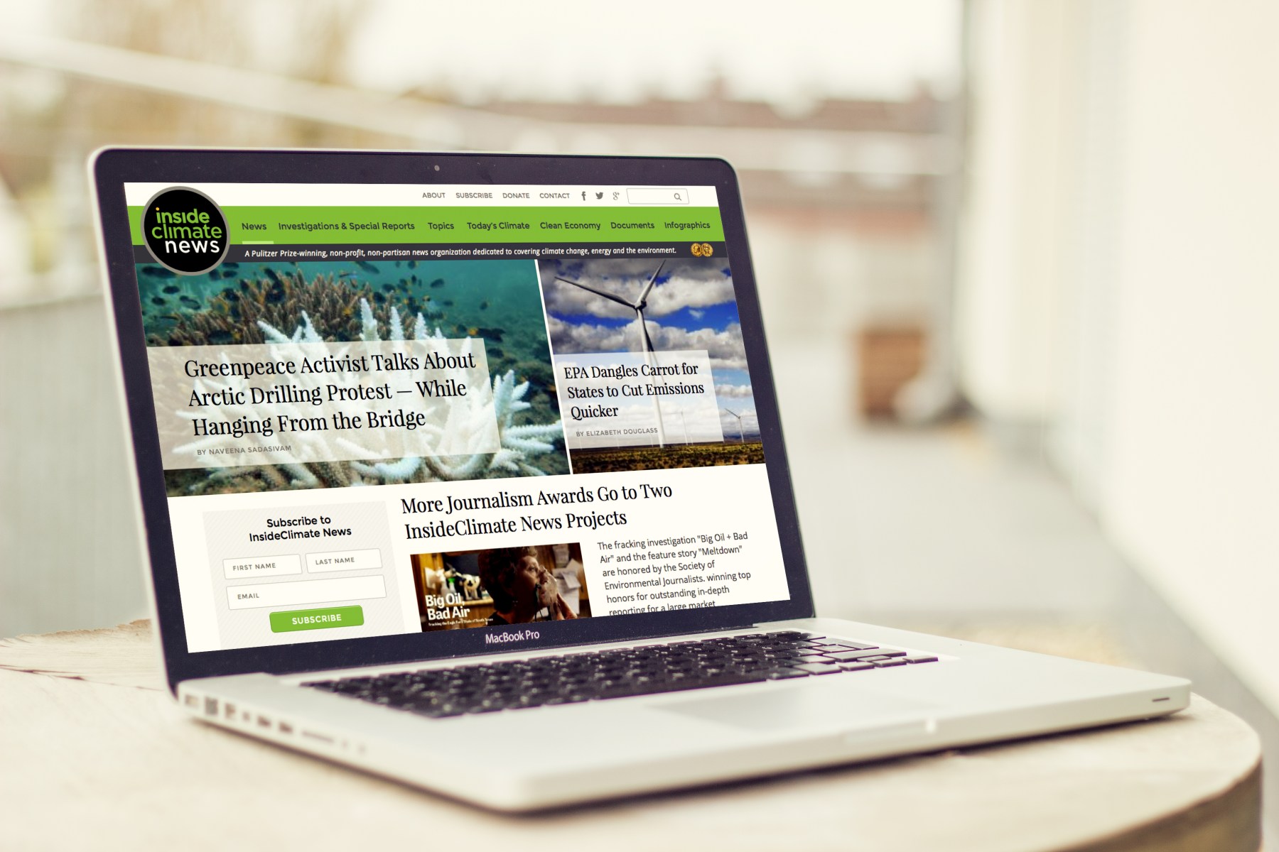
Inside Climate News
Design for Pulitzer Prize-Winning Journalism
Work done in 2016 in collaboration with Sara's team at Range
Background
InsideClimate News is a Pulitzer prize-winning, non-profit, non-partisan news organization that covers clean energy, carbon energy, nuclear energy and environmental science— plus the territory in between where law, policy and public opinion are shaped. Their mission is to produce clear, objective stories that give the public and decision-makers the information they need to navigate the heat and emotion of climate and energy debates.
Mission
InsideClimate News needed a facelift, better organization, and a memorable presence. We loved working with their team to come up with a fresh new design and front end development that their Drupal team could put into action.
Goal
To Increase brand awareness, increase pageviews, and provide better organization.
Solution
We developed a custom design through our strategy-focused process. We made branded Email Templates for their campaigns, unique Call To Actions, Templates that highlight their investigative reporting series, Ebook covers, and Unique page layouts.
Case Study from 2016
Design Update Needed
In order to further their mission, ICN needed a better framework for communicating their stories to the public. Their previous layout was dated, tricky to navigate, and didn’t quite seem to match the organization’s incredible reputation and award-winning work.
Laying The Foundation
From the very start, we recognized the opportunity to help this incredible organization refine their image and match their reputation. We laid our foundations for design by understanding their brand, audience, business goals, and most immediate needs. This deep understanding of ICN formed the basis of our informed design – design that’s not only appealing, but strategic, fact-based, goal-driven and purposeful.
Creating The Framework
Starting with a style tile and wireframes, we worked with their team (the CEO, audience engagement specialist, journalists, everyone) to identify a layout and information architecture that improved ICN’s overall workflow and presentation.
At this stage, we used Invision to create guided tours of the wireframes so that the ICN team could easily view and discuss the layouts after our initial walkthrough.
This allowed ICN to provide the robust feedback we used to craft our draft designs. Many careful iterations later, we unveiled our final designs. Through this intensive collaboration, we created a more strategic homepage structure, more engaging article layouts, easier to navigate newswires, and many other updates.
Strategic Homepage Structure
For the homepage, both ICN and our team envisioned something that was easy to navigate, had clearly differentiated types of content, and reflected the overall strength of the ICN brand.
For easy navigation and content differentiation, we segmented the homepage into clearly titled blocks such as “Featured Special Reports”, “Hot Again”, and “Most Popular.”
These blocks allowed ICN to feature and re-feature content based on relevance, not necessarily on publication date.
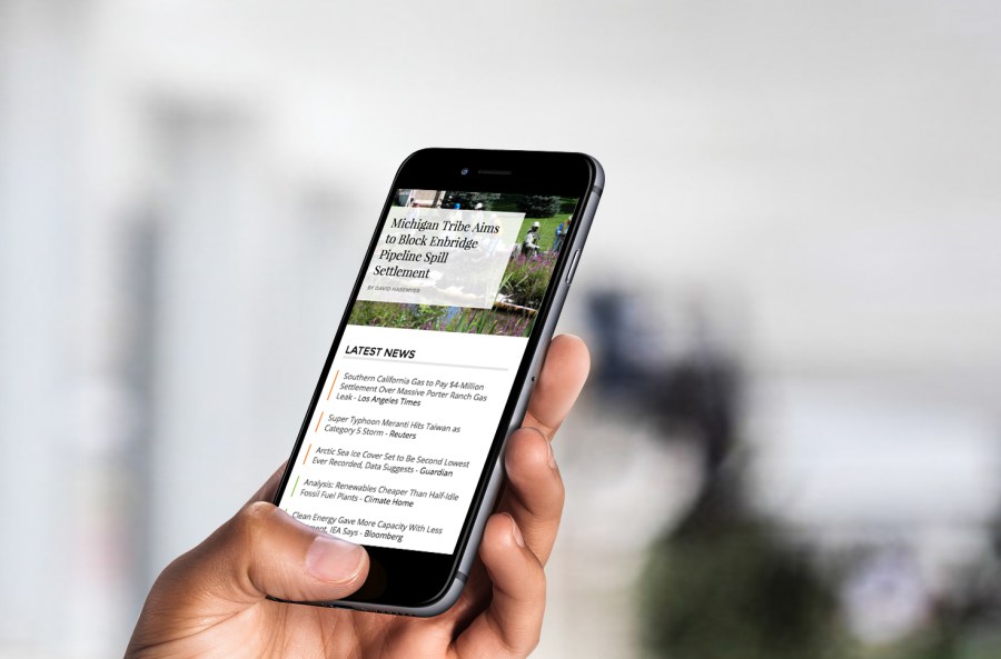
For “Today’s Headlines,” we added some additional color-coding to help visitors differentiate latest headlines by category – which also served to draw attention to ICN’s aggregated newswires!
These updates, combined with an updated header, footer, and color scheme, presented a more accurate picture of the high quality content and journalism ICN has been nationally recognized for.
Driving User Engagement through Articles
After diving into ICN’s site analytics and speaking with their staff, we realized something interesting – most of their traffic was not coming through the homepage. Traffic was primarily arriving through article pages.
This wasn’t a problem – but the fact that these pages saw a large amount of drop off was. So we set out to update both the standard and featured article layouts with the goal of driving users deeper into the site through most popular and related stories. This update also helped ICN move off of a frustrating external publishing platform that they had been using for their featured writings.
Easy to Navigate Newswires
One of our favorite ICN products is their aggregated content. For avid consumers of climate news, ICN provides two types of aggregated content online and four via their daily and weekly newsletters (you can sign up for those here if you’re passionate about this issue and want to stay informed).
To boost newsletter signups, we placed a prominent signup box on each page and visually differentiated each aggregation – orange, yellow and red for Today’s Climate and shades of green for clean economy – so site visitors always know which aggregation they are exploring.
We also included a nifty timeline feature that scrolls with the visitor so users can easily track their progress through the timeline.
More of Sara Cannon's Work
OccupiProduct Design
RegenerosityWeb Design
Spruce PlannerApp Design

KwickLetterApp Design

PorteriOS Design
Select BrandingBranding
BrodoAccessibility Color Audit

CUNY Academic CommonsSite Redesign and UX
ConservSAAS Product Design
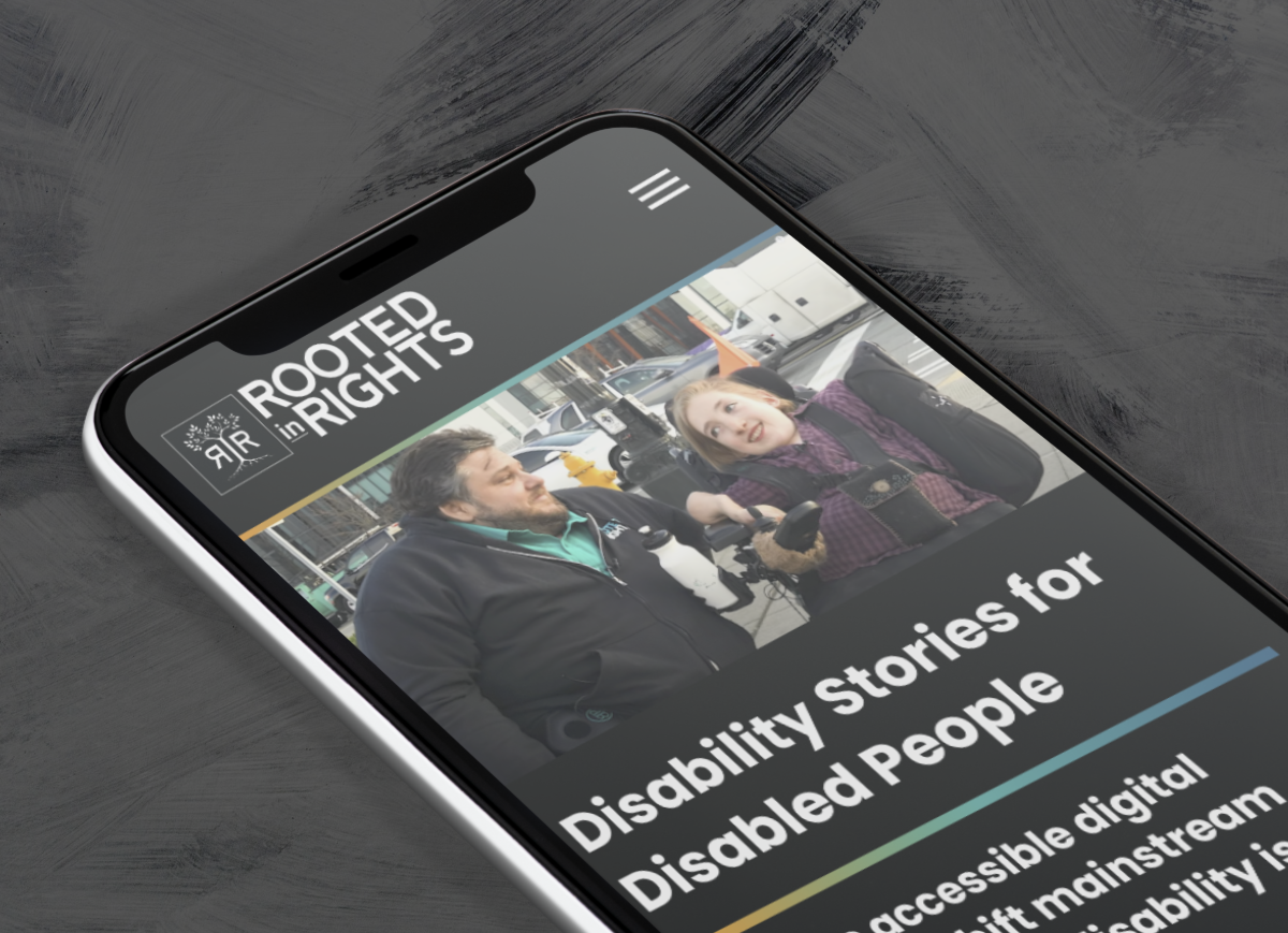
Rooted In RightsWeb Design

LifeTutors - Branding and Web DesignBranding and Web Design
BorteaWeb Design
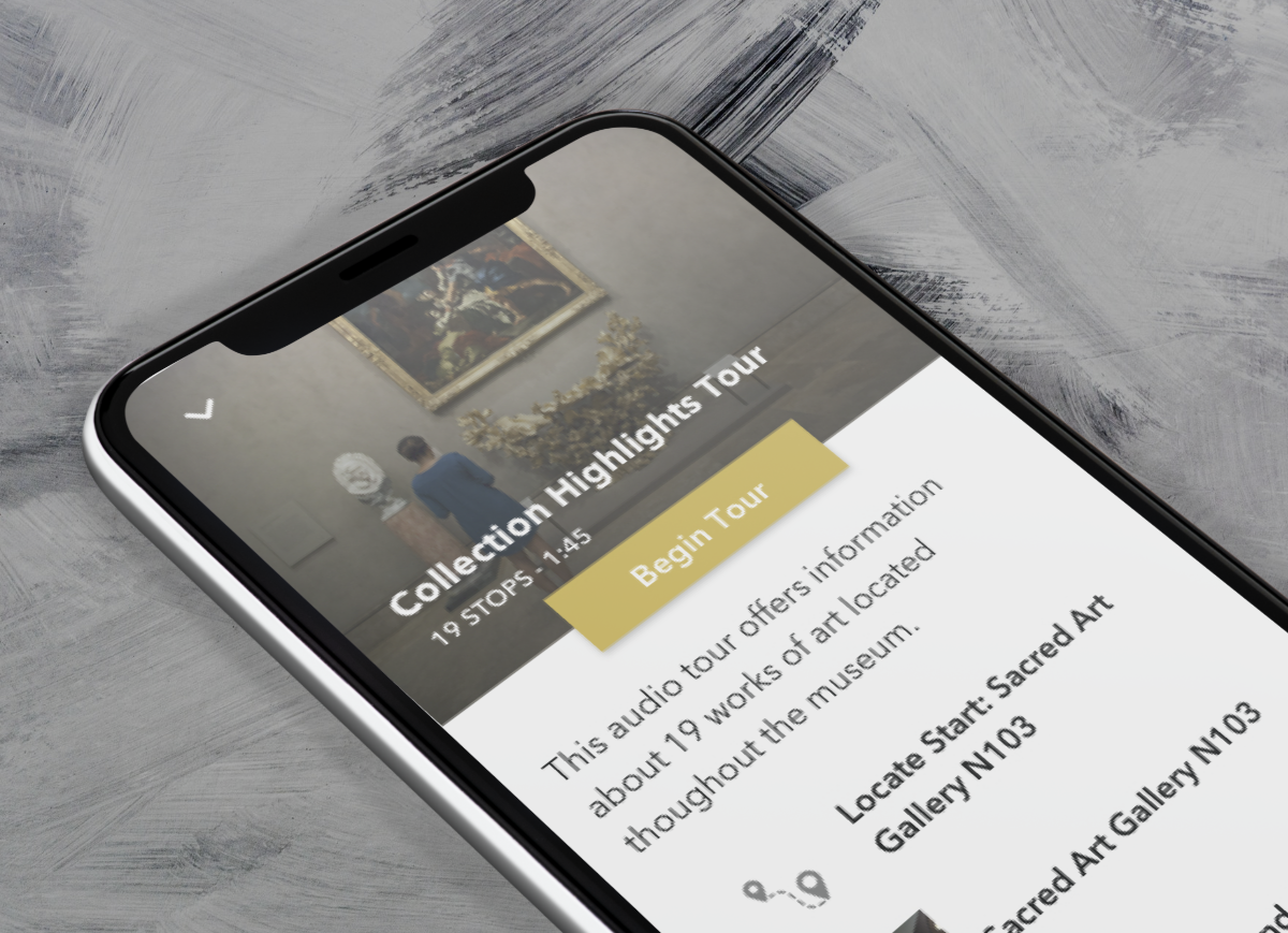
Museum Audio GuideApp Design
Art ProcessorsWeb Design

Underdog RescueBranding

WeRateDogsECommerce
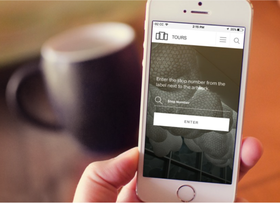
SmART GuideWeb Design
DhriftBranding & Web Design
Tressie McMillan CottomWeb Design
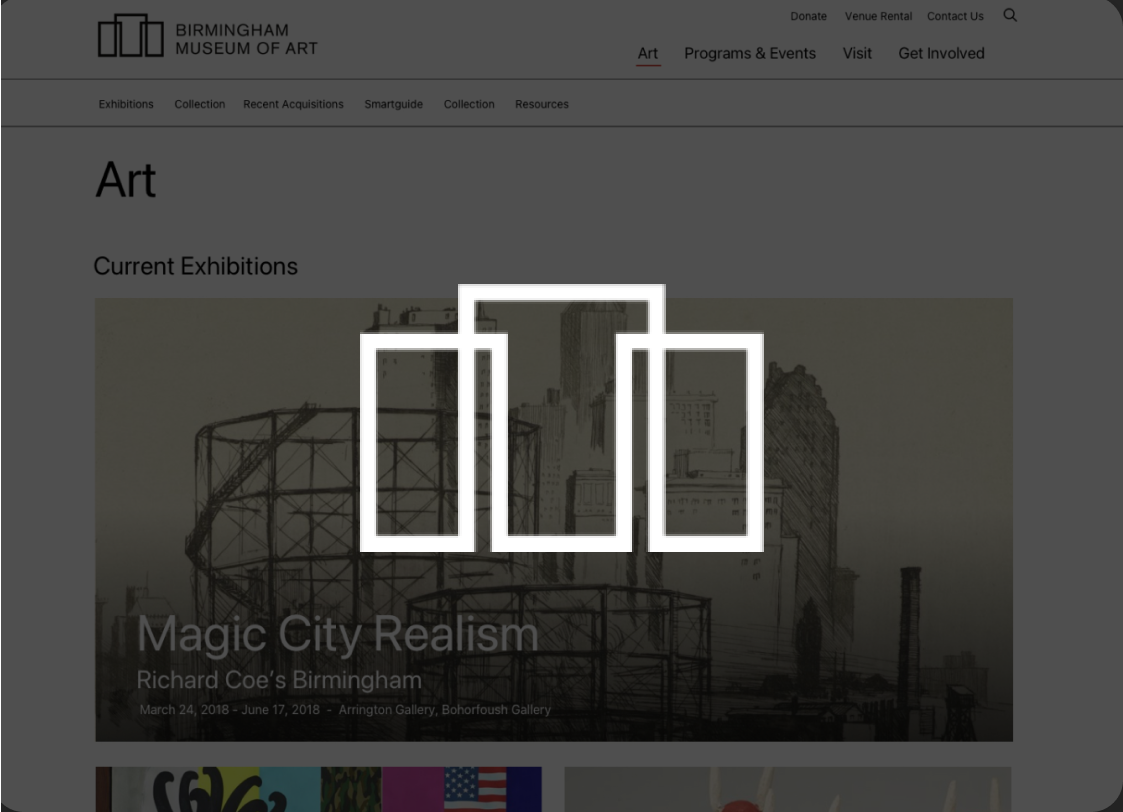
Birmingham Museum of Art - Site DesignWeb Design

The Ulterior EpicureWeb Design
High Growth HandbookWeb Design

Rick RiordanWeb Design
ChalkbeatWeb Design

InsideClimate NewsWeb Design

California Law ReviewWeb Design
Flickr BlogWeb Design
Sara Cannon is a Web Design and Branding Specialist | Helping brands build seamless digital experiences.
She's also an Artist.
Do you have a project she can help you with? Contact Sara at sara@saracannon.com.