Web Design
California Law Review
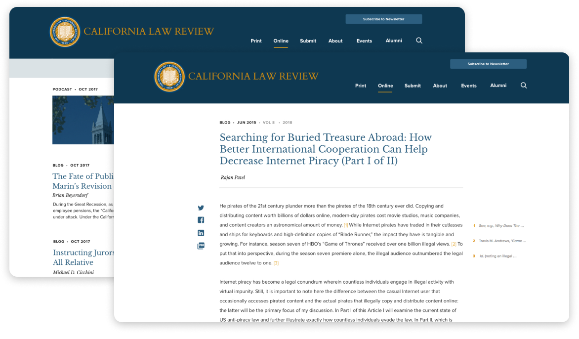
The California Law Review (CLR) is one of the premier law reviews – not just on the West Coast – but in the entire US. However, their previous site didn’t reflect this.
On the old site, it was difficult for staff members to enter content. Worse, it was tough for readers to explore the high-quality work staff members spent months revising and publishing. (And what good is content if it’s not read?) This was a major problem for the publication site.
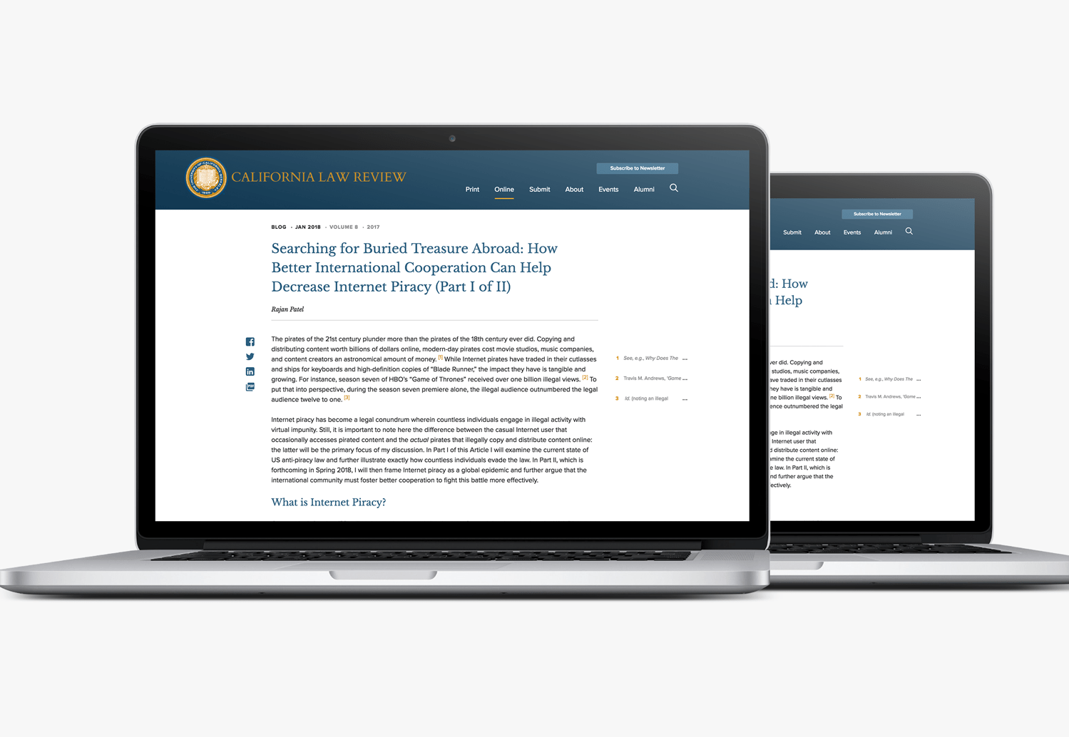
Refining the appearance of a premier law review
Discovery
In our Discovery phase with CLR, we discovered they needed a new site that could:
- Allow visitors to easily download and share published content
- Enable administrators to add content, make edits, and insert footnotes
- Communicate the authority of CLR publications to readers

A Prestigious Design
With the Law Review’s reputation, we weren’t looking to design a site that’d convince someone of their authority. Rather, we were looking to complement CLR’s well-established name and credibility. To do so, we chose a color palette that’s:
- consistent with Berkely’s brand guidelines
- conducive to long bouts of reading
- complimentary to CLR’s prestige
We also made sure the color palette we chose – and the way we implemented it – kept reader focus on content. Our team wanted to support reader immersion, not distract from it.
Sorting Content Types
One of the larger development challenges with CLR was sorting and organizing their content archives. The Law Review publishes excellent content both online and in print. Each format has its own archive and its own type of content.
To organize this, we separated posts into two separate post types: online posts and print posts. This allowed the CLR staff to develop a unique set of categories for each content type, as well as display different forms of meta-data for print vs. online posts. Other improvements we made included:
- Creating a way to automatically add a table of contents to long posts
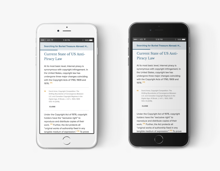
- Adding and displaying footnotes
- Creating a better way to track and store legacy content, such as mastheads
The Result
California Law Review’s site now reflects their premier position in the legal world, plus gives readers maximum access to their content. Followers can more easily browse, read, and share content, while site administrators can more easily publish and organize their work.
More of Sara Cannon's Work

OccupiProduct Design

RegenerosityWeb Design

Spruce PlannerApp Design

KwickLetterApp Design

PorteriOS Design

Select BrandingBranding

BrodoAccessibility Color Audit

CUNY Academic CommonsSite Redesign and UX

ConservSAAS Product Design

Rooted In RightsWeb Design

LifeTutors - Branding and Web DesignBranding and Web Design

BorteaWeb Design

Museum Audio GuideApp Design

Art ProcessorsWeb Design

Underdog RescueBranding

WeRateDogsECommerce

SmART GuideWeb Design

DhriftBranding & Web Design
Tressie McMillan CottomWeb Design
Birmingham Museum of Art - Site DesignWeb Design

The Ulterior EpicureWeb Design

High Growth HandbookWeb Design

Rick RiordanWeb Design

ChalkbeatWeb Design

InsideClimate NewsWeb Design
California Law ReviewWeb Design

Flickr BlogWeb Design
Sara Cannon is a Web Design and Branding Specialist | Helping brands build seamless digital experiences.
She's also an Artist.
Do you have a project she can help you with? Contact Sara at sara@saracannon.com.