Product Design
Occupi
Occupi is a rental platform focused on making life easier for both tenants and property managers. I worked closely with their team to rethink and redesign three key areas of the product: the payment flow, the tenant dashboard, and the main marketing website. From early UX decisions to polished UI in Figma, I helped bring clarity, consistency, and usability to their growing platform.
Reimagining the Payment Flow
The original "Pay Now" experience was clunky—filled with multiple steps, unclear navigation, and a confusing mix of payment options. User testing allowed the team to identify exactly where users were getting stuck or abandoning the process, and that data played a key role in shaping our design decisions.
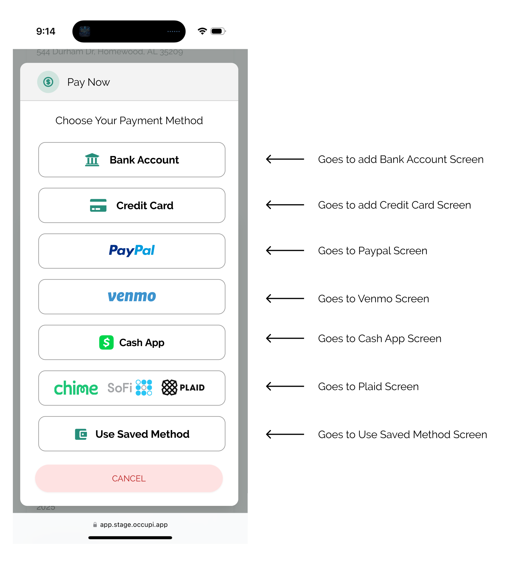
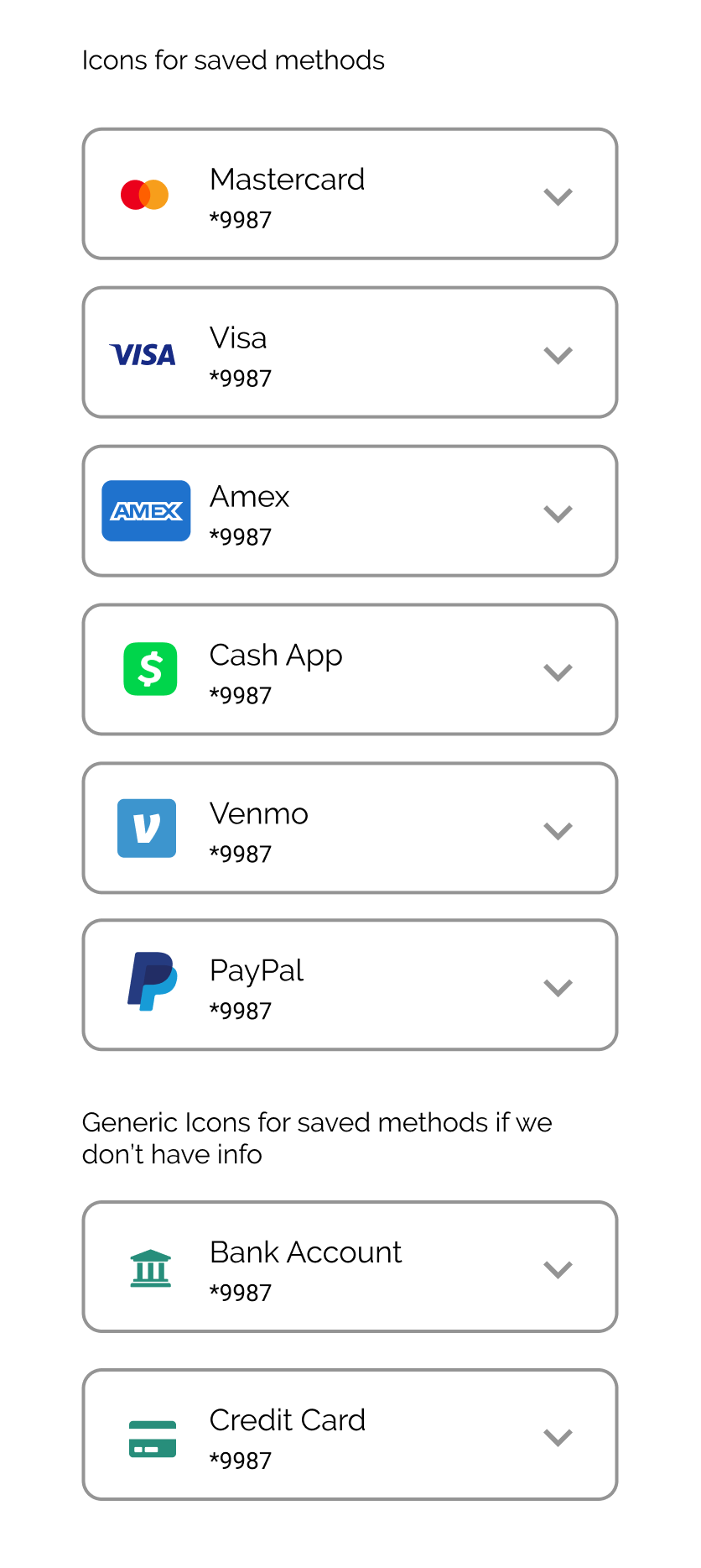
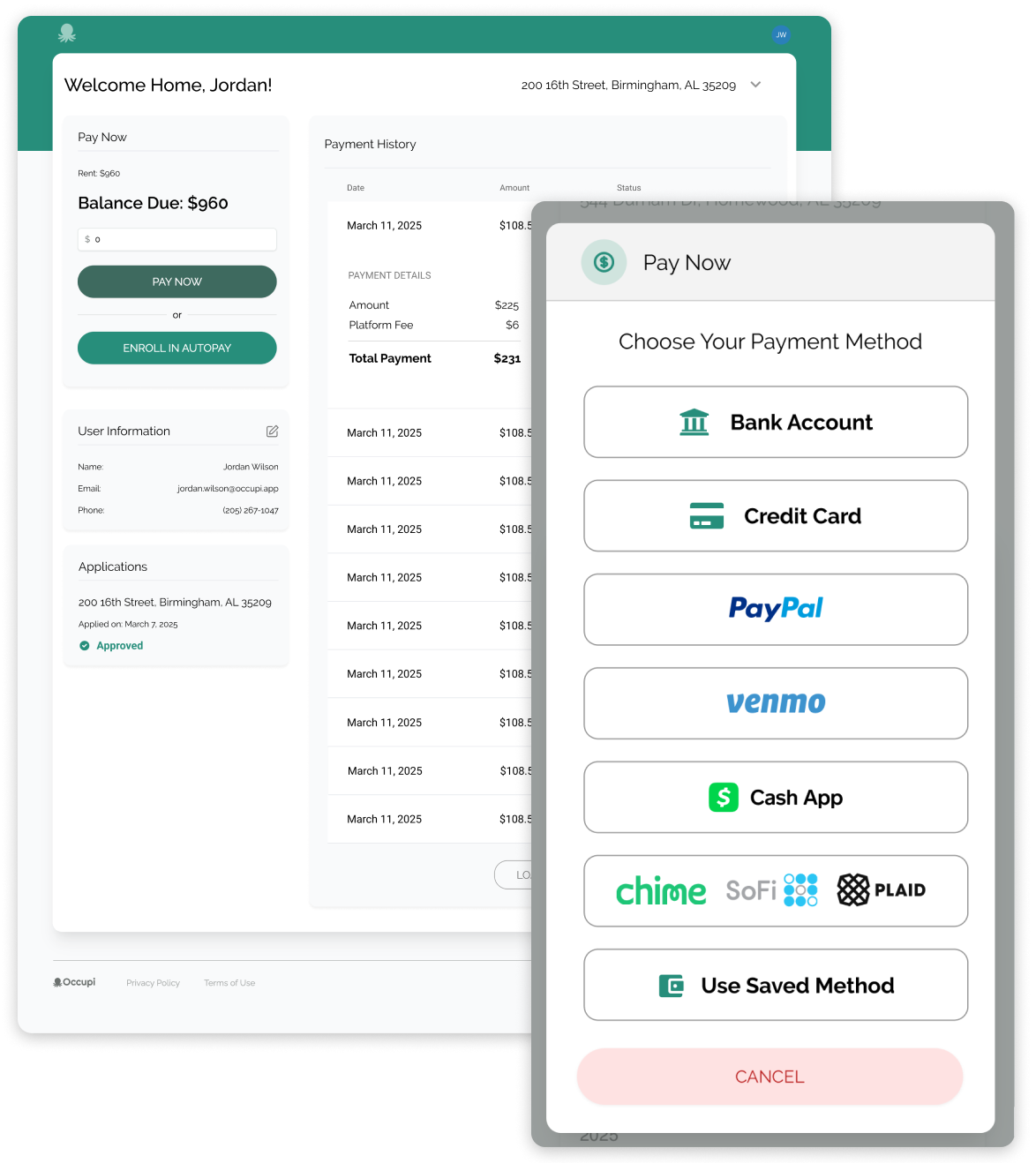
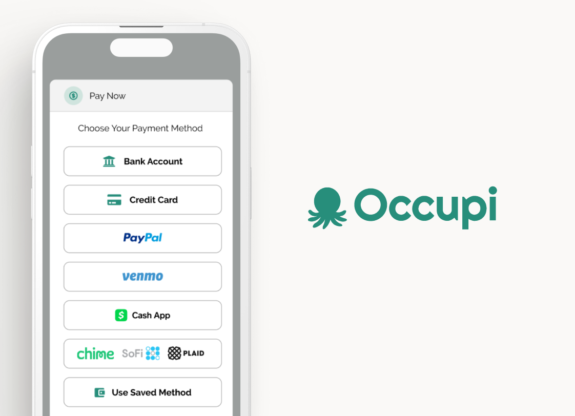
Working within their existing style, my goal was to simplify the process and make paying rent feel less stressful. I created a cleaner, more intuitive flow that guided users through their options (credit card, bank account, PayPal, Venmo, Cash App, etc.) while making sure legal language was clear but not intrusive.
Some highlights:
- Designed easy-to-navigate screens for each payment method
- Streamlined fees and total display logic based on method selected
- Built in helpful error states and checkbox confirmations
- Created thoughtful defaults for saved methods and tricky flows like Plaid
User Flow
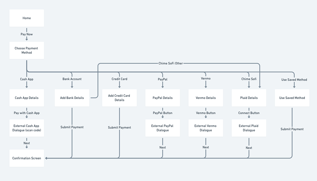
Since saved payments weren’t a priority given the current state of the app, I mapped out a user flow that felt more aligned with Occupi’s goals and user needs.
Pay Now Screen
After you enter your amount in the Dashboard, you hit the Pay Now button. This brings up a dialogue where you can choose your Payment Method. When you hit PayPal, Venmo, or Chime/SoFi, you get bumped to their external dialogue.
Pay with Bank Account & Credit Card
Screens for adding bank account and credit cards. Payment is submitted immediately. We had to remove the traditional X to close out the modal because users would consistantly input their information and then hit X when they were done thinking that submitted it.
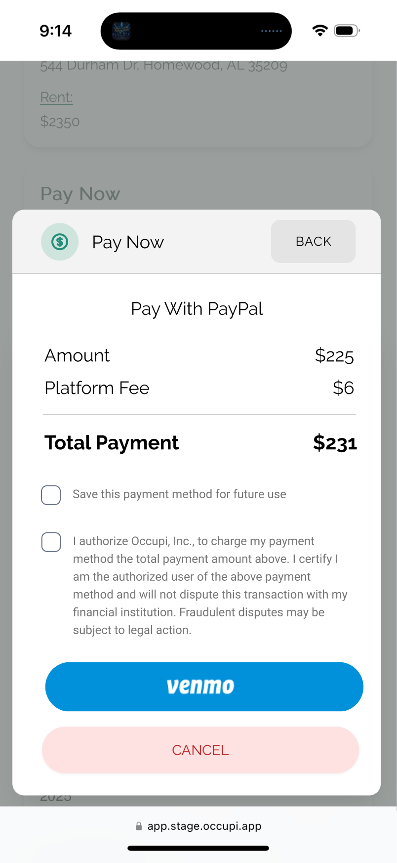
Pay With PayPal & Venmo
Screens for Paypal and Venmo. Opens External Dialogue. We had to include this really long legal authorization without hiding it in a link because of all the rampant fraud that occurs with this type of transaction.
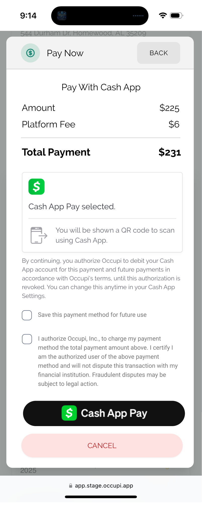
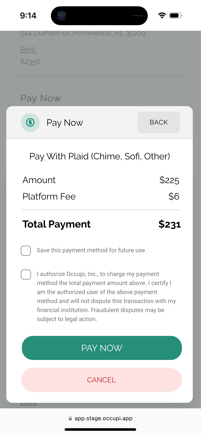
Pay With Cash App & Pay With Plaid (Chime, Sofi, Other)
Screens for Cash App and Plaid. (Chime, Sofi, Other) Opens External Dialogue. The transition to Cash App and then back is a pretty unique flow compared to the others as it opens up a QR Code. We still have to have them check the authorization box first.
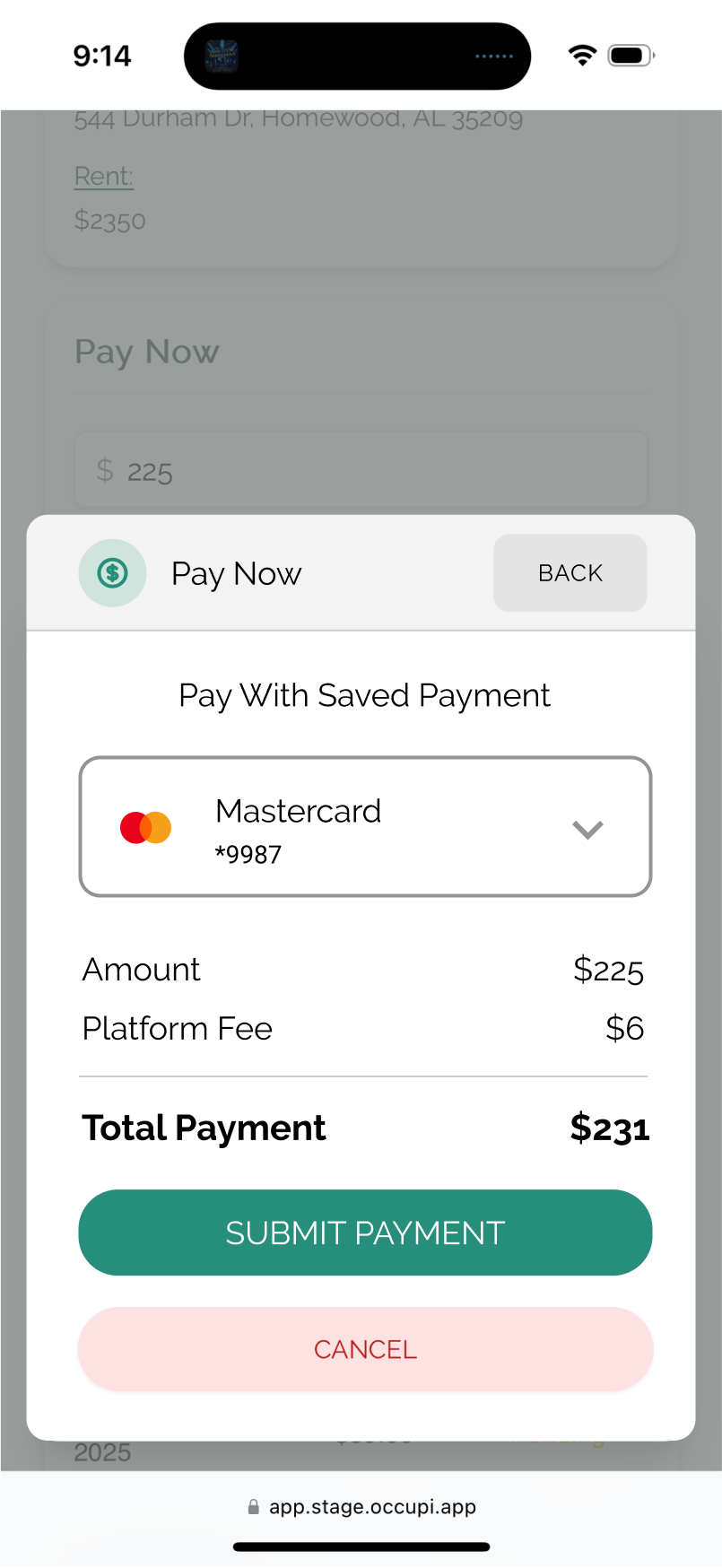
Pay With Saved Method
Use the dropdown to select between all your saved methods. Last used is on the top with descending order.
Simplifying the Tenant Dashboard
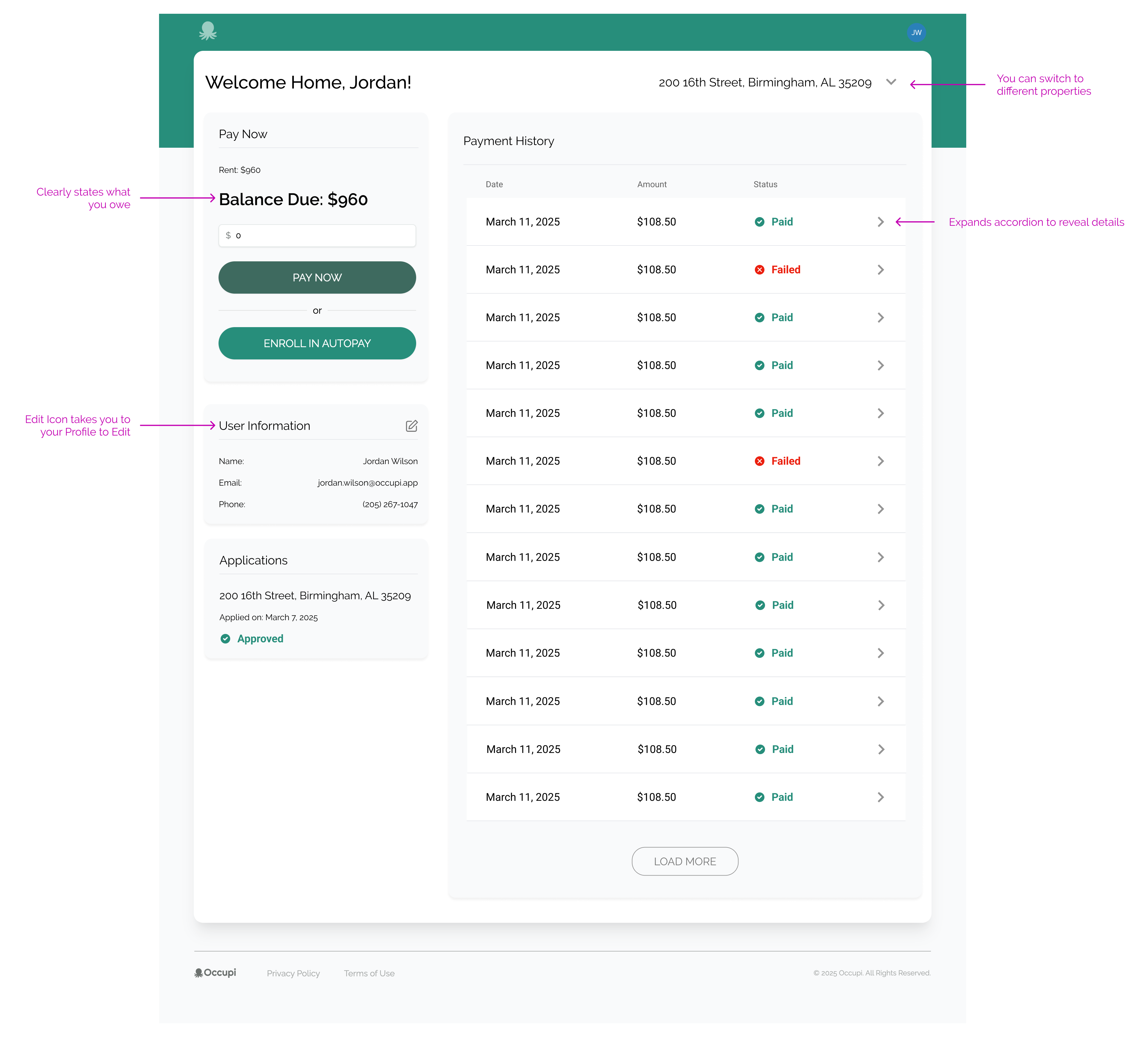
The dashboard needed love. It split payment and charge history into two views, used clunky table pagination, and didn’t scale well on mobile. I redesigned the layout to combine related info, introduced expandable sections for viewing payment details, and made key actions like “Pay Now” and “Enroll in Autopay” easier to access—especially on smaller screens.
Some things I improved:
- Combined payment + charge history into one view
- Replaced pagination with a “Load More” experience
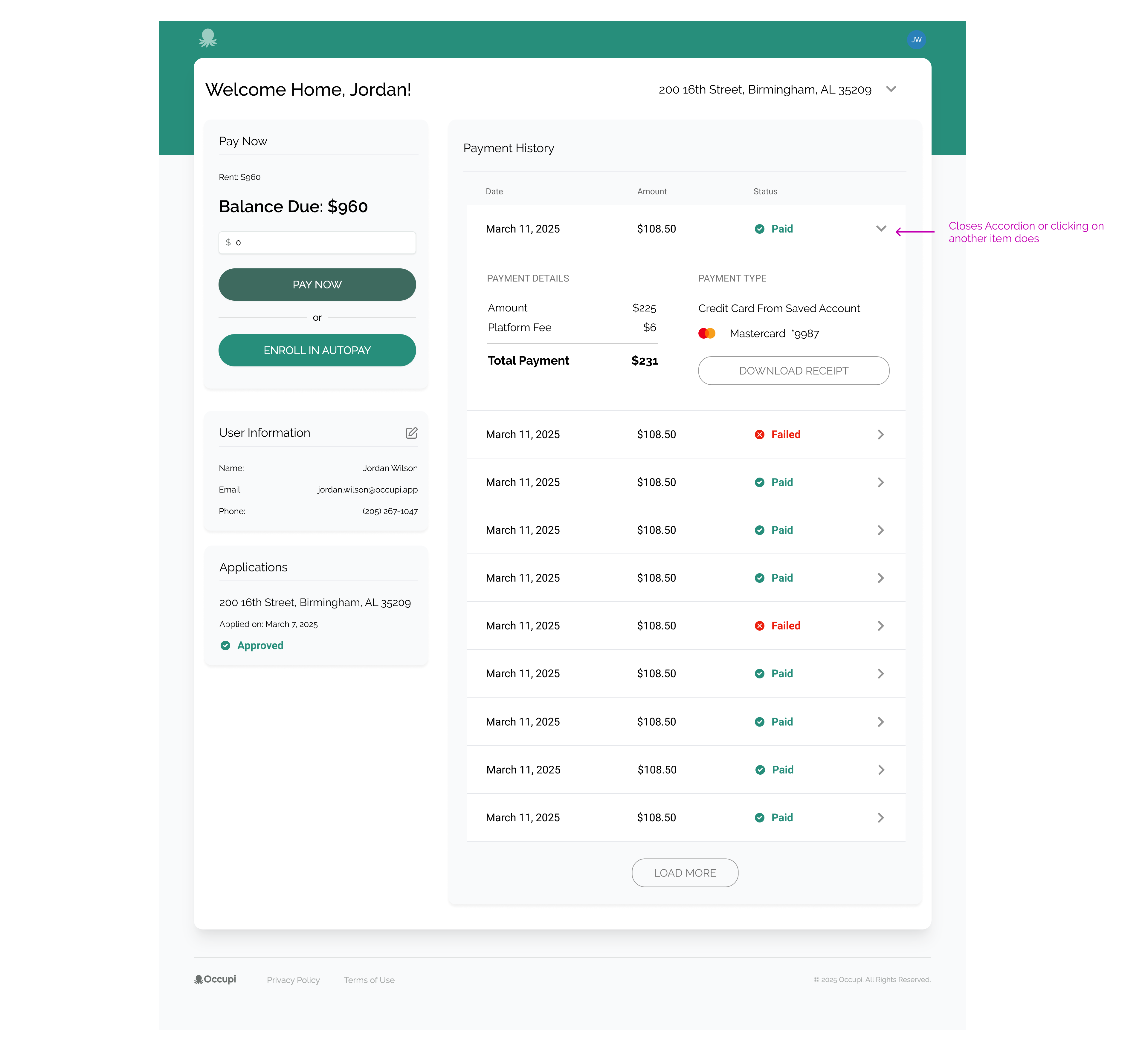
- Added expandable rows for receipt info and status details
- Optimized the whole thing for mobile usability
- Focused on a cohesive mobile experience
Dashboard View
Here I re-arranged the dash and combined the Payment History with the Charge History. This opens up a detailed accordion. I also included a Load More button instead of table pagination.
Dashboard - Mobile View
Refreshing the Website
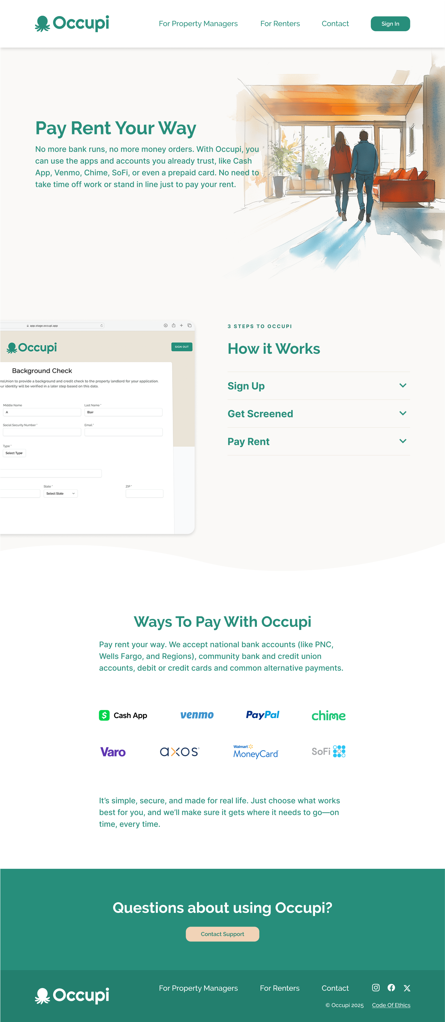
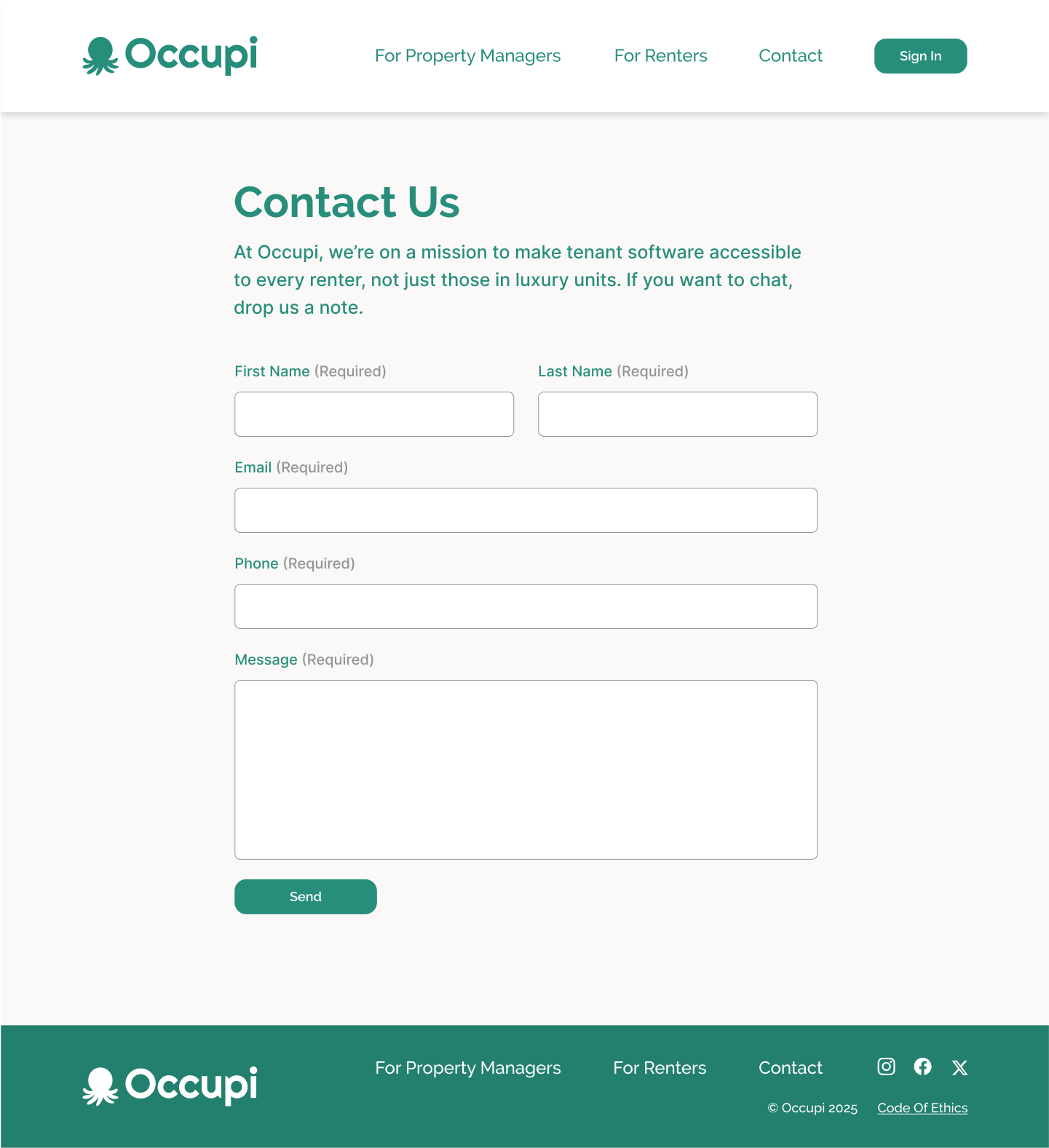
Occupi’s original marketing site didn’t reflect how polished and powerful the product had become. I gave the site a visual refresh that brought it in line with the product UI, clarified messaging, and created room for future growth. Working within their existing brand guidelines, I reorganized the structure, cleaned up the design, and made sure everything looked consistent and modern.
What I focused on:
- Designing modular layouts to highlight product features
- Updating typography and spacing for clarity and impact
- Writing and organizing content to better communicate value
- Making sure the site design felt cohesive with the app experience
Outcome
These redesigns were the result of close collaboration with the Occupi team, and they helped bring new clarity and confidence to the platform’s users. Renters can now make payments with ease, track their history without confusion, and navigate across devices more smoothly. The refreshed website also helped strengthen Occupi’s credibility and better reflect the thoughtful, user-focused experience behind the product.
More of Sara Cannon's Work
OccupiProduct Design
RegenerosityWeb Design
Spruce PlannerApp Design

KwickLetterApp Design

PorteriOS Design
Select BrandingBranding
BrodoAccessibility Color Audit

CUNY Academic CommonsSite Redesign and UX
ConservSAAS Product Design
Rooted In RightsWeb Design

LifeTutors - Branding and Web DesignBranding and Web Design
BorteaWeb Design
Museum Audio GuideApp Design
Art ProcessorsWeb Design

Underdog RescueBranding

WeRateDogsECommerce
SmART GuideWeb Design
DhriftBranding & Web Design
Tressie McMillan CottomWeb Design
Birmingham Museum of Art - Site DesignWeb Design

The Ulterior EpicureWeb Design
High Growth HandbookWeb Design

Rick RiordanWeb Design
ChalkbeatWeb Design

InsideClimate NewsWeb Design

California Law ReviewWeb Design
Flickr BlogWeb Design
Sara Cannon is a Web Design and Branding Specialist | Helping brands build seamless digital experiences.
She's also an Artist.
Do you have a project she can help you with? Contact Sara at sara@saracannon.com.
