Site Design with a focus on Accessibility
Rooted In Rights
Rooted In Rights is a non-profit that uses accessible digital media to advance the dignity, equality, and self-determination of people with disabilities.
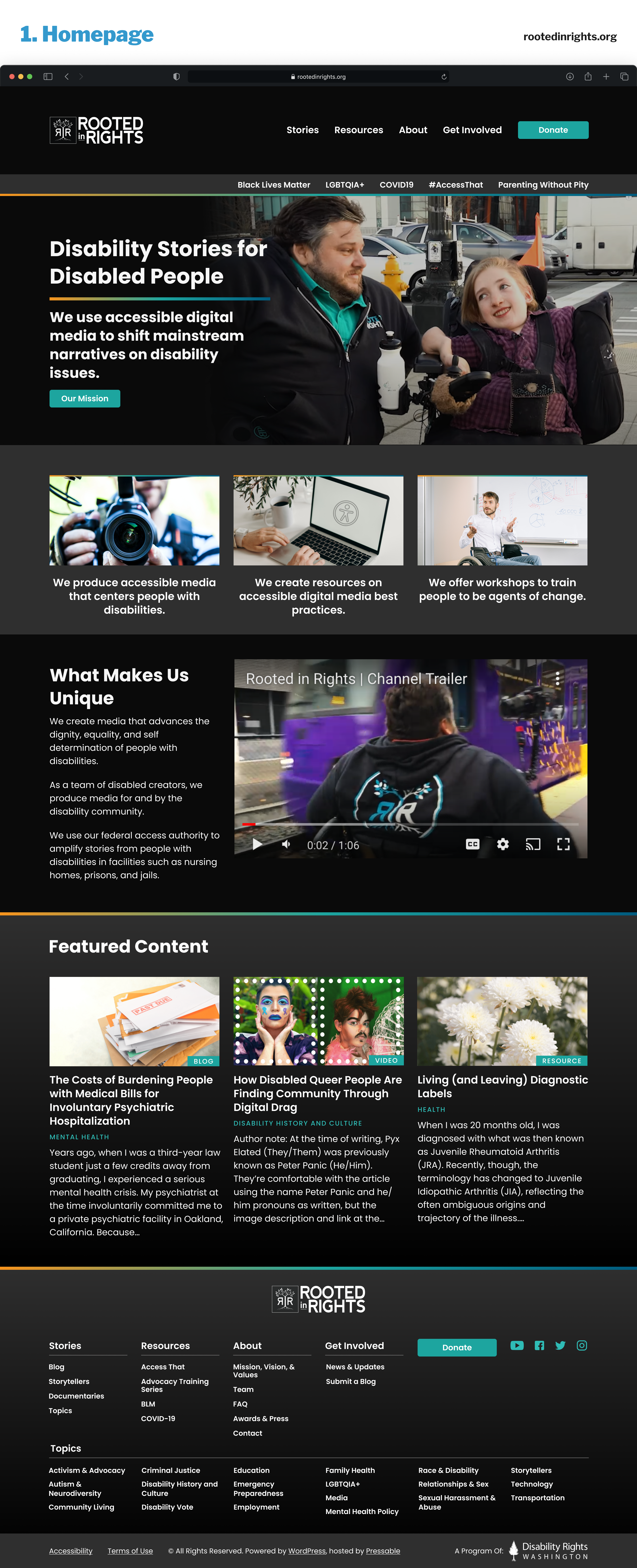
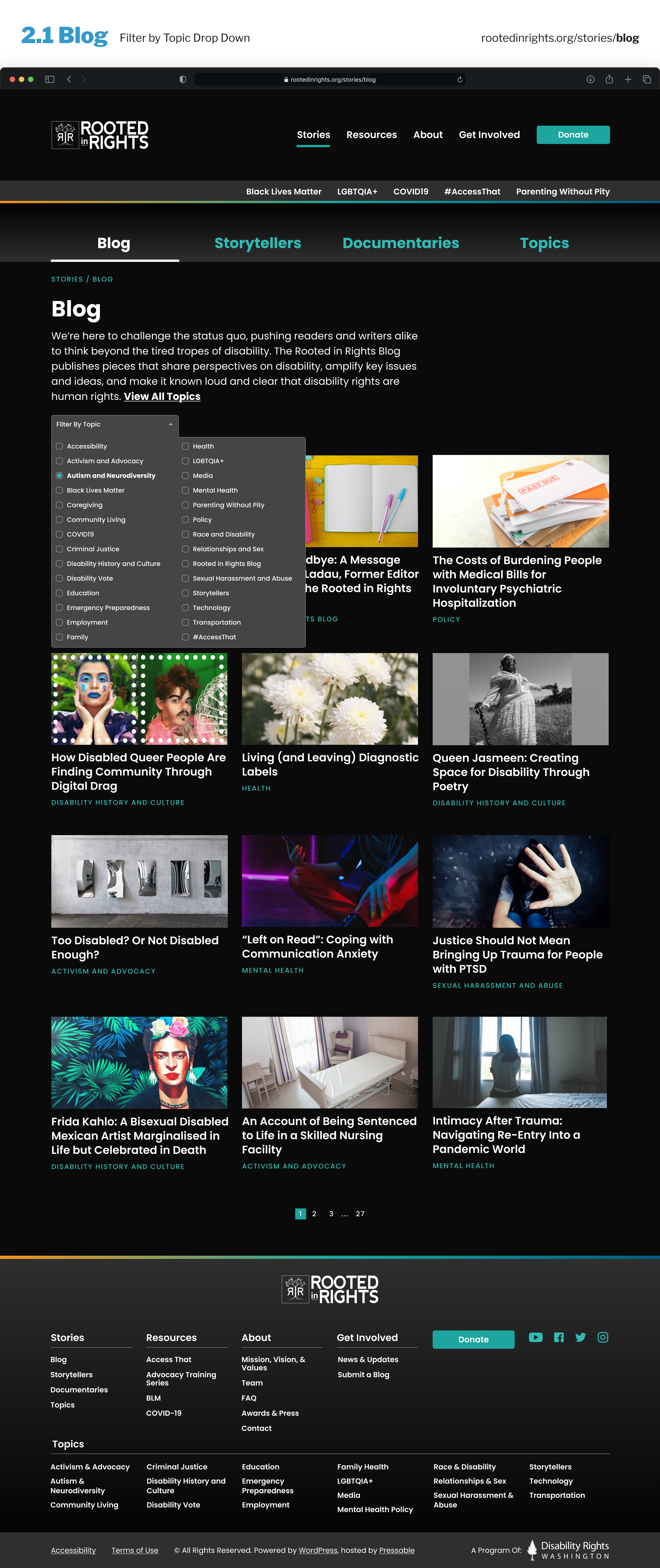
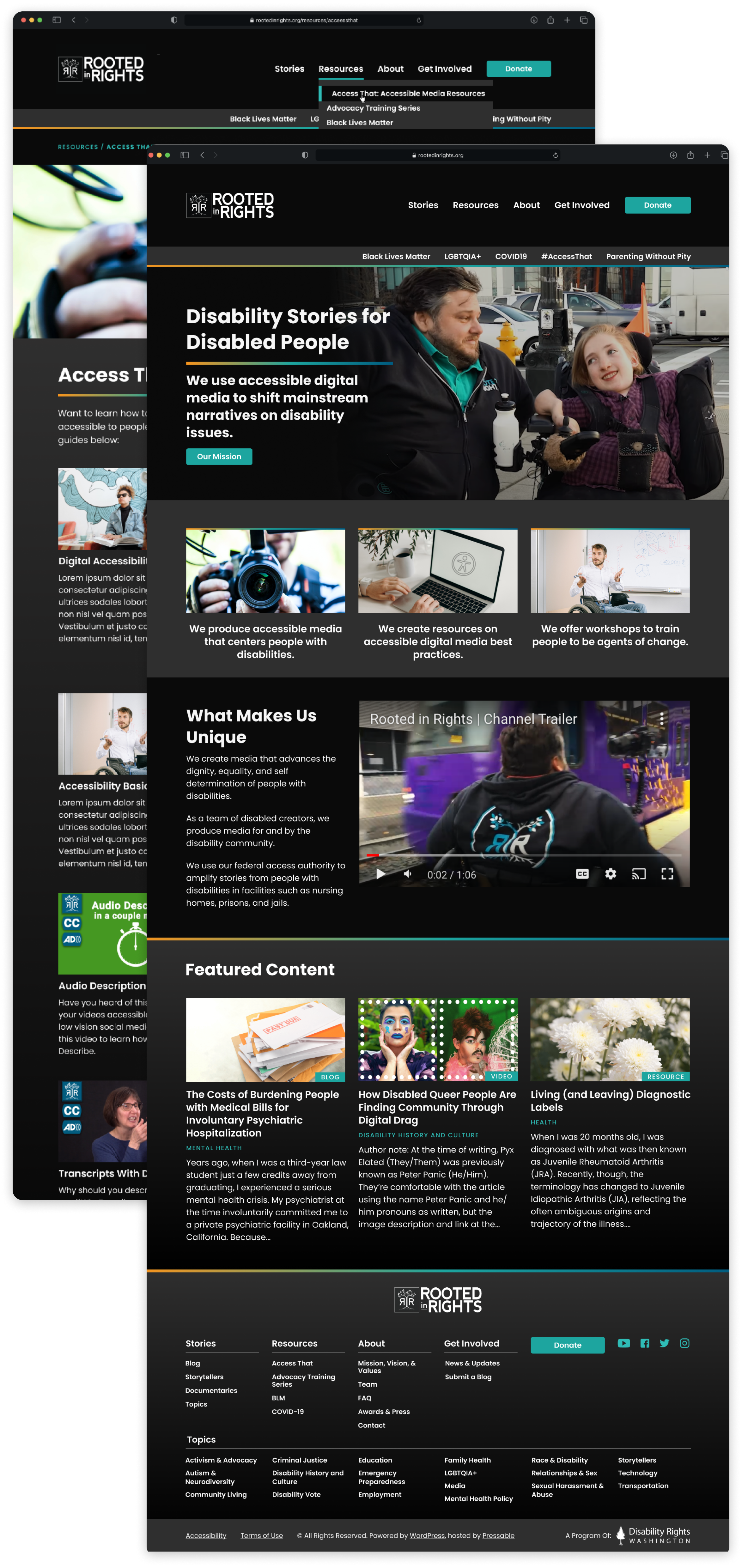
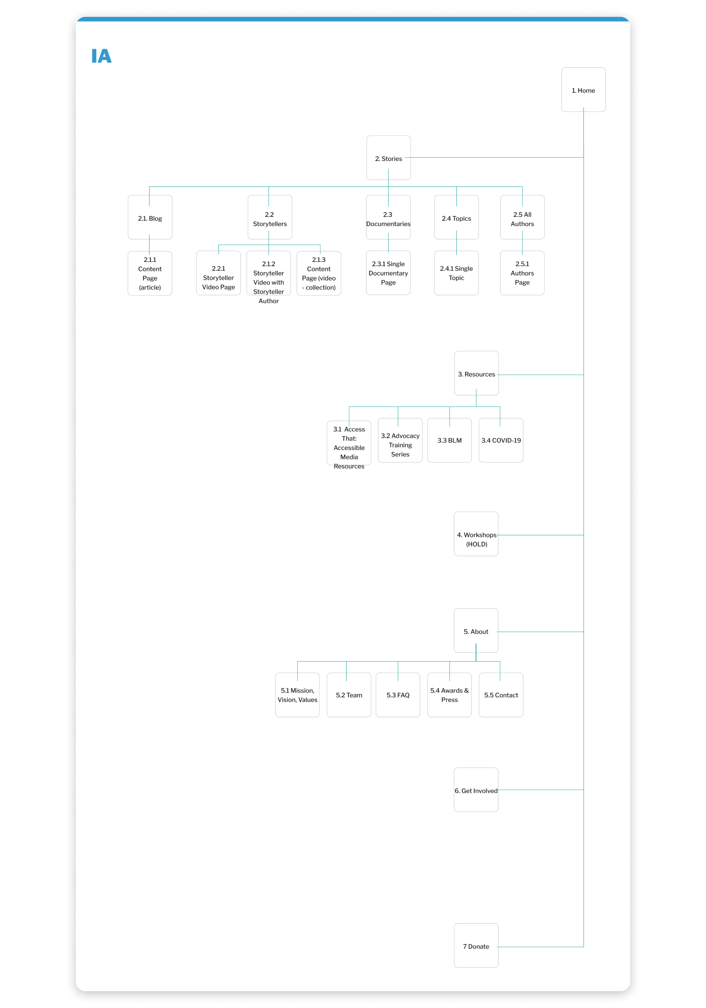
While working with Automattic's Special Projects, I transformed their online branding with an eye for accessibility. We created the site in dark mode with high contrast and focused our attention on re-doing the site's information architecture to align the navigation with their site goals.
Style Tile Choices
We sent them over three different high-contrast style tiles to choose from. They ultimately went with the dark mode one.

Option 1: This option sticks closely to the RIR main Blue color, and does not utilize nay of the orange. It is Illustration and Icon focused with a clean sans-serif throughout.

Option 2: This option is a streamlined black and white option with a fous on imagery with the use of a color gradient thoughout. The main color utilized from the palette is the teal.

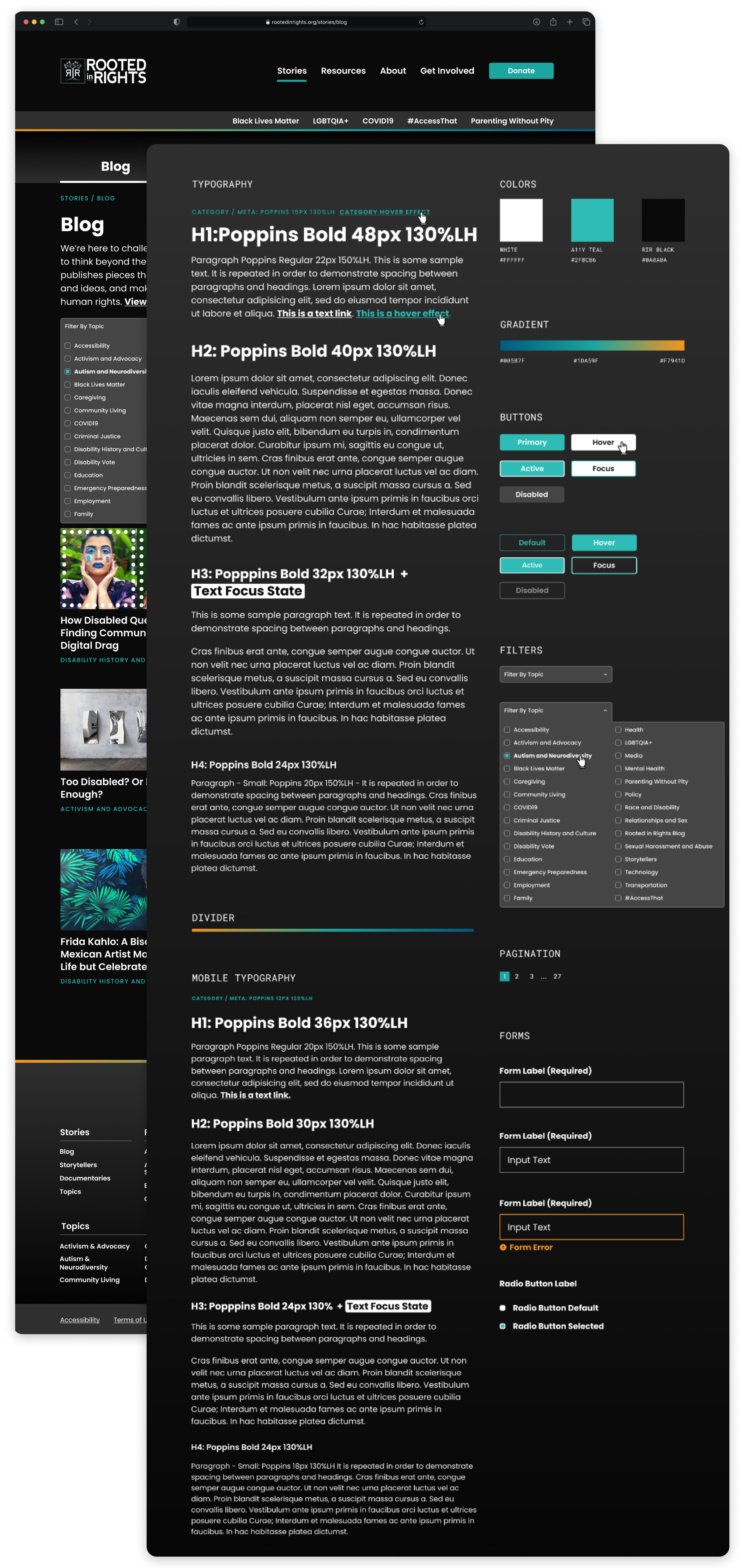
Final Style Tile - We decided to go with a high contrast dark mode with gradient features.
Site Design
The redesign process focused on restructuring the site’s content to make advocacy campaigns, videos, and resources more discoverable. Attention was given to ensuring compliance with web accessibility standards, including high-contrast visuals, clear typography, and an intuitive navigation system. The design also prioritized multimedia storytelling, making it easier for visitors to engage with video content and advocacy efforts.
The result is a website that not only meets high accessibility standards but also strengthens Rooted in Rights' ability to share impactful stories, mobilize communities, and drive social change.
More of Sara Cannon's Work

OccupiProduct Design
RegenerosityWeb Design
Spruce PlannerApp Design

KwickLetterApp Design

PorteriOS Design

Select BrandingBranding
BrodoAccessibility Color Audit

CUNY Academic CommonsSite Redesign and UX

ConservSAAS Product Design

Rooted In RightsWeb Design

LifeTutors - Branding and Web DesignBranding and Web Design
BorteaWeb Design

Museum Audio GuideApp Design

Art ProcessorsWeb Design

Underdog RescueBranding

WeRateDogsECommerce

SmART GuideWeb Design

DhriftBranding & Web Design
Tressie McMillan CottomWeb Design
Birmingham Museum of Art - Site DesignWeb Design

The Ulterior EpicureWeb Design

High Growth HandbookWeb Design

Rick RiordanWeb Design

ChalkbeatWeb Design

InsideClimate NewsWeb Design

California Law ReviewWeb Design
Flickr BlogWeb Design
Sara Cannon is a Web Design and Branding Specialist | Helping brands build seamless digital experiences.
She's also an Artist.
Do you have a project she can help you with? Contact Sara at sara@saracannon.com.
